Ah, the Facebook cover photo. Your personal billboard. Your first impression. Your chance to shine.
There have been many changes and updates to Facebook cover photos – psst! check out the latest guidelines for Facebook cover photo sizes & dimensions– but no matter what, the cover photo has remained front and center: It’s there, it’s proud, and it demands to be awesome.
Indeed, if an image speaks a thousand words, then your Facebook cover photo sure is wordy. It’s a story in visual format. It must tell something about you or your brand. Perhaps you want to showcase your product or flaunt your personality? Maybe you want to inspire action or evoke emotion?
Whatever your goal, you’re probably out for some inspiration of your own. After all, you have found your way here, to 50 examples of great Facebook cover photos. We’ve grouped them by categoryand called out our favorite features – each brand’s best-in-class accolade – so you can find inspiration in the best and then go rock your own Facebook cover photo.
But before you do, let’s talk about how to make a Facebook cover photo and how to change your cover photo on Facebook.
How to Make a Facebook Cover Photo
There are several ways to go about making your Facebook cover photo. As you’ll see in the dozens of examples below, Facebook cover photos can take a variety of forms, such as photos, geometric designs, repeating patterns, collages featuring multiple photos or images, and more. So, if your business is product-based, you could stage a scene featuring your product being used in a real-world scenario and take a photo – you can even do it with your smartphone. Then, all you need to do is resize it to meet Facebook’s cover photo specifications.
If your photography skills aren’t on point, you can always opt to use a stock photo for your Facebook cover photo (just be sure that the usage license allows you to use the photo for that purpose). Check out our list of the 50 best stock photo sites for some excellent stock photo resources.
If you want to use graphic design for your Facebook cover photo, such as adding your brand name or logo on top of a photo or creating a unique graphic design using geometric shapes or other elements, you can start with a Facebook cover photo template or use an easy-to-use design tool such as Canva or Crello. There are also tools that make it easy to create a collage by choosing a template and uploading the photos you want to feature, such as Photo Collage. Check out our list of 50 free image creators for marketers for more graphic design tools that can help you design the perfect Facebook cover photo.
Always keep Facebook’s guidelines and recommendations in mind when making your Facebook cover photo. Here are the highlights:
- Cover photos display at a resolution of 820 x 312 pixels on computers and 640 x 360 pixels on smartphones.
- Your cover photo must be at least 400 x 150 pixels. Facebook cover photos that are 851 x 315 pixels and less than 100 kilobytes in size in sRGB JPG format will load fastest. However, if your cover photo includes your logo or text, PNG format may work best.
- Facebook cover photos must comply with Facebook’s Pages Terms. Your cover photo must not be misleading or deceptive, and it can’t infringe on anyone’s copyright. (That’s why making sure the licenses for any stock photos you use allow you to use them for this purpose.)
You may want to experiment with different cover photo designs to see what designs your audience best responds to. But, be wary of changing your Facebook cover photo too frequently, as it becomes a recognizable part of your brand.
How to Change Your Cover Photo on Facebook
After you’ve created the perfect Facebook cover photo design, it’s time to upload it to your Page. Fortunately, it’s a simple process:
To change your cover photo on your Facebook Page:
- Click ‘Pages’ in the left-hand menu from your Facebook News Feed.
- Navigate to your Facebook Page.
- In the bottom-right corner of your Facebook cover photo, click ‘Edit.’
- Click ‘Upload Photo’ to upload your cover photo from your computer. Or, to choose from a photo that’s already been uploaded to your Page, click ‘Choose From Photos’ and select the image you want to set as your cover photo.
- After uploading or selecting a photo, click and drag it to position it precisely as you want it to display.
- Click ‘Save Changes.’
To change your cover photo on your Facebook Profile:
- Visit your Profile. To do this from your News Feed, click on your profile photo in the upper-right menu (next to your name).
- In the lower-right area of your Facebook cover photo, click ‘Edit Cover Photo.’
- Choose ‘Select Photo’ to set a previously uploaded photo as your cover photo, or select ‘Upload Photo’ to upload a new cover photo.
- Click and drag your cover photo to position it precisely as you want it to display.
- Click ‘Save Changes.’
50 Amazing Facebook Cover Photo Examples to Inspire You
Now that we’ve discussed options for making your Facebook cover photo and how to change it on Facebook, you’re ready to go – if only you knew what your ideal Facebook cover photo looks like! Below, we’ve rounded up 50 amazing examples of unique and creative Facebook cover photos that are sure to inspire your own creativity. Click on a link below to get inspired by the best Facebook cover photo examples across several categories:
- Winners: Retail & e-Commerce
- Winners: Food & Beverage
- Winners: Agencies & Services
- Winners: News & Media
- Winners: Travel
- Winners: Fashion, Design & Creatives
- Winners: Odds & Ends
Winners: Retail & e-Commerce
1. 1-800-Flowers.com
There’s nothing quite like the holidays to grab hold of customer’s dreams, wishes and nostalgia. So, if you sell seasonal products, or if your sales ramp up for the holidays, or if you’re just a big fan of the season, consider doing as 1-800-Flowers does: swap your standard cover photo for a holiday version, and celebrate the season with glad tidings and holiday symbols.
Best in class for: The holiday spirit
2. Backcountry

If you’re in the outdoors industry, you have a unique advantage: You can create a powerful FOMO (fear of missing out) effect with stunning imagery showing visitors exactly what they’re missing out on if they don’t gear up and head out. And that’s exactly what Backcountry, an outdoor and sporting goods company, does in this cover photo, which features mountain bikers doing what they love against a beautiful backdrop showcasing the great outdoors. Because wouldn’t you rather be here?
Best in class for: Action shots
3. Aïshti
Color-blocking isn’t restricted to blocks, did you know? Aïshti uses out-of-the-box color blocking perfectly, by employing a striking (but not distracting) violet color palette to set off the orange-colored flower – the brand’s signature hue, by the way. And they do it in a gentle, non-jarring way (uncommon with color blocking, if we’re being honest.) It’s calming, it’s irresistible, it’s seamless, and it’s very memorable. You’re not going to forget this image, any time soon.
Best in class for: Use of color
4. BellaSoleil.com
When does a cover photo tell a story? When it’s not all about you, but the story behind you. Take this example from BellaSoleil.com, an Italian pottery store. Instead of displaying their wares front and center (they do keep those in rotation!), they took the opportunity to highlight their wares’ journey: a winding path through rural Italy. If their audience knows even a bit about what BellaSoleil.com offers, then this photo will instantly call to mind thoughts of its origin story.
Best in class for: Subject-adjacent photography
5. The Calico House
There’s nothing quilters love more than a great quilt, and so The Calico House uses the quilt motif to showcase their offerings. This “quilted” cover photo – a collage, by any other name – clearly showcase what The Calico House does, while also offering the company’s fans a bit of eye candy and visual inspiration: Don’t you want to stop what you’re doing and quilt right now? You would, if you were a quilter!
Best in class for: Inspiring action
6. Chewy.com
A one-stop shop for all things pet-related, Chewy.com definitely knows its audience: doting pet parents who want to shower their four-legged (and otherwise) family members this holiday season. The result cover photo mashup is marketing gold, blending an adorable pup with a holiday invitation – plus, a carefully placed (but not obnoxious) sleigh full of Chewy.com goodies. Well played.
Best in class for: Keeping it lighthearted
7. Deus Ex Machina Motorcycles
A company like Deus Ex Machina Motorcycles, a custom-bike builder, could definitely employ machinery close-ups and plenty of chrome in their cover photo, but instead they go the other way: they pull back from the shiny and let their typography take center stage. They know they don’t have to show off; their reputation does the talking. And so, their cover photo rough, it’s a little bit gritty, and it’s unique – just like the company’s custom-make bikes.
Best in class for: Letting the typography do the talking
8. The Good Twin
Great news! Symbolism isn’t just for college English class anymore. Now, you can use it in your Facebook cover photos to tell a story without actually telling the story. The Good Twin does a good job at leaving a little bit to the imagination, using brand-relevant symbols – feathers, arrows, stars, gems, and other nature symbology – to show off its brand values and lifestyle, not to mention its focus on simplicity and style.
Best in class for: Symbolism (ba-dum-ching!)
9. J.Crew
It’s 2021 and whitespace no longer has to be white. Enter this example from J.Crew, which perfectly demonstrates how any color can work as white space. It’s very season-appropriate and, even better, is sophisticated and cool. What’s more, the brand uses plenty of complimentary reds in their products, to create a very cohesive photo that manages to pop, not blend. It’s stand-out, in all the right ways.
Best in class for: Seeing red
10. KiwiCo
If you think you can’t show off your products without seeming salesy, check out this example from KiwiCo, a company dedicated to STEAM for kids 0-16+. Using symbols, typography and, yes, strategic product placement, the company pulls together an uncluttered Facebook cover photo that tells a story – the story of how KiwiCo can set your kiddos on a fun path to science, technology, engineering, the arts, and math.
Best in class for: Showcasing its products
11. Mt.MaskingTape

If you have a cool product, then why not use your cover photo as a showcase? Take Mt.MaskingTape, a brand that embodies the motto, “Making is Fun.” Using fun color, a bit of strategic product placement (Snoopy’s dog house is made of – what else? – strips of the company’s colorful Peanuts™ themed masking tape), they highlight their product and their company personality.
Best in class for: Product placement
12. Old Spice
Old Spice has smartly refreshed its brand over the last several years, which is very evident in this fantastic Facebook cover: It’s muscle, it’s strength, and it’s oh so manly. They’re poking a little fun at their masculine image – but like, you should know that it really will keep you dry and great-smelling, even if the sharks are circling – and it works as a perfect complement to their brand image.
Best in class for: Unabashed branding
13. Printed.com
If you’re in a crowded industry like Printed.com (on-demand printing), then you’d do well to showcase your product: Show people what your product really looks like. No, not a mockup: the real thing! Especially if your real thing is as slick and sleek as Printed.com’s newest collection, which clearly shows its high quality, muted colors, and appeal to the Millennial aesthetic.
Best in class for: Real talk, not digital mock-ups
14. Wild Rumpus Books
If there’s anything book-lovers love more than a good book, is a good book and great ambiance. And that’s why the Wild Rumpus Books cover photo is so perfect: Low lighting, powdery snow, and a window full of books – it’s the reader trifecta. Bonus points for another of their cover photos, which showcases the free-range chickens that freely roam the bookstore.
Best in class for: Setting the stage
Winners: food & beverage
15. Snapple

With environmental causes top-of-mind among many consumers today, Snapple plays it smart by using its Facebook cover photo real estate to promote its new recycled bottles, now made with 100% recycled plastic. Plus, the bright yellow banner lets Snapple fans know that they’ll still get the same great Snapple taste they love while doing their part to preserve the environment by making a purchase from this environmentally minded brand.
Best in class for: Promoting environmentally friendly change
16. In A Pickle
And the award for most drool-inducing photo goes to… In A Pickle! Well done. So very, very well done. In A Pickle, a restaurant that showcases many unique-to-them creations, does a fantastic job at transmitting taste, scent, and texture through their cover photos. I mean, if this image doesn’t grab your cravings by the horns, then another one will. Guaranteed. And that’s definitely the point.
Best in class for: Mouthwatering photography
17. Nutella

Let’s be honest: You could probably sell Nutella by showing a jar, a spoon, and some delicious hazelnutty goo. But Nutella takes it a few steps further (and many steps more aesthetically pleasing), to design a table full of Nutella goodness as part of a healthy, balanced breakfast the whole family can enjoy.
Best in class for: Fitting into the everyday family lifestyle
18. Sugaree’s
And… cue drooling. Here’s another example of a food brand using their Facebook cover photo to inspire watering mouths and cravings all over. Sugaree’s bakery does that very well, choosing perfectly coiffed food and plenty of color, to create inviting food photography that probably inspires pilgrimages to their bakery. Indeed, this photo does take the cake, doesn’t it? (Sorry, alllmost made it through without a pun!)
Best in class for: Edible imagery
19. The Tea Spot
Who knew tea could be so fun? That’s the idea behind The Tea Spot, which always has a great time with its Facebook cover photos. This one’s a great example, using color gradients and a sense of movement – can’t you just feel the tea, falling in a fan across the table? – to help you feel and experience a product that you can actually feel and experience. Yet. Because not you want to go get some, amiright?
Best in class for: Adding dimension
Winners: Agencies & Services
20. Adfreak
In today’s environment, some of the best advertising is unconventional: Hit consumers with the unexpected, and you have a better chance of catching their attention. Adfreak knows this well, as they also know that unbuttoning the corporate personality resonates well with audiences. So, they do both with their cover photo, which displays both their humor and their company culture.
Best in class for: Unbuttoned personality
21. Innovative Global Vision

Sometimes, it’s necessary to highlight your unique selling points, as is the case with Innovative Global Vision. While the name doesn’t immediately tell you everything the company does, its Facebook cover photo sure does: Using simple imagery and clear words, you immediately understand the company’s offering: website design, digital marketing, video production, and other essential services for your brand.
Best in class for: Stating the non-obvious
22. Fiverr
If you’re after a back-to-basics kind of cover photo, consider this entrant from Fiverr. As a company dedicated to connecting freelancers with the businesses who need them, Fiverr demonstrates it can do just that: Cover photo testimonials, each paired with a face, to demonstrate through word and image that Fiverr fulfills its promises. It’s credibility in its simplest form, and it works.
Best in class for: Use of powerful testimonials
23. Post Planner
Post Planner keeps it simple with this cover video, which simply highlights each benefit of their service. What do we mean by that? For example, instead of saying that they offer “Social Media Management” as a feature, they highlight the benefit: it’s “smarter” because it helps boost your engagement, clicks, and sales. Clear, concise, and screaming for a click.
Best in class for: Brandishing benefits
24. Salesforce
Salesforce knows that good people love to know they can make a change. And that’s why the brand has chosen their Facebook cover photo to inspire – to incite their clients to use the Salesforce platform as a vehicle to fulfill their goals. This Facebook cover photo pulls at the heartstrings to effectively evoke emotion.
Best in class for: Inspiring action
25. SocialMouths
Think you can’t showcase social proof without acting like a braggart? It’s certainly a tightrope walk but we think it’s doable, such as in this example from SocialMouths: The image is friendly and approachable, but it also clearly demonstrates social proof: Top 10 Social Media Blog by Social Media Examiner. Twice. Yeah, it could sound like bragging but the image (and a smile) do a good job in offsetting that feeling.
Best in class for: The humble brag
26. Sprinklr
Ah yes, another collage. And another that’s just pitch-perfect! This time, it’s Sprinkler, using their Facebook cover image to show off the people behind their company. But, not just any people: smiling people, happy people, silly people. Employees with personality. Because again, this is 2018 and your customers want to know who you are, not just what you do.
Best in class for: Adding the human touch
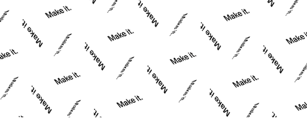
27. Squarespace
There’s (almost) nothing simpler than this cover image from Squarespace: “Make it.”, repeated over and over again. It’s part inspiration, part call-to-action. And, with a company like Squarespace – a service that makes websites easy – that’s perfect alchemy. If clients were on the fence, this might just push them over it. Because what’s simpler than the simplest invitation to just, “make it”?
Best in class for: Keeping CTAs fun
Winners: News & Media
28. Brandingmag

Brandingmag understands the power of a Facebook cover photo to bring attention to other offerings, in this case, the company’s podcast, Branding Over Wine. It’s new, it’s different, and we know it’s effective. Bonus points for their use of black and white with a splash of powerful burgundy to grab visitors’ attention.
Best in class for: Showcasing other media offerings
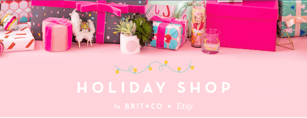
29. Brit + Co
The holidays are not restricted to red, green, and shades of glimmer alone. Enter Brit+Co, which has perfectly parlayed pink into a seasonal color. What’s more, they’ve used a bright and well-themed photo to tie into their overall color palette, to create a cohesive and clean look. It’s not simple but it’s not crowded, either. In fact, it feels just right for their audience.
Best in class for: Complementary colors
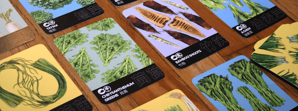
30. The Cleaver Quarterly
Its name may not tell the whole story, but The Cleaver Quarterly – “Chinese food. Read all about it.” – uses its Facebook image to fill in the ending. By using eye-catching imagery in its Facebook cover photo, they pull your attention to the details– in this case, details that highlight possibly unfamiliar ingredients that will become familiar, as you read all about Chinese food. This is a photo that will be noticed and, more importantly, remembered.
Best in class for: Noticeable details
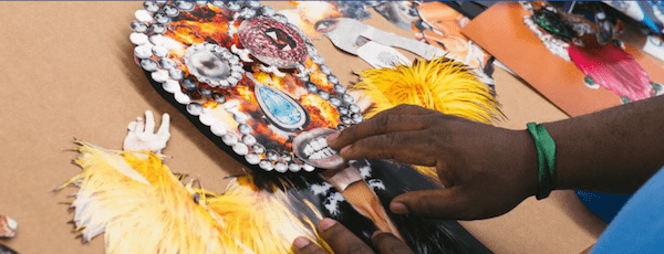
31. Creators
Creatives know: Sometimes we just need a bit of inspiration. And that’s what Creators strives to do with its lovely Facebook photos, which show artists in various stages of inspiration, project execution, and completion. Bonus points in this example for using mixed media, so almost any type of artist can see his/herself in the creation. This the photographic embodiment of the platform’s mission statement: to make art more accessible to a wider audience.
Best in class for: Inclusive imagery
32. Hulu

Hulu is making a big push for its original series and movies, and what better place to let visitors know just how much the popular streaming service has to offer than its Facebook cover photo? This cover photo features stills from a variety of Hulu’s original shows and movies, giving visitors a glimpse into the vast collection of entertainment that awaits them.
Best in class for: Showcasing unique offerings
33. Livestrong

If you’re not familiar, Livestrong works to improve the lives of people living with cancer – a mission their Facebook cover photo perfectly reflects. One look, and the pop of translucent yellow, orange, and blue over a collage of survivor photos is inspiring. The eye is drawn to the opaque blue semicircle in the corner that shares an important and inspiring message: “You deserve a better today.” Because, Livestrong wants people to know that they’re not alone, that they can fight their cancer, and that they can survive. And this image illustrates that perfectly.
Best in class for: Strong sense of purpose
34. Mashable

Mashable uses a modern, sleek geometric design in bold contrasting blues, bright yellow, and white to catch your attention (and keep it, hopefully). Not only is the modern design attention-getting, but the simple and cool colors flow well and create an appealing visual contrast. Mashable reports on digital news and innovations – a busy field with a lot of competition – and this Facebook cover photo conveys that sense of modern technology innovation well.
Best in class for: Modern, eye-catching geographic design
Winners: Travel
35. Blueways Ireland

Bearing a striking resemblance to BelleSoleil.com’s cover photo – wending, unending paths do something to our collective imagination! – Blueways Ireland does an excellent job at evoking a sense of wanderlust. In addition to being a striking photo, the company highlights one of the many activities travelers can enjoy. And what could be more peaceful than a relaxing kayaking trip with this breathtaking scenic backdrop?
Best in class for: Highlighting activities
36. KLM

KLM uses its valuable Facebook cover photo real estate to share an important message: That we’re all in these challenging COVID times together, and the company is doing its best to serve you as quickly as possible. It also includes a URL to point visitors to the airline’s latest updates and self-service options. With a plane image in the background and a loyal, friendly employee in the forefront of the image, it evokes trust and reliability.
Best in class for: Communicating a crucial message
Winners: Fashion, Design & Creatives
37. Betsey Johnson
A fashion designer known for her fun, glamorous-yet-punk designs, Betsey Johnson’s Facebook cover photo showcases her flair for glitz and glam, featuring a pair of sparkly heels atop a table filled with the most divine treats and fine wines fit for a wedding party. Not only do the sparkly heels stand out, but the wedding themed backdrop makes it clear that Betsey’s fashionable shoe designs are the perfect fit for even the most glamorous wedding celebrations.
Best in class for: Glitz and glam
38. Natalie Foss

If you’re an artist or creator of any sort, it can be sorely tempting to collage a cover photo out of all your work. Don’t get us wrong – that can work. But it’s not the only way. This cover photo from Natalie Floss shows another: one solitary work, showcased to its best advantage. It’s not only beautiful, but it gives your work its due. And it shows potential customers just how talented you are. A collage doesn’t have enough detail for that.
Best in class for: Less is more
39. Matchstic Branding

Branding firms have to make an immediate impression that conveys their branding prowess, and Matchstic Branding does just that with this incredible play on the company name: the agency’s cover photo is none other than a series of matchsticks, each one burnt down a bit farther than the last. It’s powerful, it’s memorable, and if you had doubts about the company’s ability to make your brand stick, this unique Facebook cover photo alone might just change your mind.
Best in class for: A powerful example of talent
40. Lady Gaga

Lady Gaga seems to do just about everything right, when it comes to her marketing and self-branding, so it comes as no surprise that her Facebook cover image is on point. We love that it’s artistic, like the artist herself – it’s a reflection of Lady Gaga’s personality – but it’s also aesthetically pleasing, and a timely reminder of the performer’s upcoming album release with Tony Bennett.
Best in class for: Artsy promotion
41. Sandra Dieckmann

Hey, creatives! Why not do as Sandra Dieckmann does and leverage your Facebook cover photo as your own free billboard? Navigate to her page and you’re immediately intrigued by her artwork and all its details; it’s almost impossible not to stop and study it, for at least a few seconds. (And a few seconds is a lot, in Internet time.) So, go ahead – if you’ve got it, flaunt it! Don’t be afraid to show off on Facebook.
Best in class for: Flaunting the goods
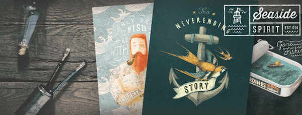
42. Seaside Spirit
Another selection that tells a story, this cover photo from Seaside Spirit does an excellent job of showcasing art while telling a wistful story– a story that evokes emotion and highlights design sense, demonstrates brand aesthetic while capturing a mood. It’s lovely, it’s calming, and it flows very well – all things that Seaside Spirit wants to capture.
Best in class for: Selling the story
43. Splintered Studios
Artists often feel they must choose between showcasing themselves and their artwork, but Splintered Studios knows differently. In many cover photos, artist Stephen Quick can be seen with his artwork – a kind of creative action shot. No longer must you settle for this or that; done right, you can have this and that, all in one photo.
Best in class for: Action shots
44. Jeremy Mann

Yeah. We could leave this explanation right here because this image does the talking. And, that’s the whole point, right? Your Facebook cover photo should talk up a storm, just like this one from artist Jeremy Mann. It’s so beautiful, so textural, so dimensional. Don’t you want to dive in? If this is your kind of art, then we can’t think of a better way to highlight your talent, than to show snippets of it, up close and personal.
Best in class for: Texture that’s touchable
Winners: Odds & Ends
45. D&AD

When you think of design in 2021, you probably think graphics: fancy programs and lots of digital tools. But D&AD understands that even today, most designs begin with the most basic of tools – paper and pencil. And so, they start there: with a Facebook cover photo that reminds you of any design’s origins, off-screen and just after they’ve crawled out of a designer’s imagination. It’s back-to-basics and we love it.
Best in class for: Putting pencil to paper
46. Folk Wellness Co.
Color theory is a big part of any branding and/or marketing, but that doesn’t mean it’s easy to do. It depends on a lot of factors but when it works, it works. And that’s the case with Folk Wellness Co, which uses an unconventional yellow – a color to incite action (and, hence, wellness – with a cooling aqua, to promote optimism and activity. It’s a simple image but boy, does it make you want to step away from the desk and get a little active.
Best in class for: Color theory
47. Guy Kawasaki

When you are your brand, your cover photo can show that off. Guy Kawasaki’s cover photo does a great job of this, not only making our subject the clear subject of the photo, but capturing his personality in its purest essence: One look, and you know he’s friendly and approachable, and totally the kind of guy you’d like to hear speak. Plus, it makes visitors aware that they can do just that by tuning into his weekly live show. This photo “speaks” volumes, just like Kawasaki himself.
Best in class for: Self-branding
48. Slingshot
Gradients are cool again and Slingshot knows it. We know it, too, and we just love this Facebook cover photo. Because it doesn’t get much simpler than a rainbow gradient. And it doesn’t get much happier than a rainbow gradient, either! And that’s kind of the point, as slingshot is showing off its fun and vibrant personality, as well as its au courant design sense.
Best in class for: Graded shades of cool
49. Southbank Centre
Welcome to the bridge between branding and photography. This excellent cover photo by Southbank Centre shows just how much an image can speak for your brand: color, lines, and clean design, all wrapped into one simple photograph. One, simple photograph that, while of just a tiny sliver of your brand (this is a staircase section), speaks volumes about your entire brand. It’s professional, it’s innovative, and it’s artsy – apropos for an arts centre.
Best in class for: Branded photography
50. SpeechGear
We told you we liked collages! And, here’s where they work well: With brands like SpeechGear, a company that produces enterprise-level, real-time translation software. When you think of their offerings in the real world, you think of rapid movement and in-the-now needs– of this visual kaleidoscope of business, moving quickly and in real time. This is one business where image collage is a perfect choice.
Best in class for: Well-purposed collage
Now you tell us – what are some of your favorite Facebook cover photos? Why do they shine? What emotion do they incite? And remember, a fabulous Facebook cover photo is just the beginning; it’s what draws your audience in and grabs their attention.
Turn to Facebook Audience Insights to find out what content engages your audience most (and check out our Facebook audience insights post for expert tips on getting the most out of Audience Insights, along with our other guides on all things Facebook marketing to answer questions like how do I pin a post on Facebook?). And be sure to add a Facebook follow button to your site to increase Facebook followers and ensure you’re getting the maximum traffic to your new and fabulous cover photo!


