With nearly 2 billion active users, Facebook is one of the world’s largest and most successful social media platforms. This growth has made Facebook a vital resource for businesses looking to engage with new and existing customers. Facebook pages for businesses look a lot like individual user pages, allowing companies to manage their posts and feed settings and even pin posts on Facebook business pages. In addition to this, several tools are available to help brands reach and engage with their audiences, including many types of Facebook Ads and robust ad targeting options that will get you so much reach and engagement you may even need to turn off Facebook comments for some posts.
Facebook ads are a great way to target specific segments of Facebook’s massive user base. In this post, we’ve rounded up 50 Facebook ads that do an excellent job of sharing a powerful and concise message in a small space. Since these advertisements appear within users’ news feeds, it’s important to create ads that grab attention and get users to stop scrolling.
We’ve included examples of exceptional branding, photography, and messaging among this selection of ads. We hope you find some new ideas for your own ad campaigns and learn how to take full advantage of this powerful social network. The ads are presented in random order and are not ranked or rated in any way.
1. Amazon
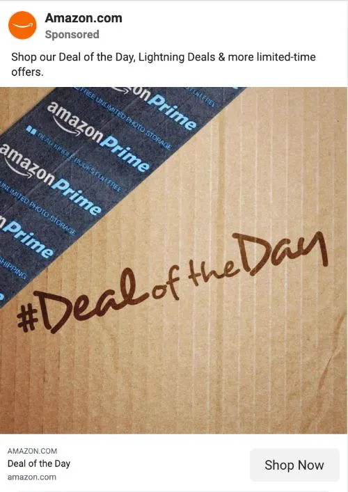
Amazon does a great job of promoting their product deals on Facebook, and the company has a number of active campaigns. This ad features a hashtag that Amazon displays regularly to give customers a reminder for where to find the latest daily deal. With a well-designed and pleasing image that features bold text, this is an easy to read and noticeable ad.
Why It Works: Hashtags are a great way to improve customer engagement and build brand loyalty.
2. CoSchedule
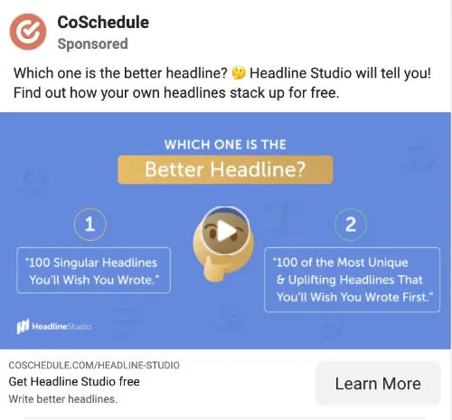
CoSchedule is a work management software platform built for marketers. The Facebook ads they run highlight the many features of their system and communicate the value that the product brings to businesses of all types. This particular ad asks the viewer to identify which headline is better and presents two options to choose from, showcasing a prevalent problem that CoSchedule’s Headline Studio solves.
Why It Works: Asking an interesting question that highlights a problem or use case is a great way to get more clicks.
3. Everlane

Clothing brand Everlane has clearly spent time developing their brand guide, as their Facebook ads have a uniform and cohesive style. Jeans are one of the company’s primary products, and this advertisement not only features a video but also mentions their customer reviews. Companies spend a great deal of time cultivating quality feedback, and this ad is a great example of leveraging a strong reputation.
Why It Works: Referencing product reviews and testimonials can help build your reputation.
4. Mailchimp

Using a bold yellow background, this Facebook ad from Mailchimp matches well with its brand style. As an email marketing platform, Mailchimp focuses their advertisements on software features. This ad speaks to the goals of internet marketers and presents a clear value proposition for reaching more email subscribers.
Why It Works: Presenting a clear value proposition helps connect with your target audience.
5. Shutterfly

Holidays are a great time to promote relevant products and services. The photography and print business Shutterfly created this simple and effective Facebook advertisement for Father’s Day. When you look at the image, you’ll notice that it avoids any marketing copy and instead focuses on a share-worthy Father’s Day phrase.
Why It Works: Running ads during holidays is a great opportunity to market to a motivated audience.

Intuit Quickbooks is a leading platform for business accounting and financial management. This Facebook ad features a video that describes a case study from one of their customers. Sharing a customer experience in your advertisements can be used to demonstrate real-world success as a result of using your product or service.
Why It Works: Case studies offer a compelling reason for prospects to learn more about your product.
7. P.F. Chang’s

Asian restaurant chain P.F. Chang’s offers indoor dining and takeout food across the country. They make good use of their large following on Facebook, using their advertisements to promote food, jobs, and other products. This ad presents the company’s gift cards as a great choice for a recent college graduate, an excellent strategy timed with graduation season.
Why It Works: Gift cards are a convenient item to buy directly from a social media ad and works well when timed with seasonal gift-giving needs.
8. Warby Parker
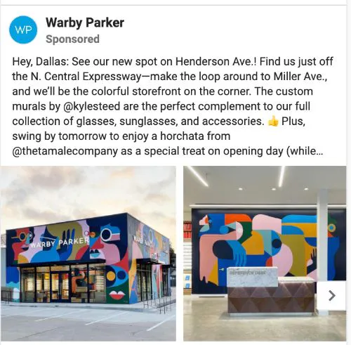
Warby Parker offers affordable eyewear and has opened physical stores in a number of different towns and cities. This ad is targeted to Facebook users in the Dallas, Texas area as a way of promoting a new store opening. Customers that follow your social media feeds are often interested to hear about new ways to interact and shop.
Why It Works: Hyper targeted ads are perfect for promoting a new store in a particular location.
9. Lyft

Rideshare company Lyft has become a popular choice for transportation and has gained a large following. They regularly use their Facebook ads to share short-term deals and service updates. In this ad, they use a pink banner to clearly communicate this limited-time discount offer, and it is definitely hard to miss.
Why It Works: Banners help differentiate text from the rest of an image.
10. Allbirds
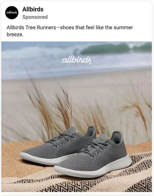
Casual footwear company Allbirds sells popular, sustainably made shoes and clothing. One of the great things about their ad campaigns is the many versions of each ad they run and test. Footwear is often available in several colors, giving these brands an opportunity to try several ad designs and themes.
Why It Works: Showcasing several clothing styles helps you find the best audience for each one or the most eye-catching styles and color combinations.

Dollar Shave Club is a subscription-based service for grooming products with an active Facebook presence. While emojis have long been a popular choice for Instagram feeds, they are sometimes overlooked in Facebook Ads. This advertisement uses emojis to clearly highlight several points of value for their women’s razors.
Why It Works: Emojis are noticeable and make it easy to communicate emotions.
12. Casper

Casper sells comfortable bedding products at a reasonable price. This Facebook ad includes a video and two images that fit a ton of information in a small space. They are able to point out several features of their Haven bed frame within a single ad.
Why It Works: Using multiple images and videos helps you present more information in an engaging way without overwhelming the viewer.
13. Nike

Nike is one of the most iconic sports apparel brands in the world, offering hundreds of different products. This ad does a couple of things really well by integrating a carousel picture browser and a clear call to action. By including a simple message to “download the Nike app to shop,” they can direct customers to their preferred mobile platform.
Why It Works: Including a clear call to action helps customers decide what to do.
14. Blinkist

Blinkist is an innovative media company that offers short book and podcast summaries. This Facebook video ad uses 4 different book cover images on the video thumbnail. By presenting many different works together, the ad can appeal to a wider audience that is interested in diverse topics.
Why It Works: Video thumbnails should present a clear message.
15. Shopify

The e-commerce platform Shopify offers a complete set of tools for running a successful online business. As they have expanded their business over time, they have added several new products, such as the POS system featured in this Facebook ad. The ad includes a logo, URL, and information about the product without feeling cluttered.
Why It Works: Sharing a URL makes it easy for customers to visit your website directly.
16. Nintendo

With an active base of players, the gaming company Nintendo continues to find new ways to engage its audience. The advertisement shown here is promoting a live-stream event that will take place on Facebook. Targeted at users of the Nintendo Switch, they have also included hashtags and an explanation of what information will be shared.
Why It Works: Streamed live events are growing in popularity on Facebook.
17. Houzz

Houzz has become a go-to resource for home improvement and interior design ideas. This ad uses a carousel-style feature to display images and links for many different services they offer. Using an ad design like this gives you a wide scope of material that you can share in a single advertisement.
Why It Works: A carousel ad is a great way to highlight different product features or services.
18. Ben & Jerry’s

Ben and Jerry’s makes ice cream, and if you didn’t already know that, you would be able to tell in seconds by looking at their Facebook page. One of the nice things about this ad is that they feature their ice cream along with other food. Providing context for your product can help make your images more interesting.
Why It Works: Showing your product alongside other items to make images more engaging.

As a leading news publisher, the New York Times always has a lot of recent information to share with its audience. We like this ad for its simplicity. Sometimes all it takes is an interesting image such as these merging faces to get you to notice and read an advertisement.
Why It Works: Simple and unique ad images get noticed.
20. Slack

Slack is a business communication platform built for teams. Customers love free stuff, and this ad features a link to a free ebook about the future of the modern workplace. This ad presents a clear and relevant offer that is likely to resonate with the company’s professional audience.
Why It Works: An ad with a clear call-to-action is almost always more effective than an ad without one.
21. Sephora

Beauty product retailer Sephora offers thousands of products through their website and retail shops. With bold advertisements like the one presented here, they are more likely to be noticed in the noise of a Facebook feed. By using bright and contrasting colors, this hair treatment product looks truly unique in this ad.
Why It Works: Bold, contrasting, and neon colors stand out from simple primary colors.
22. Bombas

Fashion retailer Bombas is best known for their socks, and the company donates one pair to charity for each pair that is purchased. This Facebook ad shares a lot of information with a single image. They showcase several sock colors and offer a discount code with an embedded video for additional details.
Why It Works: Sometimes the color of your products can help your ads get noticed.
23. Starbucks
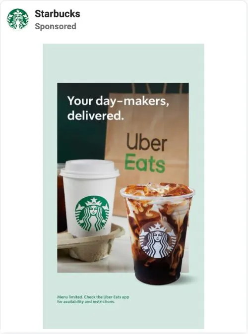
Seattle-based coffee company Starbucks has become a global sensation by offering a simple menu and focusing on product quality. Delivery services have boomed during the COVID-19 pandemic, and this ad not only promotes Starbucks coffee but also Uber Eats. Ads can get boring when only focused on a product, and it’s often worthwhile to highlight other services and special situations.
Why It Works: Highlighting other business partners in your ads is a great way to develop professional relationships and appeal to a broader audience.
24. Canva

Online graphic design platform Canva has become a popular resource for marketers, designers, and webpage builders. The company offers a premium version of its software, and it can be challenging to differentiate the key features in a single ad. This Facebook advertisement gets it right by highlighting the size of Canva’s massive media library.
Why It Works: Sharing measurable data in your ads helps build credibility.
25. Soylent

Soylent makes plant-based meal replacement drinks that are nutritious and part of a balanced diet. This Facebook ad features a sharable little infographic that explains why their product is the perfect meal replacement. The picture has a bright yellow background, and it’s easy to tell what they’re trying to communicate.
Why It Works: It helps to take full advantage of the visual space that images provide.
26. Moo

Custom print and design shop Moo has an excellent selection of stationary and other creative products. They obviously know a thing or two about quality design, and it shows in their Facebook ads. This advertisement features their products displayed on a table, which adds visually appealing depth to the graphic.
Why It Works: Adding depth to your images helps make them more noticeable.
27. Hootsuite

The social media management platform Hootsuite helps customers develop their online presence. When viewing this Facebook ad, the infographic immediately catches the eye. The description text offers a free downloadable report, and many viewers are likely to click on the ad to get more details.
Why It Works: An infographic is especially meaningful in ads that discuss industry and market trends.
28. Square

Square develops payment processing technologies for small to medium-sized businesses. Having the opportunity to work with thousands of local businesses has also given them some compelling customer stories to share. This ad supports black-owned businesses and features information about a successful company in Chicago that uses Square technology.
Why It Works: Featuring customer stories in ads highlights the personal side of your brand’s mission.
29. Google

Google has developed a large portfolio of products and services built around its dominant search engine. This Facebook ad is intended for Spanish-speaking users and is an excellent example of audience targeting. If you have customers that speak different languages, it may be worthwhile to test ads written in their native language.
Why It Works: Customers that don’t speak English as a first language often appreciate ads prepared in their native language.
30. SEMrush

SEMrush is a popular search engine optimization and web analytics company. The company has become popular by understanding customer needs, and this ad is firmly targeted at web developers and bloggers who require content for their websites. The ad has a clear value proposition and compelling offer to receive quality content within 5 days.
Why It Works: Focusing ad strategies on customer needs will help make them more relevant.
31. Coinbase

Coinbase is a cryptocurrency hosting and trading platform that has grown exponentially in recent years. This Facebook ad example is one of many that feature a sign-up bonus of $5 in Bitcoin for joining their platform. Coinbase is running several variations of this ad, demonstrating the importance of testing variations and focusing on what’s working.
Why It Works: Testing multiple variations of a single ad can help optimize performance among audience segments.
32. IKEA

The Swedish retailer IKEA has become an international brand by focusing on product quality and convenience. They also spend significant effort on customer support and safety, as this advertisement demonstrates. Not all ads need to be selling directly; sometimes, it can be just as effective to remind customers what you stand for and how you can help them.
Why It Works: Customers want to know what your company stands for.
33. Grammarly

Grammarly is a real-time writing assistant that helps identify spelling, punctuation, and grammar errors. They understand that customer feedback matters, and this Facebook ad highlights the fact that 90% of their customers consider their product effective. Sharing specific figures like this can really make a difference when building credibility.
Why It Works: Sharing measurable figures in your ads can build trust.

Airlines such as American Airlines have faced a significant threat to their business during the lockdowns of the COVID-19 pandemic. With restrictions being lifted in many countries, American Airlines is now running Facebook ads that feature particular routes. This ad has a nice picture, easy-to-read text, and a clear message.
Why It Works: Businesses that serve audiences in particular regions should target these areas with ads.
35. NerdWallet

The personal finance website NerdWallet offers a ton of advice and guidance to people across the world. This Facebook ad is a great example of one that promotes a particular web page or blog post. Facebook users who see this ad and are interested in how their credit score matches up to others are likely to be interested in this message.
Why It Works: People often like to understand how their lives compares to others.
36. Marvel

The comic book and entertainment company Marvel has many products to promote. This ad features their subscription service, Marvel Unlimited, and it captures a lot of information in a single ad placement. The marketers at Marvel have gotten very good at blending images with text to create appealing ads.
Why It Works: Using compelling images from print and video content can help boost ad engagement.
37. Lululemon

Athletic apparel brand Lululemon has clothing that suits even those with the most active lifestyles. This ad is a great representation of their brand and features pro surfer Malia Manuel. It’s an excellent example of combining brand ambassadorship with an active image that allows the audience to picture themselves wearing Lululemon’s clothing.
Why It Works: Images that feature movement and motion capture attention.
38. Capital One

Capital One is a popular banking and credit card company with a major presence in the U.S. This Facebook ad is part of a promotion for their no-fee 360 checking account. This is a nice example of saying a lot with a minimal amount of text.
Why It Works: Ads on Facebook work best with short and simple messages.
39. LinkedIn

The professional social network LinkedIn has become a major resource for workers and businesses worldwide. One of LinkedIn’s major features is job postings, and this Facebook ad reminds viewers of this service. It features a nice statistic about the timeliness of job applications that fits perfectly with the ad message.
Why It Works: Use statistics to help educate your audience and strengthen your message.
40. Garnier

Women’s haircare and beauty product company Garnier runs extensive ad campaigns in print, video, and digital. They share information that their audience can appreciate, such as this ad in collaboration with PopSugar. It’s a good example of how these partnerships can help spread your message to a wider audience.
Why It Works: Collaborations are a great way to expand the reach of your ads.
41. Lemonade
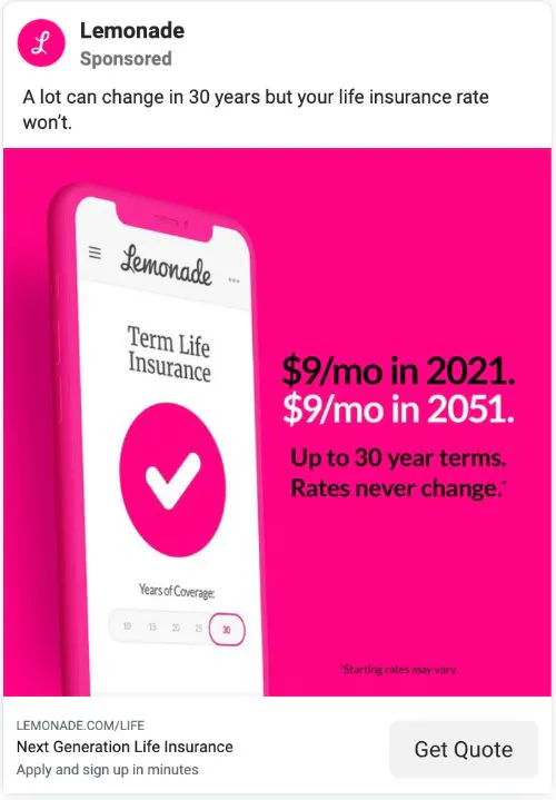
The insurance provider Lemonade offers affordable policies with a smooth and easy sign-up process. This Facebook ad is a perfect example of leveraging a color palette. The bold, pink background of the ad image stands out and matches their logo and website style perfectly.
Why It Works: A style guide and color palette helps build brand familiarity with your audience.
42. Squarespace

Squarespace is a popular website building and hosting platform. The company has offered a free trial for several years as a way to engage new users and secure more signups. This Facebook ad features that offer along with a testimonial from one of the many customers who have used the services.
Why It Works: Use customer testimonials in your Facebook ads to convey powerful statements supporting your brand.
43. Blue Apron
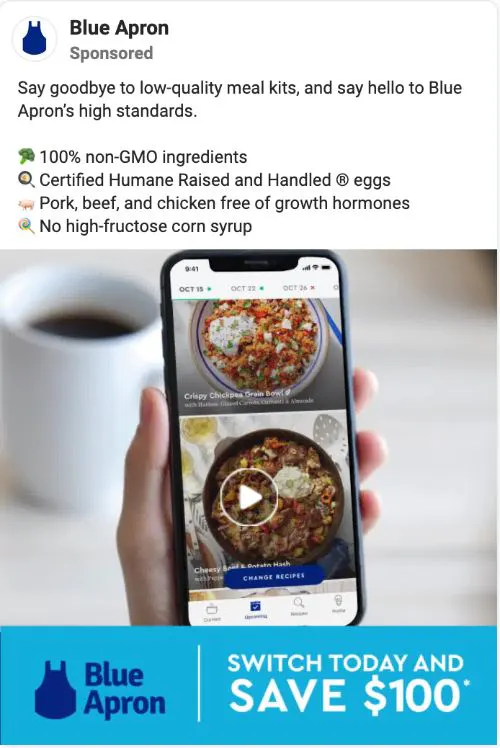
Meal delivery company Blue Apron provides customers with healthy and affordable foods. This Facebook ad incorporates many of the best practices we’ve already touched on in this post, including the use of video, emojis, and an image banner. With an easy-to-read layout, the team at Blue Apron can convey a lot of information in a single ad.
Why It Works: Ad formatting doesn’t need to be one dimensional and can include several complementary elements.
44. Marriott Bonvoy

Bonvoy is hotel chain Marriott’s loyalty program, around which they have built custom-branded social media channels. This gives them an opportunity to connect with and speak to a subset of their audience that is interested in rewards and booking opportunities. This ad for the Sheraton Hotel in Greensboro, North Carolina connects viewers directly with this location.
Why It Works: It’s helpful to minimize the layers between your content and sales channels.
45. Vox

The news and media company Vox has several ways to connect with their audience through Facebook. In addition to their posts and other content, they also run ads that feature content relevant to breaking news and headlines. This example highlights the strength of the current real estate market, a trending topic across the entire country.
Why It Works: Connecting ads to trending topics is a proven way to increase visibility.
46. Acura

Car manufacturer Acura is one of the most dominant automative brands in the world. They have done a great job of diversifying their ad content to meet the needs of several different groups. This ad speaks to military families with an exclusive discount offer for active U.S. service members.
Why It Works: Exclusive and targeted offers can be a highly effective method of product promotion.
47. NPR

National Public Radio has a presence that goes far beyond traditional media channels. They are known for producing content that is thoughtful and aligned with the interests of everyday people. This ad introduces a compelling story about the electoral college in the United States and links to an article with the details.
Why It Works: Telling a story through ads makes them more powerful.
48. Shutterstock

Stock photography company Shutterstock features high-quality images and vectors that are used throughout the world. It’s a given that their ads should feature excellent images, but this one is especially powerful. June is LGBTQ Pride month, and there is no better way to share their support while promoting their products with a dynamic rainbow-colored image.
Why It Works: Aligning your branding with social movements adds powerful meaning to your company values.
49. Spotify

The music streaming service Spotify caters to everyone’s listening needs. Their ad selection is varied, and they’ve chosen some really unique ways to present their content. This ad uses an interesting image of an iguana wearing a collar, a strategy that’s sure to get noticed.
Why It Works: Unique and unexpected images can draw attention to your ads.
50. VICE

News and media company VICE is known for its realistic reporting on gripping stories happening all around us. This Facebook ad is another great example of partnering with another business. Having support from Hornitos Tequila allows VICE to share this story while also capturing the most Facebook followers possible of another brand.
Why It Works: Brand partnerships are a powerful form of advertising for reaching new customers.
Facebook advertising is one of the most effective strategies for reaching a wider audience and getting prospects and customers interested in your content, your products or services, events, and more. If you’re taking advantage of Facebook’s retargeting options to recapture the interest of consumers who have previously interacted with your brand, you need to make sure you’re in compliance with consumer privacy regulations, such as GDPR and the California Consumer Privacy Act (CCPA). ShareThis’ Consent Management Platform makes it easy to obtain consent to collect your website visitors’ data, giving them a simple way to opt in or opt out and monitor and control what companies receive their information. Get started with the Consent Management Platform today so you can take your ad campaigns to the next level without worrying about privacy compliance. It’s simple to install and free to use!


