Imagine: You’re browsing your favorite news sites from your phone as you grab a cup of coffee. As you scroll down the page, you’re suddenly hit with a mobile popup that takes up your screen, wanting you to subscribe to a newsletter. There seems to be no way to click out of it to get back to reading your article.
This is a common complaint of mobile internet users, whether they’re using an app or browsing the web. Mobile popups can be excellent converters for marketers and companies, but they can also be thorns in the side of mobile users. Learning to create mobile popups that are eye-catching and not problematic is the key to better conversions.
There’s projected to be over 295 million mobile internet users in the United States alone in 2023. Mobile is obviously where it’s at. But we also need to remember that the typical mobile internet user wants to do what they’re doing without ads and popups interfering. There’s a fine line between a helpful, converting mobile popup and one that messes with the user experience.
How to Create a Mobile Popup: Tips and Best Practices
Many marketers believe that coding their mobile popups to be responsive — automatically detecting the user’s device to find the best popup fit and format — will prevent them from being intrusive. Although that can help, it’s not that simple.
Mobile popups are much different from desktop popups because you have much less space to work with. Plus, desktop screens are wider than they are tall, while mobile screens are taller than they are wide. What works on one probably won’t look or work even close to the same on the other.
The following best practices and tips can get you creating mobile popups that convert, rather than turn people away:
Align Your Popups with Google Policies
A few years back, Google added some guidelines about mobile popups within its policies. Basically, Google can — and will — devalue your pages if it finds that your popups interfere with a mobile user’s experience. Specifically, it states:
“Pages where content is not easily accessible to a user on the transition from the mobile search results may not rank as high.”
Therefore, if you have an obtrusive mobile popup that appears once a user visits your landing page from Google, Google can give your site less value in its search results. Google appreciates popups that don’t prevent users from seeing your site’s content or pop up immediately upon visiting.
Design Specifically for Mobile
Responsive popups will only get you so far. Sure, they’ll help determine screen size and size a popup accordingly, but that doesn’t mean that your popup will look and behave how you intended. Designing specifically for mobile devices is the best way to go.
That means sizing them properly and optimizing their file sizes to help them load faster. For mobile, JPEG or WebP is the best file type. They’re much smaller file sizes than PNGs, and still look great on a webpage. Try to keep your popup no larger than 320 pixels by 500 pixels to avoid having it take up the whole screen.
If you’re using WordPress, you can preview your mobile site through the theme customizer to make sure your popup looks perfect.
Leave Space to View Content
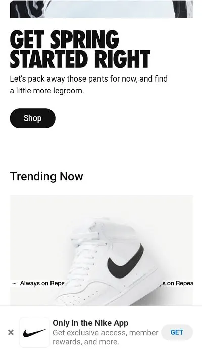
Your website visitors should still be able to see some of your content despite having a popup show up on their screen. This makes it not so intrusive as they browse. Check out Nike’s simple, small popup at the bottom of the screen, casually reminding visitors to download the Nike app to shop:
Screenshot via Nike
It doesn’t get in the way of browsing, yet serves as a simple reminder that the app is there for the shopper’s benefit.
Keep Visuals to a Minimum
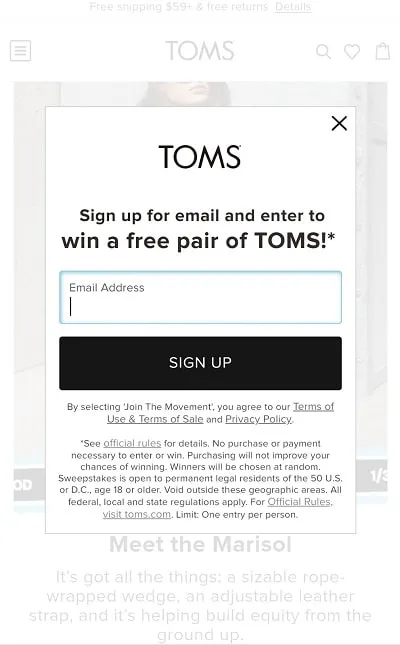
While desktop popups usually feature an image to get a person’s attention, you’re working with a much smaller space on a mobile device. Therefore, it’s usually best to scrap images and use your words instead. Toms does this well with its minimalistic email newsletter sign-up:
Screenshot via TOMS
Use Simple Forms
You might want more than just an email address from your visitor, but that’s probably all you need from them right now. After all, you can use that email address to continue to market to them and get the other information you might need to nurture the lead.
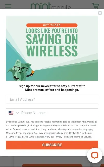
Mobile users don’t want to fill out a 20-question survey, so keep your forms simple. Ask for a name, email address, and whatever information you need to start building that relationship. But the simpler you keep your mobile popup form, the easier it’ll be to get that info.
Screenshot via Mint
Mint Mobile doesn’t ask for any more than an email address and, optionally, a phone number from mobile users. The company gets what it needs to begin forming warm leads with potential customers without making them answer a bunch of questions.
Craft a Clear CTA
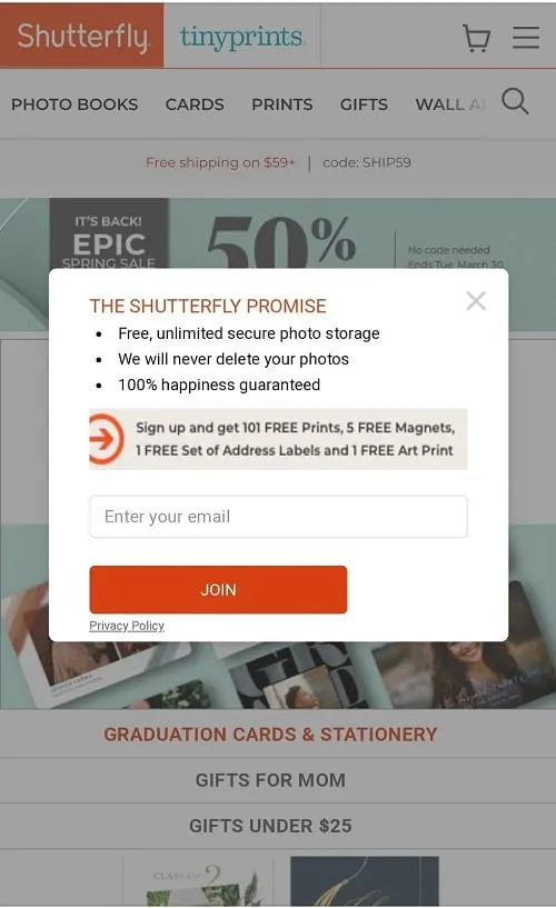
Use the minimal space you have on your mobile popup wisely with a clear, enticing call-to-action (CTA). Your CTA explains what you’d like people to do, whether that’s watching an explainer video, sharing an article, signing up for your newsletter, or buying something.
Screenshot via Shutterfly
This tiny popup on Shutterfly’s mobile site says a lot while being straight to the point. Users know exactly what they should do: Sign up for Shutterfly and get free stuff.
ShareThis has partnered with POWR to make their popup builder available to publishers directly from the ShareThis platform so you can easily create powerful popups to engage your audience. Try the POWR popup builder to craft mobile-worthy popups that will look great on your site and make your visitors happy!


