Are you building an email list of potential customers?
Then you need a squeeze page.
A squeeze page is a type of landing page that has a single goal: to collect email addresses. Normally, it’s very short, and it might appear in the form of a popover that appears while the visitor is reading a webpage, or when they signal “exit intent.”
While squeeze pages might look straightforward (because they’re almost always short with a single call to action), they need to be carefully constructed and tested to make sure they’re doing a good job of converting curious visitors into long-term subscribers. When done right, a squeeze page can earn you tons of subscribers – subscribers you can continue to drive back to your website with enticing offers and valuable content.
Key Features of Your Squeeze Page
Your squeeze page should have:
A single call to action. You want to drive as many visitors as possible to sign up for your email list … and that won’t happen if you have other calls to action, like a button for them to contact you, or a bunch of links to your products. In fact, many marketers avoid having any links on their squeeze page other than the signup button: the visitor will need to go back, or close the popover, to take any other action.
Short, to the point copy. This is not the place for paragraph after paragraph about who you are. Focus on the absolute essentials: what the visitor will get when they sign up for your email list. Keep this short and focused – you don’t need to go into lots of detail or share dozens of testimonials from loyal subscribers.
A very short form to fill in. Ideally, you’ll just be asking for an email address; if it’s important for you to personalize your emails to your subscribers, then you can also ask for a first name. The more pieces of information you ask for, the more likely people are to not subscribe at all. Don’t ask for personal information that you’re not going to use – such as a phone number or address – as people will wonder why you want it.
A way to leave or close the form without filling it in. If you’re using a popover, then make sure there’s a clear, easy way to close it without completing it, such as a “No thanks” link next to the “Subscribe” button. Some marketers get creative with these, with wording such as, “No, thanks, I don’t want to improve my business” – be cautious with this approach as it could alienate visitors who simply want to read more of your content before deciding whether or not to sign up for your email list.
A thank you or welcome message that appears after the form is submitted. While this isn’t part of the squeeze page itself, it’s a crucial follow-up that lets new subscribers know that they submitted the form successfully… and that tells them what to expect next. This is a good place to explain, for instance, that subscribers will receive an initial email with a confirmation button or link that they need to click in order to get your emails.
Examples of Great Squeeze Pages
If you’re looking for some squeeze page inspiration, here are three great examples to learn from.
Example #1: Goins, Writer’s Welcome Messager

This minimalist squeeze page from Jeff Goins is a great example of how just a few words can be effective.
Note the skillful use of specific numbers (“100K” and “18 Months”) in the headline, plus the simple buttons that allow for a fuss-free, guilt-free “no thanks” option.
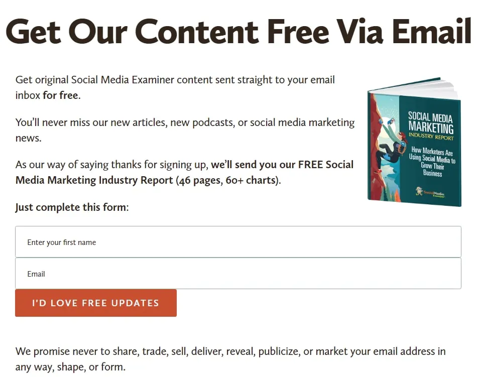
Example #2: Social Media Examiner’s Newsletter Page

This squeeze page is a little longer than Jeff Goins’ – but it’s still short and to the point. There’s a clear benefit to signing up (with an attractive image of the guide) and the form only has two fields. The call to action – “I’d love free updates” – is positive and upbeat.
A couple of tweaks that Social Media Examiner could potentially make here are to have just “First name” instead of “Enter your first name” (as it’s shorter and then fits better with the second field just having “Email”), and to consider reducing the copy after the form, as the long list of things they won’t do sounds oddly formal compared with the rest of the page.
Example #3: Productive Flourishing’s Popover

This popover asks a compelling question in the title, offers a clear call to action, and has a quote from a reviewer to help sell the book. It’s a little different from a generic “join our newsletter” call to action as the focus is very much on the book and the free chapter that the visitor will receive. “Get a free chapter” is a clear, compelling call to action for the button text. The “X” in the top right makes it easy to close the popover if the visitor isn’t interested.
Creating a squeeze page isn’t a one-time event. If possible, you’ll want to split test your squeeze page so you can optimize how well it converts visitors into subscribers. You might try changing the copy, having a different call to action, or even changing the color of your “subscribe” button. Small tweaks can make a big difference.
Want a super simple way to start growing your email list? With our Popup Builder, you can quickly and easily customize a pop-up to target your visitors at just the right moment. And, it integrates with MailChimp for totally seamless audience building!


