A Facebook cover photo is often the first point of contact you have with potential followers. Bottom line: This is one arena where first impressions count. There is a right way. And size does matter.
So, what’s the perfect Facebook cover photo size? Well, that depends. Sort of.
The perfect Facebook cover photo size
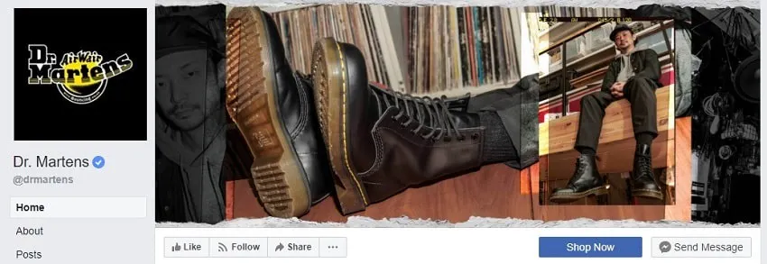
What are the perfect Facebook cover photo dimensions? We say 820 x 461 pixels. (Screenshot via Dr. Martens)
Let’s start with the source itself: Facebook’s take on the perfect cover photo size for Facebook Pages:
- For desktop: Ideally, 820 pixels wide by 312 pixels tall
- For smartphones: Ideally, 640 pixels wide by 360 pixels tall
- Minimum dimensions: At a minimum, your photo must be 400 pixels wide and 150 pixels tall
- Fastest load: Optimize as an sRGB JPG file at 851 pixels wide, 315 pixels tall, and under 100 kilobytes
Note that these sizes differ from the recommended sizes for Facebook event cover photos.
End of article? Well, not quite.
Since the ratios for desktop and smartphone cover photo sizes diverge, no one photo will display the same on desktop an mobile. Cover photos display taller (16:9 ratio) on mobile (tablets and smartphones) but narrower.
The good news? Facebook won’t try to force-stretch an image to meet desktop or mobile dimensions. That means Facebook will not auto-distort your cover photos. Instead, they will crop a larger photo (i.e. desktop cover photo dimensions) to meet mobile dimension requirements.
In other words, always upload your cover photo optimized for desktop. But still, it’s not quite that simple.
Don’t forget the “mobile safe” area
The important issue of desktop vs. mobile dimensions/ratio/display brings us to the next point of consideration: the “mobile-safe” area for your Facebook cover photo.
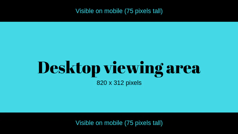
Since dimensional ratios differ between desktop and mobile – at 820 x 312 pixels, a non-standard 205:78 ratio on desktop, vs. a standard 16:9 ratio on mobile – you must take into consideration the mobile viewing area of your desktop-optimized photos.
Putting this to numbers: If you were to adhere to the 820 x 312-pixel Facebook cover image dimensions for desktop, the equivalent mobile (16:9 ratios) viewing area of that image equates to about 555 x 312 pixels:

If you upload a Facebook cover photo at 820 x 312 pixels, the center 555 x 312 pixels will be viewable on mobile.
Alternately, you may also design your desktop cover image at a 16:9 ratio – in other words, 820 x 461 pixels (technically, 461.25 pixels). If you opt for this route, understand that Facebook will crop the image (remove top + bottom sections) to meet its desktop display of 820 x 312 pixels:
 Alternatively, if you upload a 16:9 ratio image for desktop (= 820 x 461 pixels), then only the vertically centered 820 x 312 pixels will be visible on desktop.
Bottom line: Make sure your text and other important cover image information are placed fully within the mobile and/or desktop viewing area of your photo. In a pinch, Facebook’s repositioning tool can help, but you’ll have less frustration and better results if you design your photo for these specific dimensions.
So, what’s the perfect Facebook cover photo size?
If you want the highest quality, clearest image for your Facebook cover photo (and you should), then the answer is 820 x 461 pixels.
At this size, your photo will display beautifully both on desktop and mobile, while its cropped version will never lose integrity. In other words, you’ll have a crisp, perfect Facebook cover photo, no matter how it’s displayed.
Don’t forget Facebook cover VIDEO!
Did you know? You can now display a cover video (20-90 seconds in length), as opposed to a static cover image.
The same rules apply: Your video must be a minimum 820 x 312 pixels. If the dimensions/ratio are slightly off, you can use the Facebook repositioner to display your preferred video area. But, know that due to the nature of video, it’s difficult to create one, single video that displays perfectly on both desktop and mobile. For now, that is.
Tips for designing an eye-catching Facebook cover photo

All good Facebook images have a focal point.
Now that you know what size to design, it’s time to start brainstorming what to design. What makes for the most effective, highest converting Facebook cover photo?
1. Add a focal point
Your Facebook cover photo is the first thing a consumer sees of your page. You don’t want your message to be distracting, confusing, or muddled. Better yet, you do want your image to feature a central focal point to draw the eye and focus attention. Be sure this focal point aligns with your brand.
2. Minimize text
Once upon a time, Facebook allowed a maximum 20% text on cover photos. That restriction has long since gone, but that doesn’t mean you should slap tons of text onto your cover image. The new goal: keep your cover photo copy concise.
3. Employ a call-to-action
Facebook allows for call-to-action buttons (think: Shop Now or Sign Up), so why not use your cover photo as a call-to-action for your call-to-action?
For example, you could use a person in your cover photo to point to your call-to-action button below. If you go this route, though, remember that desktop displays differently than mobile; your person can vaguely point toward your CTA but if it’s too precise, it won’t work on both desktop and mobile.
4. Add text + a link to your cover image description
Many businesses fail to add a cover photo description when in fact, this is an excellent spot to highlight and support your Page’s call-to-action.
5. Highlight deals and/or current events
Don’t be afraid to update your cover photo with upcoming sales, events, and other current developments in your business. You can even use the space to highlight certain features, points of pride, or other information you’d like to call out.
6. Pin a related post
Don’t just stop at your cover photo and photo description: create a related pinned post on Facebook – and by that, we mean a post that directly relates to and reinforces the CTA in your cover photo – to the top of your page, to further bring home your message.
Want to grow your Facebook followers quickly?
Now you know how to maximize your Facebook cover photo impact (and dimensions), but what’s a great image without the followers to love it? If you’re not sure how to get more followers on Facebook the ShareThis Facebook follow button is a perfect tool to begin growing (or supercharge) your Facebook following. Not to mention, it’s also mobile optimized, lightweight, and easy to configure and install. Check it out!


