
A/B testing can be a relatively quick and effective way to increase lots of leading KPIs like opens or clicks as well as conversions, revenue, improve conversion rates, and profits.
Most businesses want more of these things, of course, but many struggle with what to test.
Spending a lot of time testing the wrong things can lead to multiple issues:
- Money wasted on inefficient / under optimized ad spend
- Money left “on the table” in the form of traffic that would have converted better but didn’t
- A lot of design / creative / development resources expended on a test that has no impact (or even under-performs the control)
In this post, we’ll walk through 50 examples and ideas for A/B tests. Some of these will be real-world examples of tests with data and creative, while others will be ideas for areas you might consider testing across landing pages, website design, ad campaigns, email, and even product design.
Real World A/B Testing Examples
Data 36 had a 6-week online data course and had a sales page for the course. It was 1500 words long and had one embedded video.
To test against this first page, they created a much longer landing page:
- Focusing on answering specific questions they knew students had and clarifying language around specific things they knew students found confusing about the landing page (two great ideas for things to test!).
- The new version was 4,000 words with 4 embedded videos.
After 3 weeks version B (the longer page) showed a 96% increase in conversions (or roughly 2x!)
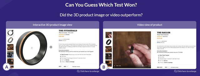
Manly Bands and conversion optimization expert Rich Page decided to test two different variations of a product page for a ring: an interactive 3D image as well as a video of the product.
The results were interesting:
- The 3D image increased conversions versus the prior design (a static image) by 33.76%, yielding 10s of thousands of additional sales during the test period
- While the video also outperformed the conversion rate of the prior design (2.54% vs 2.37%) it lost to the 3D image (3.17% conversion rate)
The hypothesis for the test was based on user data that suggested people wanted to be able to see and manipulate images of a ring before purchase (which certainly seemed to be confirmed by the test!)
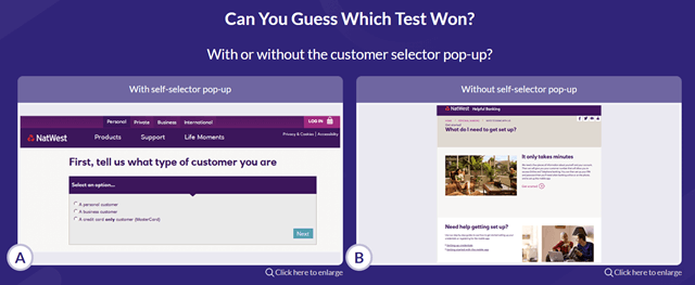
NatWest, a UK bank, wanted to test whether a persona pop up asking visitors questions about themselves and showing them a custom experience based on their answers would cause visitors to go deeper into their site.
They set up this test to determine CTR and engagement with and without the pop up.
The test was interesting:
- Version B or the traditional landing page was a somewhat narrow winner!
- A 39.8% versus 39.64% conversion rate (with a conversion rate being a click) resulted in a 90% confidence win for version B
It’s always important to keep in mind: hypotheses aren’t always right! Controls do win A/B tests!
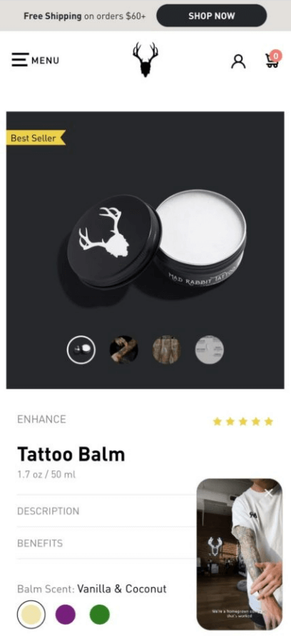
Mad Rabbit tested layering a product video on its product detail page. The video showed the product in action and provided more information about Mad Rabbit’s after tattoo care product.
The video was presented as a floating video with an option to expand in the lower right corner of the PDP. The PDP + video out performed the traditional page:
- Lifting session duration by 76%
- Improving conversion rate by 8%
Mad Rabbit then rolled out floating videos on each of their PDPs after the test.
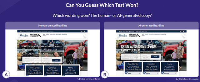
This is a good example of a test with “mixed results”:
- The human headline out-performed on engagement metrics like time on site and pages viewed
- The AI headline outperformed on down-funnel conversion metrics for this car dealership like credit applications and get financing inquiries, but was a narrow and not statistically significant winner there.
- The human headline won on metrics like appointment and view vehicle options
Having your goals clearly defined and understanding which metrics are most important to impact on tests where multiple actions and metrics are available is a key component of A/B testing, as these results show.
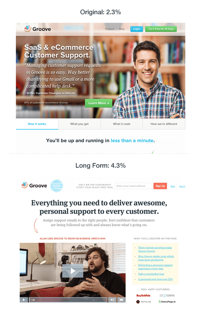
After a lot of work talking to customers and refining their value proposition, story, and messaging, Groove revamped their home page:
- Conversions nearly doubled!
- After the large win, Groove created a culture of testing and designed a number of additional A/B tests around things like headlines, shorter home page designs, calls to action, etc.
Again test ideas with a hypothesis based on user data and data in general can often be high-impact.
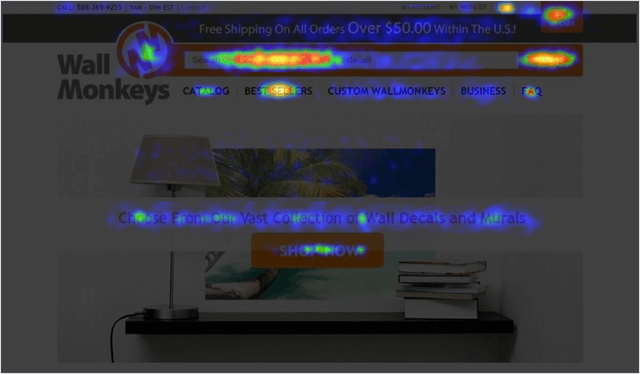
Wall Monkeys used heat map data to create a series of home page tests to optimize conversions:
- First, after noticing users were ignoring their hero image, they tested a more fun product-focused image. This lead to a 27% increase in conversion.
- Next they swapped out the slider on the home page which was also being ignored with a search bar. This was the big winner, leading to 550% increase in conversion rate!
This is a good reminder to:
- Use data to drive your testing theses
- Think about UX features (like search versus a slider or browsing options) that may be more user-friendly
- Run multiple tests when you have multiple viable ideas – you don’t know which will provide the biggest results!
Healthspire made additions to an underperforming landing page, specifically putting a simple value proposition front and center on the page and de-emphasizing a break down of available products and plans.
The new approach in the form of a longer landing page with more value copy won the test with a 638% increase in leads!
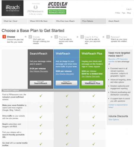
iReach created a different conversion flow, adding content towards the beginning of the checkout process that segmented users, showing them specific content after they visited the first page via a clear product matrix
The results of the test were positive:
- Conversion increased by 31%
- Revenue increased by 38%
Creating a custom experience / conversion flow is something that’s often overlooked as a testing option but can be a powerful lever.
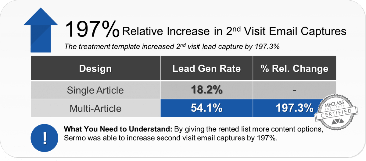
Sermo was sending Emails to a rented list. They noticed that tests that featured different content types in their Emails to the rented list led to varied conversion rates, so they hypothesized that people’s biggest driver for converting or not may be the content option.
To cast a wider net with each Email, they decided to try giving multiple content options rather than one with each send.
The treatment with multiple options resulted in a 197% increase in 2nd visit Email captures, meaning the conversion rate for visitors who came to the site twice (their most valuable segment) went up 197%.
Honing in on the real reason for variance in conversion rates led to a profitable test hypothesis here.

HubSpot wanted to increase conversion on mobile visitors to their blog. They created multiple variations to run in multiple A/B tests, looking at the options for visitors to interact with the mobile CTA, specifically:
- Maximize / minimize options so readers could dismiss the CTA
- An X to close the CTA entirely
- No option to maximize or minimize the CTA
The results yielded a lot of data about visitor behavior:
- The maximize / minimize option saw a 7.9% increase in conversions
- The ability to the close the CTA saw an 11.4% decrease in conversions
- And not offering a way to manipulate the CTA saw a 14.6% increase in conversions
The last variation was a winner, and yielded an estimated 1300 extra conversions a month.
Device-specific testing can be a great way to improve usability and conversions, particularly if you have a mobile experience that’s been underserved as that traffic increases.
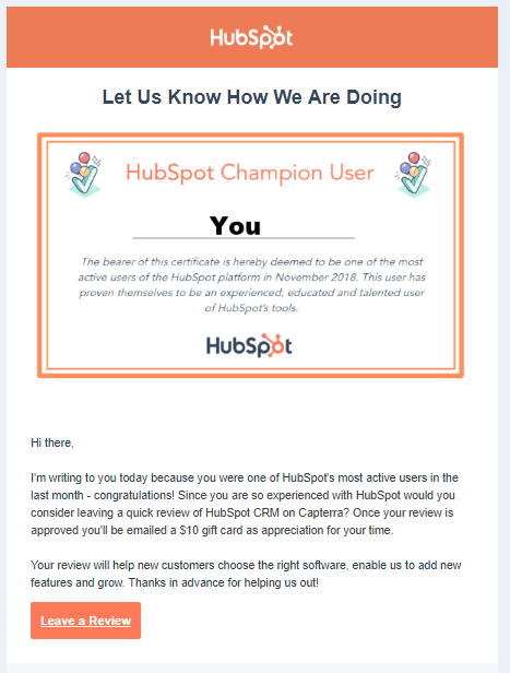
HubSpot again wanted to test performance for a specific offer, this time looking to test the effectiveness of gathering user reviews in-app versus via Email.
They tested:
- Plain text versus a certificate-style Email
- Then Email versus an in-app notification
In-app notifications seemed to go overlooked, and Emails generally performed 1.4x better, with Email getting more opens and more reviews.
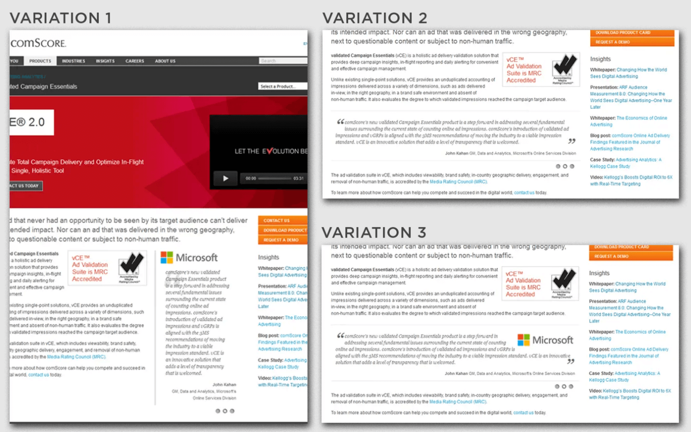
comScore wanted to test the placement and design of a popular customer logo and testimonial on their product pages.
Conversion rate of the product pages increased 69% by featuring this social proof more prominently on the product page.
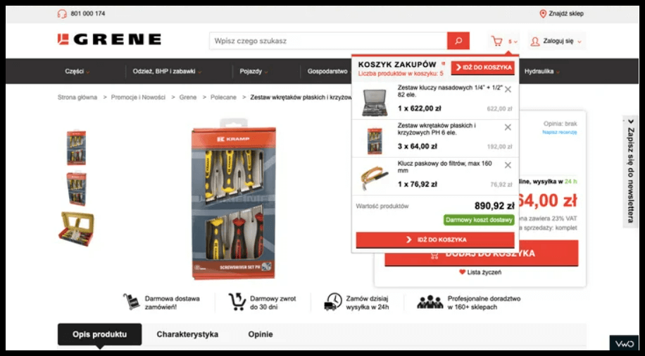
GRENE wanted to increase the click-through rate to their shopping cart.
To accomplish this they tested an updated design of their “mini-cart” or the drop down users see when they mouse over the cart icon, adding a CTA to the top of the cart as well as the bottom of the cart to make sure users were aware of how to transition to the cart page.
They saw increases in visits to cart pages, overall ecommerce conversion rate, as well as average order values.
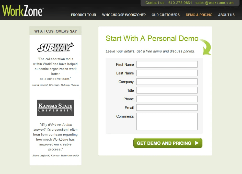
WorkZone wanted to increase conversion on their demo page. They had a thesis that the customer logos tied to testimonials next to their form were too prominent and potentially distracting from the desired action.
They tested a page with the customer logos in black-and-white, making the demo form and submit button pop versus the muted logos.
The change resulted in a 34% increase in form completions!
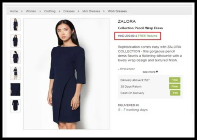
Zalora updated the order and emphasis of elements on their product pages, as well as pictures.
Particularly looking at:
- Making the word free more prominent
- Adding free return language right next to the price
A variant emphasizing free returns and free delivery for orders above $150 that also deemphasized the placement of item price produced a 12.3% increase in orders placed.
Prominence and ordering of different wording and information can have a large impact on conversions.
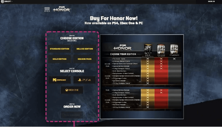
Using heatmap and visitor data and surveys, Ubisoft generated a hypothesis that reducing the up and down scroll on landing pages would increase conversion.
They created a version of the landing page where certain information that had been below the fold on the landing page was pulled up next to other information to limit scrolling.
Lead generation increased 12% with the new design.
The layout of a page and how quickly you introduce various options and information can be a great area to create a testing hypothesis, particularly if it’s based on user data.
A / B Testing Ideas
Specific examples are great for spurring your own testing creativity, and knowing the actual numbers for tests above can be helpful too, but obviously single anecdotes may or may not be applicable to your site and your business.
Even more important than these specific examples, however, is having your own process and methodology for testing.
That means things like the nuts and bolts of setting up tests and statistical significance, but it also means having a process for generating ideas to test.
Looking at things like:
- Data you collect from chat and survey tools
- Information you have or are able to collect about the demographics, goals, and priorities prospects and visitors to your site
- Funnel data about where your site visitors (and/or the folks on your list in the case of Email) are getting stuck or dropping off
And then applying those insights to a fresh look at different elements of your conversion flow, landing page, Email, etc. can lead you to strong hypotheses about what may work better than what you’re currently doing.
That’s what you’re really looking for.
Let’s walk through some of those areas you may want to apply data and hypotheses to in your site or business.
- Delivery Mechanism
If you have an offer, CTA, or content being delivered one way you might consider presenting it to visitors via a different mechanism.
For example: a banner you have in-laid within content may perform better as a popup (or vice versa – or both!)
There are lots of different ways to deliver messaging and offers:
- In images versus HTML / text
- Different types of pop ups (exit vs. scroll vs. entrance vs activity-based)
- Different Email elements like countdown timers, GIFs, image vs. text)
- Different shapes for elements like pop ups
Again whatever test you run should be driven by an intuition or insight you have about your prospects and visitors. Maybe a different delivery mechanism will be better for your visitors on certain devices, or you have a sense that your audience hates pop ups, or you have reason to believe your prospects will respond to urgency, etc.
- Layout
Layout and design is of course what a lot of people think about when they think about conversion optimization, and there are a lot of different options for things to test here as well such as:
- Emphasis on different elements
- Order of when information is presented
- Integration of different elements like trust, social proof, etc.
- Usability improvements like making forms simpler, eliminating steps in conversion, etc.
- Using design and layout to make things clearer – eg re-working the display of pricing tiers and features
Chat and survey tools as well as heat map and analytic data can give you a wealth of ideas of what to test here.
- Copy Length
Another tried and true test element is the length of copy. Testing whether layering in lots of social proof, objection answering, FAQs, etc. performs better than a shorter, sweeter value proposition is often a good idea.
Scroll and dwell time data, information about how much research your prospects do or don’t do, the priority of customers and prospects, or insights into how customers want to interact with your brand can help inform tests here.
- Focus of Copy
The nature of your Email or landing page copy is another natural element to test.
This could be small tweaks like wording and emphasis, or whole-cloth messaging changes. Here you may consider:
- How much you’re focusing on benefits, testimonials and social proof, specific pain points, and detailed information about an offering (dialing one or more of these up or down)
- How you’re positioning your offer
- What specific benefits you’re making most prominent (eg price, ease of use, etc.)
Understanding what your prospects and customers are most concerned about and want from your product or service is key here, so customer data, surveys, market research, etc. can help inform these test ideas.
- Content Medium
The use of images, video, or text can be a great element to test. You may consider:
- Adding an explanatory video to content
- Adding a video testimonial
- Having the same basic content represented via text, a visualization, and a video
- Adding or removing any of those elements
- Making one or more of those elements more or less prominent on the page
Thinking about the device your prospects consume your content on, the type of media that demographic typically prefers, the best fit for the traffic you’re driving (channel-specific), and the best fit for your most powerful message are all good ways to think about what may be a winning test.
- Call To Action
The placement, wording, visualization (button versus text link versus banner, etc.), of your CTA presents an obvious and often simple thing to test.
- Offer
Rethinking the offer you have on a landing page itself can be a worthwhile test. This may fundamentally change a lot of what you have on a page if you’re testing a demo versus a white paper, or you may just tweak the offer and the positioning of the offer (eg the offer is still a demo, but you’re running a test with a gift card offer and a specific guarantee versus a traditional demo offer).
Where your traffic is coming from (the channel and the users’ likely experience with your brand – eg a test of social media traffic coming from Facebook or similar versus Google Search), conversion of your different offers across your site and other channels, or insight into hurdles to conversion to that offer specifically for your prospects can help inform these tests.
- What Your Users Tell You To Test!
Mine your data! Looking at your customer surveys, website surveys, user testing, analytics, etc. will often surface a story about what might be a conversion blocker on your site. Follow the data to find new things to test!
The Right Tools For The Right Jobs
One important element of A/B testing is making sure you have the right capabilities (testing software, design and development resources, etc.) for the tests you want to create.
If what you’re looking to optimize for in your A/B tests is increased social shares or site engagement, our free website tools might be the perfect A/B testing idea for your site.