
Having a contact form on your website is one of the most effective ways to engage with your audience. There are multiple reasons customers or visitors may be searching for a way to get in touch, from technical support to sales requests, brand partnerships, or customer service. Therefore, it’s crucial to remain accessible and make it easy for your audience to reach you through a variety of different channels., and if you’re setting up or redesigning your website, your contact form should be one of the most important considerations.
There are many different ways to create a good contact form. Contact form designs may be influenced by a brand’s style guide, website theme, contact management process, and other factors such as the amount of information you need to collect, which depends on the purpose of your contact form. One of the best ways to develop a unique and effective contact form design is to draw inspiration from other websites. In this post, we’ve selected 50 excellent contact form examples that come from an international selection of diverse businesses.
The contact form examples below are listed in simple alphabetical order by company name; otherwise, they’re not ranked or rated in any way.
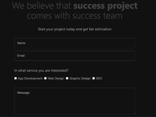
1. Achieve 3000
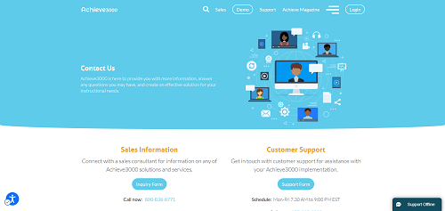
Achieve3000 is an online curriculum platform for educational institutions. The website for Achieve3000 has two separate contact forms, one for technical support and another for sales inquiries. Maintaining separate contact forms for distinct purposes helps focus each inbox on the most relevant communications and more efficiently route questions and inquiries to the appropriate team members.
2. Ashes & Milk

Ashes & Milk is a food blog focused on teaching visitors how to choose and prepare healthier meals. The website owner, Ashley Milk, has not only designed her entire website around her personal brand but has also taken a personalized approach to the contact form. She uses the title “contact me” to make it clear that she will receive each message. The form also has a simple, clean layout that’s easy for visitors to fill out.
3. Atlassian
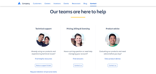
Atlassian is a leading software developer that has released popular products such as Jira and Trello. Their feedback forms are divided up into six different sections that give people a choice of technical support, billing, product advice, careers, and general inquiries. The most unique part of the contact page is the ability to submit feedback directly to the founders of Atlassian.
4. Bando
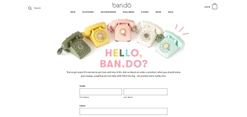
Bando is an apparel and home goods store that offers an extensive selection of products through its online shop. The contact page is very well branded, fitting the design and aesthetic of the site perfectly. In addition to the standard contact form fields, they also include a dedicated link for requesting a product return, making that part of the process just a little bit easier.
5. Beakable
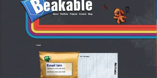
Beakable is the website of programmer Iain Hamilton, and he has put some great thought and effort into the design. The theme of the page has a distinct retro feeling with lot of graphics embedded on the pages. His contact form, which looks like a package with a piece of paper, is a great example of creating a contact page that is unique and captures your visitors’ attention.
6. Befunky
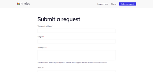
Befunky is a creative platform for image editing and graphic design. The header “Submit a request” above the contact form makes it open ended and lets visitors know that it be used for many types of inquiries. Aside from the basics (email address, subject, and description), the only selection required by the form is identifying which product, if any, your message is associated with.
7. Brandwatch
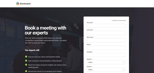
Brandwatch is a digital consumer intelligence platform that is one of the most popular on the market. Their intention is to develop close relationships with new and existing customers, and their contact form is optimized for this purpose. The form has a clear call to action directing visitors to schedule a meeting with the Brandwatch team to receive a demo and discuss specific requirements.
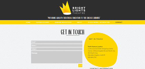
Bright Lights Theatre, located in Chicago, offers productions, classes, and educational camps. The website has a nice, bright theme with bold colors that makes the content really stand out. This also works well for the simple contact form on the website, which clearly displays the basic contact information and a few entry fields.
9. BrokerNotes
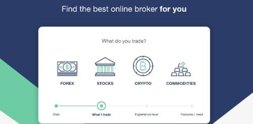
BrokerNotes is a UK-based financial company that offers regulatory and compliance services to institutions throughout the country. The self-guided contact form starts with a single question and then takes the viewer through a couple more simple steps before submitting an inquiry. Structuring a contact form like this can help simplify the process for each visitor.
10. Cabedge
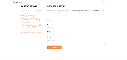
The web design and marketing company Cabedge is based in Nashville and offers a number of different services through their website. Similar to other quality contact forms, they offer the option to fill out the provided fields or simply email the company directly. This is always a great practice as it allows each visitor to choose the contact method that they are most comfortable using.
11. Cafe Evoke
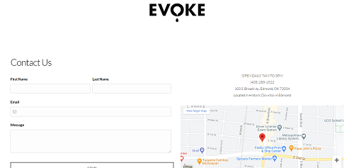
Cafe Evoke is located in downtown Edmond, Oklahoma and has a clean, basic website. The nice thing about this design is that they provide quick links to the most important topics for their business including gift cards, catering, and contact information. They also use a simple and easy to understand contact form that makes it easy for anyone to leave feedback or submit a question.
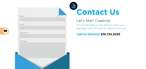
12. Carlos MBonilla
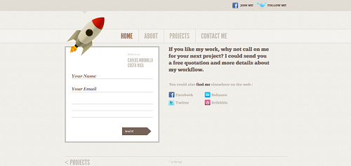
Carlos MBonilla is a graphic and web designer based in Costa Rica. His website has a unique design that captures his personal brand and design aesthetic. The contact form was created to look like a letter, and he also offers visitors a free consultation, allowing him to learn more about his prospective clients’ needs.
13. Choice Screening
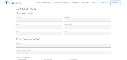
Choice Screening is a Denver-based business that offers transparent and detailed background screening services. Given the sensitive nature of their work, the contact form does a nice job of organizing the necessary details. Before making a formal request, visitors must enter contact information and select from specific types of background screening.
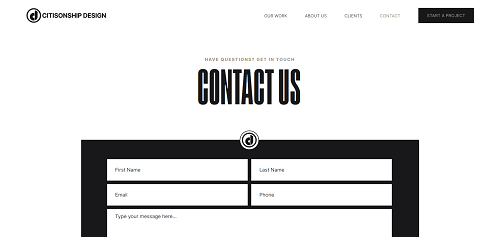
Citisonship Design is a website design and branding agency based out of Greenville, South Carolina. Their website has a modern design that uses simple black and white colors for most elements of the theme. These basic colors make for a very pleasing browsing experience, and the contact form is easy to locate and includes only a few simple fields.
15. Cobble Hill
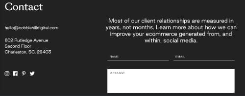
Cobble Hill is a growth marketing and digital design firm with extensive experience in SEO, social media advertising, and email marketing. With a responsive website and simple site hierarchy, it is super easy to find and locate whatever information you need. They have a full-page contact form that can be filled out in seconds, giving visitors an easy to way to make contact.
16. CreativeMob
CreativeMob is a full-service digital marketing group that provides content marketing, web development, and online marketing support. They have clearly put a lot of thought into the design of their website, and the contact form is easy to understand and engaging. Designed to look like a letter, the form asks for basic contact information and a simple message that will go directly to the CreativeMob team.
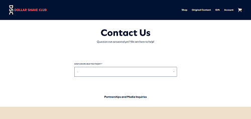
Dollar Shave Club offers customers high-quality grooming supplies through a membership club. Their website includes an online shop and an active blog containing original content focused on popular grooming topics. Their full-page contact form includes an interactive FAQ that helps answer common questions along with a simple button to submit an inquiry if they have a question not covered in the FAQs.
18. Compass
Compass is a real estate company that provides brokerage services and innovative software products to clients. The website’s contact form is displayed as a full page and asks visitors to select between general support and relocation inquiries. Since relocation support makes up a large part of their business, it makes sense to create a unique selection for this topic.
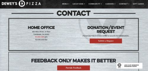
19. Dewey’s Pizza
Dewey’s Pizza is headquartered in Cincinnati, Ohio with stores located in many neighboring areas. They have a nice website with a pleasing layout and a simple design that is reminiscent of a pizza kitchen. Their contact form is divided between event requests and feedback, with bold text and large headers that make it easy to find and access the right form.
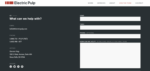
20. Electric Pulp
Electric Pulp offers clients web design, digital marketing, and app development services. Based out of Sioux Falls, South Dakota, they include basic phone and email contact information at the bottom of their landing page along with a simple contact form. This keeps their content organized in a single view and makes it easy for visitors to access the contact form by simply scrolling down the page.
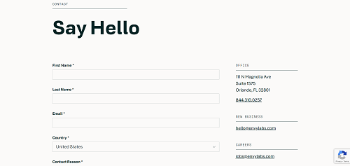
21. Envy Labs
Envy Labs is a software development company that designs custom web applications for clients. They have a full-page contact form on the website that includes a lot of useful information for visitors. One useful feature of their contact form is an optional field for identifying where you heard about their company, an important piece of information to collect that is often overlooked.
22. FabFitFun
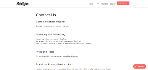
FabFitFun is a subscription-based product company that curates fashion, lifestyle, and beauty products for its customers. Receiving a box of unique products has become a popular way for consumers to discover new brands and requires FabFitFun to coordinate with a number of different partners. Their contact form reflects this with dedicated sections for customer service, advertising requests, press inquiries, and brand partnerships.
23. Grammarly
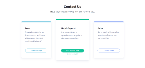
Grammarly is a digital writing assistant application that helps customers improve their communication skills. Being a company with a popular software product, they have contact forms for press, sales, and support. The technical support contact form asks visitors to select from eight popular support topics and then guides them through the rest of the process.
24. HubSpot
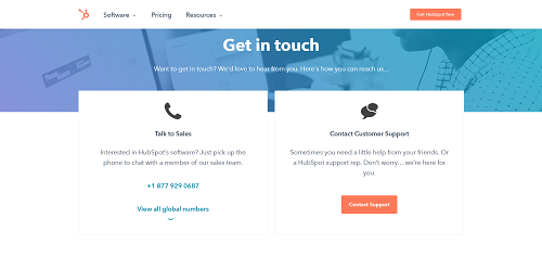
HubSpot is a popular CRM platform with dedicated modules for marketing, sales, and service functions. The website contact page encourages visitors to contact the global sales team or a regional office directly for specific inquires about their product and offerings. Access to the technical support resources for phone, chat, and email depends upon the type of CRM subscription the customer has signed up for.
25. Indofolio
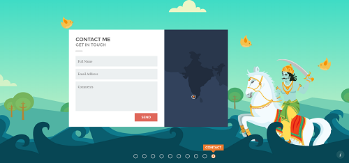
Goal Raj is the lead UI architect for Indofolio, which is his professional website for showcasing his work. The website uses a unique layout with horizontal scrolling that takes visitors through each of the 10 main pages. The last page is the contact form,which shows his location in Southern India and has a few simple fields that can be quickly filled in and submitted.
26. Jess Marks
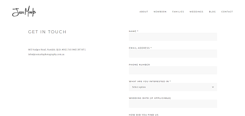
Jess Marks and her husband, Steve, are professional photographers based in Australia who specialize in newborn, wedding, and family photography. The website has a streamlined layout and focuses on their photography portfolio and contact information. By asking for a wedding date in the contact form, they can quickly identify any potential scheduling conflicts with a client right away and reduce the need for additional details.
27. Kev Adamson
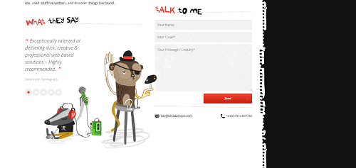
Kev Adamson is a web and graphic designer from the UK who has over 18 years of experience. He has chosen a unique design for his website with lots of embedded graphics that showcase some of his best work. The contact form is located right on the front page and is displayed next to his customer testimonials to provide a little more background for anyone looking to contact him for work.
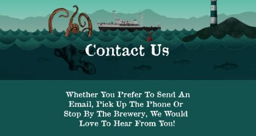
The British Columbia-based Lighthouse Brewing Company offers craft beer in a number of unique flavors. The website showcases their most popular flavors, and the contact page is easily accessed from the main menu with a single click. Their form includes a statement that explains their desire to hear feedback, which is an important request to include if you’re focused on developing closer relationships with customers.
29. Lionways
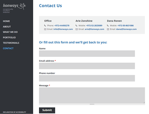
Lionways is an Israeli website development company that builds customized and unique sites for clients. In addition to a contact form, they also provide direct phone numbers and email addresses for their main office and lead developers. This makes it easy for any existing clients to contact the company with questions or for potential customers to fill out the form and make a new request.
30. Marvel
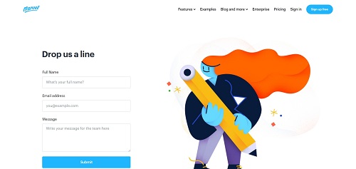
Marvel is a digital design platform for prototyping, releasing, and scaling digital products. The company is based in the UK, and the website has a lot of informative content that showcases the features of their application. The primary contact form on the site is for support requests, and users can also contact the Marvel sales team by using the supplied email address.
31. Media Proper
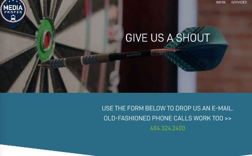
Media proper provides web design and marketing services that are customized and tailor-made to meet the needs of each client. The website has a memorable design that uses embedded video and short animations to make the browsing experience more dynamic. With a full-page contact form, the fields are easy to read from any device and can be filled out and submitted with ease.
32. Mooze Design
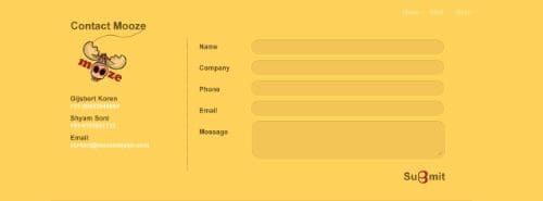
The website for web design company Mooze Design is a great example of a simple and effective site layout. All of the content is visible on a single page that can be viewed with a few cursor scrolls. At the bottom of the page they have included a basic contact form that can be easily submitted without the need to navigate to other pages.
33. Omada Health
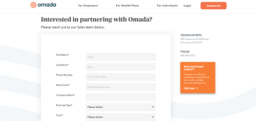
Omada Health provides digital care services through employers and health plans to help individuals develop healthier habits. Because they work with employers, health plans, and members, they have a general contact form for sales requests and a separate page for participant support. This makes it easy for any website visitor to locate and submit an appropriate request without getting lost among the other pages.
34. Orchard World
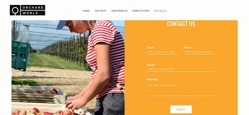
OrchardWorld is a produce company located in the UK that specializes in high-quality fruit products. The website combines bold background colors with large images for an immersive browsing experience. This contact form has a pleasing layout and is displayed in a side pane so it is visible but does not take up more room than necessary.
35. Paravel
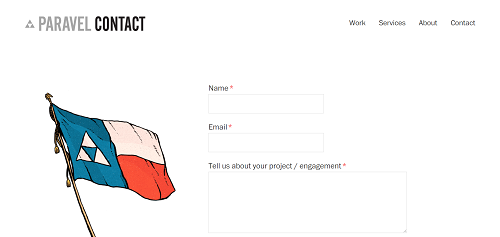
Paravel provides a variety of web-based services to clients including device agnostic designs, componentized systems, and consulting. Their contact form is well branded with an image that combines their corporate logo with the Texas flag, the state in which they are headquartered. As with most service-based design firms, they also require visitors to estimate their budget for any project work prior to submitted a request.
36. People Metrics
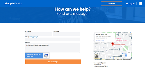
PeopleMetrics is an experience management company with a software platform for developing customer and employee experience. The link to their contact page is prominently featured at the top of their website with a dedicated button for easy access. The form includes an embedded CAPTCHA check to verify human access and help prevent spam inquiries from flooding the inbox.
37. Pixpa
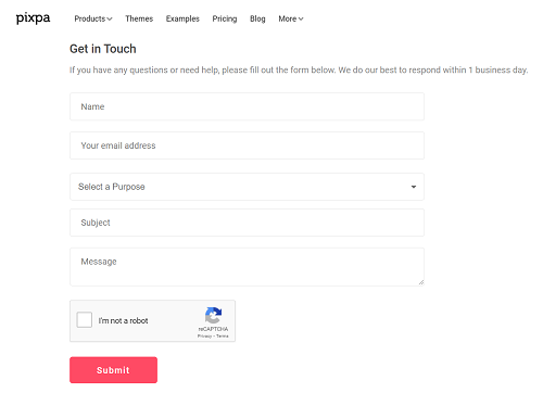
Pixpa is a web design platform for creating immersive portfolio websites for photographers and other creative professionals. They have a single contact form on their website, and users must select from six specific topics based on the subject of their message. The Pixpa team also places a short message with the form that states their intention to respond to all inquiries within one business day, which ensures website visitors that their message won’t get lost in the abyss.
38. Power-Fact
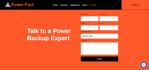
Power-Fact is a power equipment solution provider that is based in India. Because they design customized solutions, they do not provide prices on their website and instead prefer to guide potential customers to their contact form. They utilize bold colors to make the contact form really stand out, and the form itself also has an option for escalating the priority of the message in the event of an emergency service request.
39. Rockatee
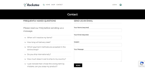
Rockatee sells t-shirts and unique gifts such as drinkware and ornaments through their website. One of the best ways to avoid unnecessary inquiries is to provide your customers with as much self-service information through your website as possible. They include some of the most popular frequently asked questions next to their contact form to give visitors a chance to find an answer to their question directly before sending a message.
40. Scribd
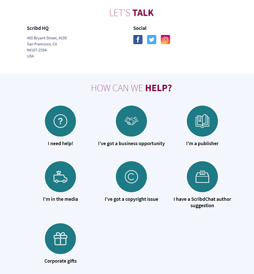
Scribd is a popular subscription platform that offers digital publications such as magazines, books, and audiobooks. The contact form on their website requires you to select from seven categories based on the type of communication you want to make. These options help direct visitors to the appropriate subject matter where they’re given further instructions for how to make contact.
41. Social Snack
The digital marketing group Social Snack places a Contact tab right on the main navigation bar, making it easy to locate. Clicking on that tab opens a sleek pop-up with an easy-to-read dark grey background. They offer local contact information for each of their regional offices, and the form itself is ultra simple and can be filled out in seconds.
42. Trionn Design
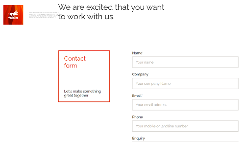
Trionn Design is a website and branding design agency from India that has implemented a sleek and modern theme for their site. Scrolling through the contact page triggers various animations with boxes that share contact information for the company. At the bottom of this page, the contact form itself simply asks for name, company, email, and phone, along with the visitor’s question or comments.
43. Tune
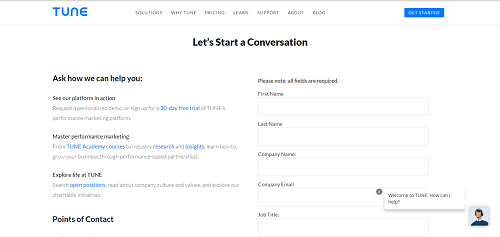
The team that makes the SaaS marketing platform TUNE has done a nice job creating an immersive website with an easy-to-use contact form. Their contact page also includes links to a software demo and additional courses they offer. As an alternative to filling out the contact form, visitors can also write to the sales or support teams directly using the provided email addresses.
44. UltraNoir
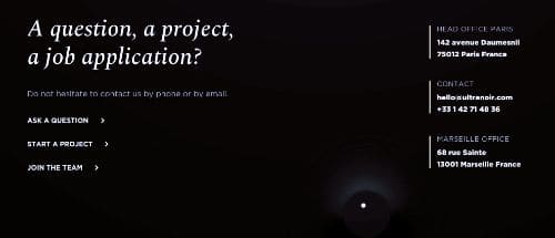
Ultranoir is a France-based digital marketing agency that creates customized web experiences for its clients. Their expertise shows through the Ultranoir company website that uses audio and graphic effects to guide the user through their web pages. The contact form provides three options for inquiries related to general questions, projects, or job applications.
45. Underbelly
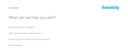
Underbelly is a digital marketing agency based out of Salt Lake City. The contact form can be accessed through the main menu and makes it easy to contact the company regarding new projects, employment opportunities, and partnerships. For new project inquiries, the form simply asks for basic contact information, budget estimates, and a description of what specific problem the Underbelly team can help you solve.
46. Vanila.io
The website of Florida-based web design firm Vanila has an informative landing page that includes all of the key information from their website. After scrolling through information about their services, software, and team, you will then find the contact form. Embedding a contact form into your main landing page can help improve the visibility of your contact information and improve engagement with the form.
47. Wavelength
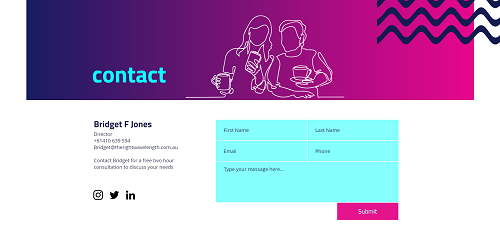
Wavelength is a consulting firm in Australia that focuses on research and business planning for government agencies and non-profits. The contact form on their website provides just the right amount of information without taking up too much space. They also include a clear call-to-action next to the form for anyone interested in scheduling a free two-hour consulting session with the firm.
48. Yeti
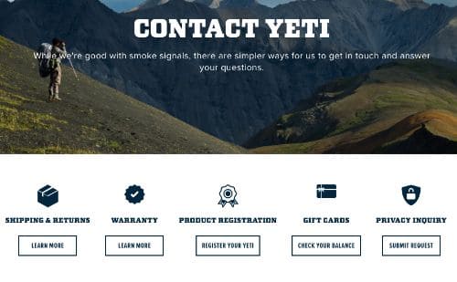
Yeti Coolers have become become a popular brand throughout the U.S., and the corporate website really captures the feeling of the great outdoors. To make navigation easy for visitors, they include a quick link for email support and newsletter sign up form directly on the landing page. Clicking on the contact page brings up a list of seven different sections that make it easy to find the information you are looking for.
49. Yummygum
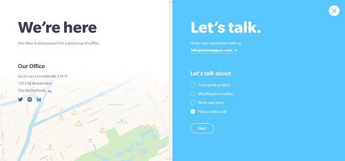
Yummygum is a digital agency from Amsterdam that helps companies turn their ideas into ready-to-launch products. There’s a contact button on their main navigation pane, making it easy to spot. Clicking there opens an easy-to-read popup with a guided contact form and links to social media, telephone, and email contact information.
50. Zendesk
Zendesk is a well-known customer support platform that offers service and sales tools for businesses of any size. As a service-based company, they emphasize quality, omnichannel support, and their contact form is no exception. Visitors can get support by using a chatbot visible from the main page of the website or by accessing the sales and technical support contact forms directly.
Looking for an easy way to create a visually appealing, functional contact form that your visitors want to engage with? ShareThis has partnered with POWR to make their website popup builder available to publishers directly through the ShareThis platform. Get the Form Builder today to start building and customizing contact forms for your website – with no coding required!