Newsletters are a cornerstone of any email marketing effort and yet, they’re so easy to get wrong. It’s not surprising: There is no one, definitive how-to manual for writing, designing, and sending a good email newsletter. It varies by industry and by company.
To some extent, each newsletter is unique: unique to its brand, unique to its audience, and unique to its goals. But one thing is not unique: If you have low open rates (the average hovers around 23%), low click-through rates (average: ~3.5%), a high unsubscribe rate (should be <0.25%), or witness any other warning metric – these are all signs that your newsletter needs some love. Stat.
Enter the following 50 great newsletter examples, which provide insight and inspiration for building a better, more effective, more loved newsletter that serves both your company and your customers.
And, to keep it fun, we’ve segmented our choices into winning categories and individual awards. Yes, we’ll cover everything from the most creative color-blocking and punny wordplay, to the greatest gamification and most flagrant use of the F-word. Off we go!
- Winners: personalization
- Winners: stand-out design
- Winners: great use of color
- Winners: beautiful minimalism
- Winners: excellent content
- Winners: powerful calls-to-action
- Winners: illuminating imagery
Winners: personalization
Screenshot via MageMail
Yes, we’re back to list segmentation. Because it’s important! Take this example from Agoda, a travel brand, which clearly understands its customer. (This one is a SE Asia buff.) Because, if you serve a SE Asia buff with Parisian content (or vice versa), you’re probably going to kill the wanderlust. Segment, segment, segment! (And psst! It’s never too late to segment.)
Award for: List Segmentation
Screenshot via FitSmallBusiness
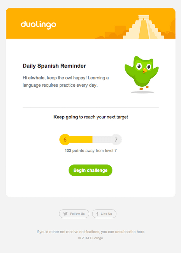
Duolingo is an online language-learning course that allows users to evolve at their own pace. Of course, that means that procrastination happens; life gets in the way (or they’re learning a new conjugation). Enter Duolingo’s simple but functional email newsletter, which sometimes delivers updates and always reminds language-learners of where they stand, framed not in typical beginner-intermediate-advanced language, but as the user-friendly “you’re only X points away from your goal!” It’s neuro-linguistic programming at its best.
Award for: Incentives
Screenshot via MageMail
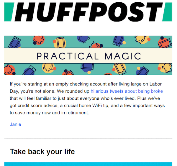
Ok, back to the topic of segmentation – we love how the HuffPost does it, allowing their new subscribers to self-select the frequency, topics, and other details of their newsletter content. It’s such a simple concept but truly, a newsletter should serve its audience, not just its company. And letting your recipients take the reins is a perfect start.
Award for: Self-Selected Segmentation
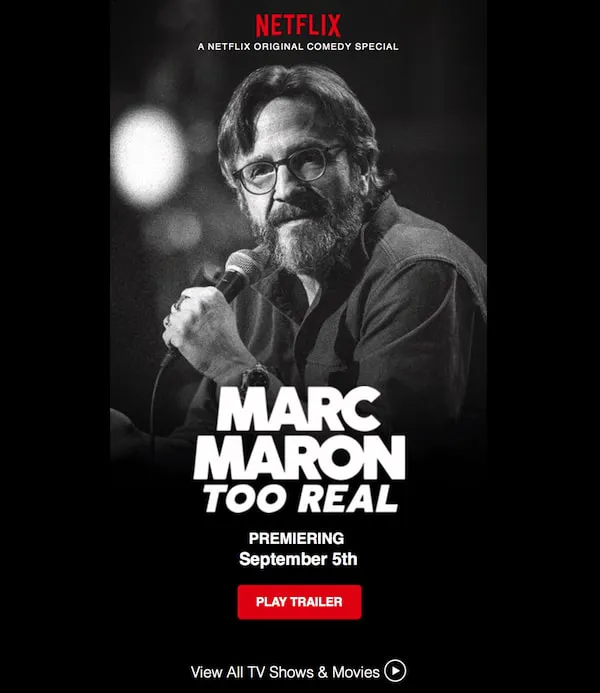
Few companies know their customers as well as does Netflix. After all, they know what you watch (and how you rate what you watch), so they have a pretty good handle on your viewing preferences. And that’s the key to their excellent and highly customized content: If they release a new show, movie or feature that their algorithm predicts you’ll love, then they’re going to tell you about it. And, chances are, you’re going to add that title to your list, watch more Netflix, and – well, you see where we’re going. Well done, Netflix!
Award for: Timely Personalization
Screenshot via sendinblue
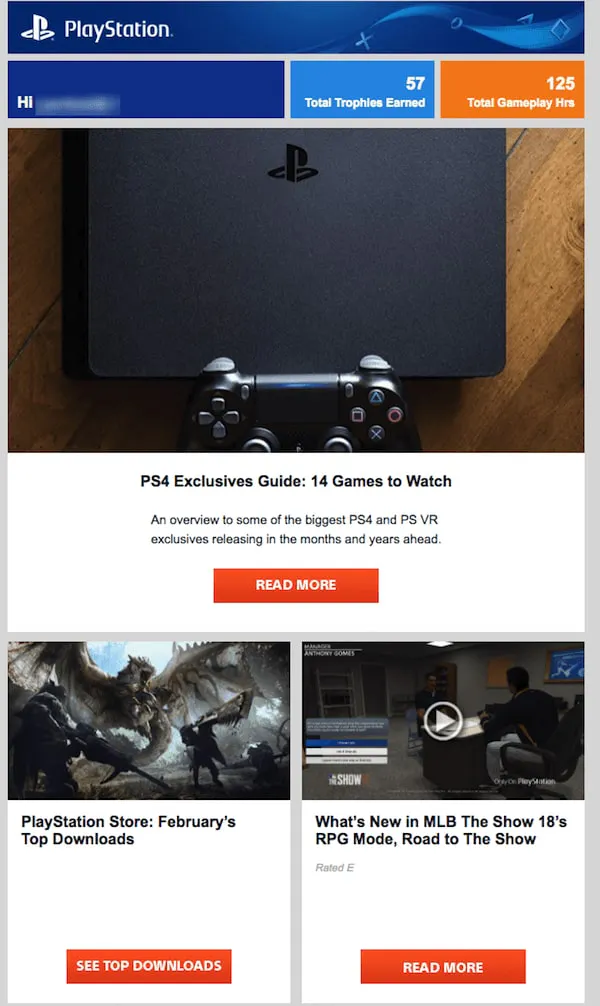
A big company like PlayStation could easily phone it in with their newsletters, sending out product announcements and other money-grabs. And, while the company of course includes promotions in its newsletters, PlayStation went the smart route and gamified their newsletter by including user stats, trophies, and other play-me-play-me! incentives that not only add interest, but personalize their newsletter to each recipient.
Award for: A Gamified Experience
6. Poncho
Screenshot via Hubspot
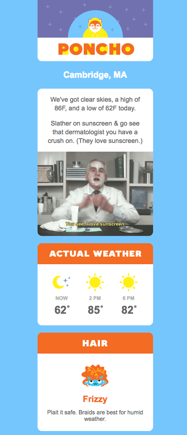
Again, with the humor. But guess what? Humor works with many of today’s market segments. Younger audiences skew humorous, accepting a more casual company personality, punny wordplay, and even the occasional expletive. This best-bud approach is why Ponco makes our list, with a daily weather newsletter (of all things) that’s not only customized but hilarious. Plus, they definitely get their audience, translating the weather into why it matters. (See “Hair” current status and its wonderful pun.)
Award for: Making the Mundane Fun
Screenshot via iMPACT
Spotify is one of those brands that knows its customers – like really, really well. Because they record everything you listen to, and because their whole job is to serve you with more great tunes you’d love, they’re in the unique position of knowing what music you like, as well as what music-you-might-like-but-don’t-yet-know-it. And that’s where their great newsletter comes into play, serving up user-specific data (what songs do you listen to the most) and a playlist that Spotify developed just for you. And that’s just brilliant.
Award for: Personalized Content
Screenshot via FitSmallBusiness
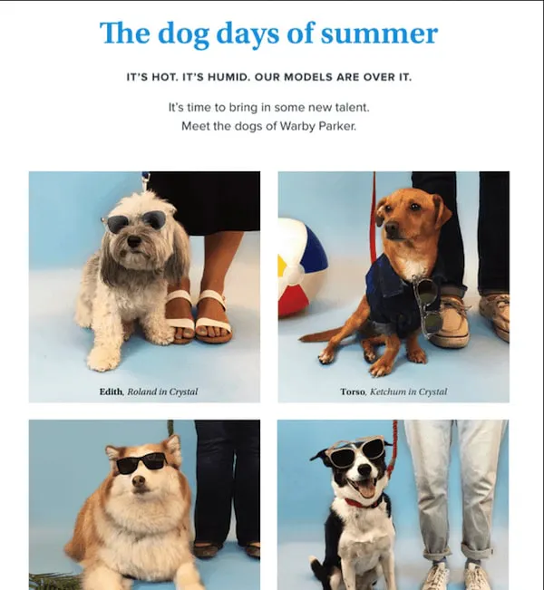
One of the most important functions of a newsletter is to connect with subscribers, based on their core interests. Why did they sign up for your emails? Enter Warby Parker, an eyewear company that knows no one can resist: 1) humor and 2) cute puppies. They seamlessly blend shared pain (oh, the dog days of summer, we already miss you!) with adorable models, in a way that’ll have their audience barking with laughter. (#SorryNotSorry)
Award for: Appealing to Subscriber Interest
9. WouldYouRather (WYR)
@wouldyourather
Screenshot via AWeber
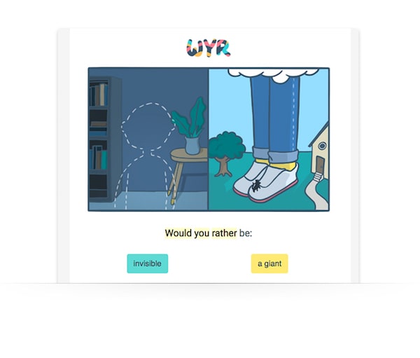
Okay, mega points to WYR for a fun newsletter, but we’re focusing on the interactive quality of this example. Because, who doesn’t love an easy (and silly) quiz? And at a company like Would You Rather? – literally, a company dedicated to the fun and entertainment of the would-you-rather scenario game – who wouldn’t want to receive a weekly newsletter with one-click gameplay?
Award for: Interactive Elements
Winners: stand-out design
10. Anthropologie
@Anthropologie
Screenshot via Canva
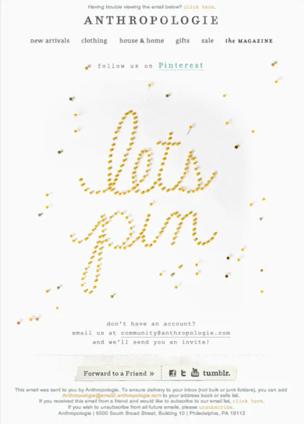
GIFs don’t have to be cheesy or low-brow; used effectively, they can be an important design element in your newsletters. Take this example from Anthropologie (click the link for full effect), which is both classy and eye-catching. What’s more, it’s surrounded by the right information and perfectly on-message – a call to readers to follow Anthropologie’s Pinterest and get inspired.
Award for: Design Animation
11. Blue Planet II
@BluePlanet2Live
Screenshot via MailJet
It’s not often that an email or website makes you want to scroll… and scroll and scroll. Sure, you do it often enough, because that’s the only way to get where you’re going, but you probably don’t enjoy the process. Enter Blue Planet II, the second edition of the BBC’s wildly popular ocean documentary, which uses imagery and smart design to immerse subscribers in the ocean’s blue depths. This is one where you definitely want to scroll until the end.
Award for: Immersive Scrolling
Screenshot via Brafton
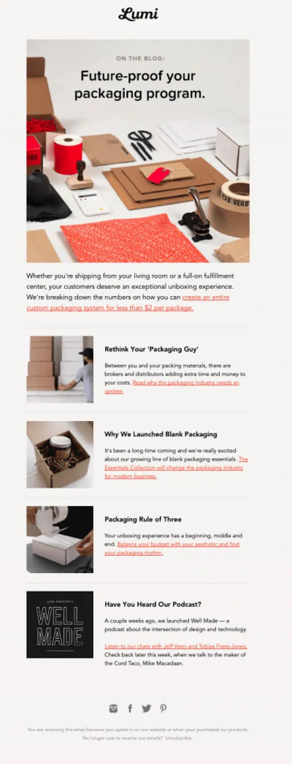
The world is increasingly mobile (55% of email is opened on mobile), so why do companies still design desktop-first newsletters? Depending on your audience, there’s a good chance they’re reading on their phones, on their morning commute, while they wait in line for coffee, or do any other of the myriad morning activities during which they have a phone in their hand. Kudos to Lumi’s newsletter, which is not only designed for mobile but mobile-optimized, as well.
Award for: Mobile-first Design
Screenshot via Brafton
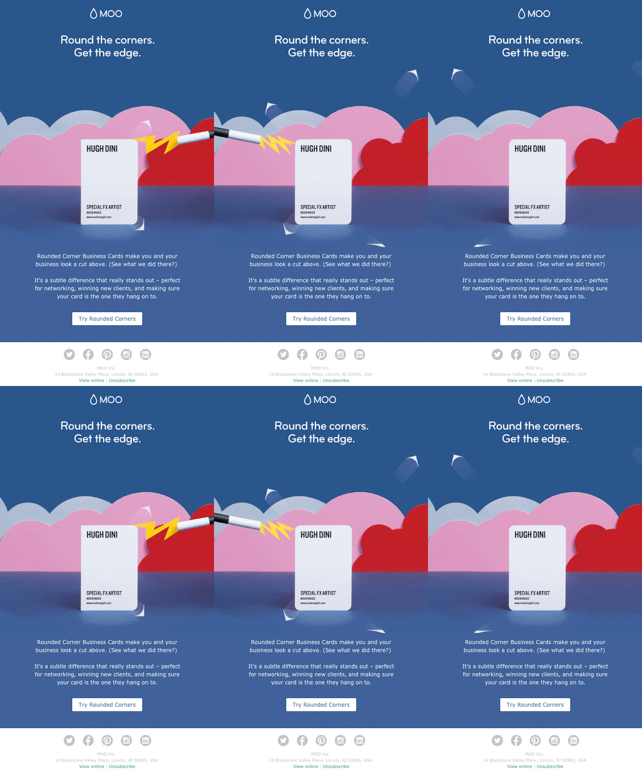
MOO is a company all about smart, outside-the-box (often, literally) design, so of course their newsletter’s going to be equally well-rounded. (Sorry, we can’t help ourselves!) Their pun-intended MOOs Letter strikes a good balance of cute cat photos and illustrative GIFs, which often showcase the company’s personality and product. (Case in point, above.)
Award for: Dash of Personality
Screenshot via MailJet
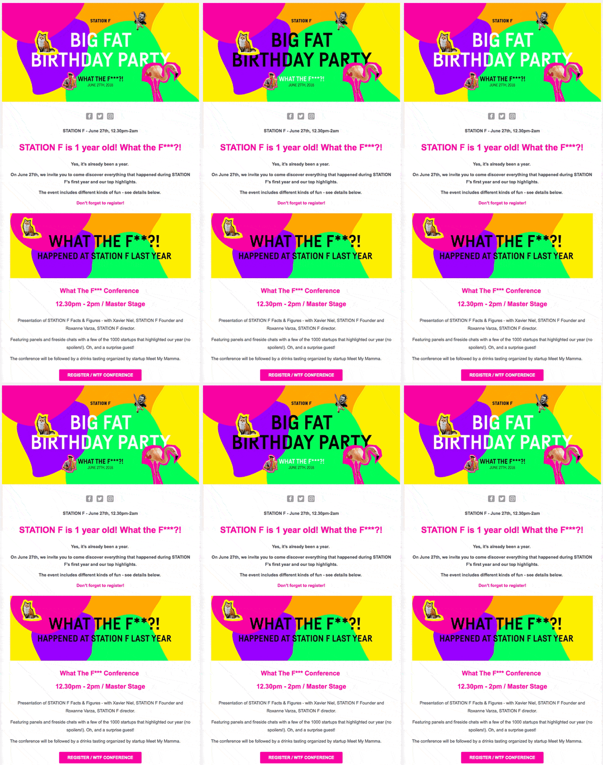
There’s no question – Station F’s newsletter approach is no for everyone. But, when you’re a startup incubator vying for the attention of the world’s greatest millennial thinkers, you have to be willing to go big. Flashing GIFs and pink flamingoes and flaming f-bombs big. And here, it totally works: it grabs attention in a minimalist world. It’s un-ignorable. And it probably makes a lot of their potential incubatees say, “What the F***?” But only in the best way possible.
Award for: Complete Originality
Winners: great use of color
Screenshot via Canva
Color can do a lot for your newsletter, and color blocking can have an even greater effect. Take this example from The Stylish City, which treats viewers to a unique and muted color palette – a sophisticated, yet fun feel that really says, “style.” Even more, beyond being on-brand and on-point, the newsletter leverages creative color blocking to focus eyes and attention on what matters most.
Award for: Color Blocking
16. Engage
Screenshot via Canva
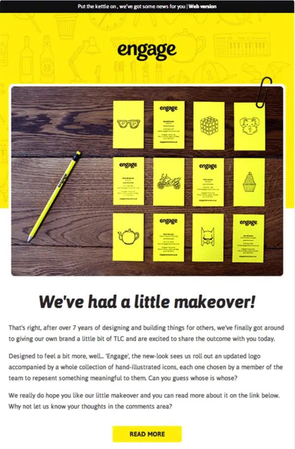
Yellow isn’t a color we typically consider when it comes to email, but Engage proves that your gut isn’t always right. The brand uses a very bright yellow (plus complementary tones and a textured background) to deliver a simple, fresh and very attention-grabbing newsletter example that’s anything but expected. Engaging, indeed!
Award for: Loud Color
Screenshot via Canva
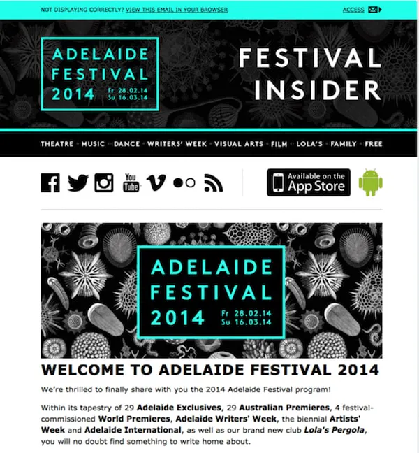
Think neon got left in the 80s? Not according to IS Design + Digital, which knows how to leverage modern neon color (and plenty of black + white space) to pull their subscribers’ attention. In fact, how can you not read that headline? The box, the graphic, the color – it’s all screaming for eyes to stop and stay awhile. Thank you, contrast.
Award for: Color for Attention
Winners: beautiful minimalism
Screenshot via Canva
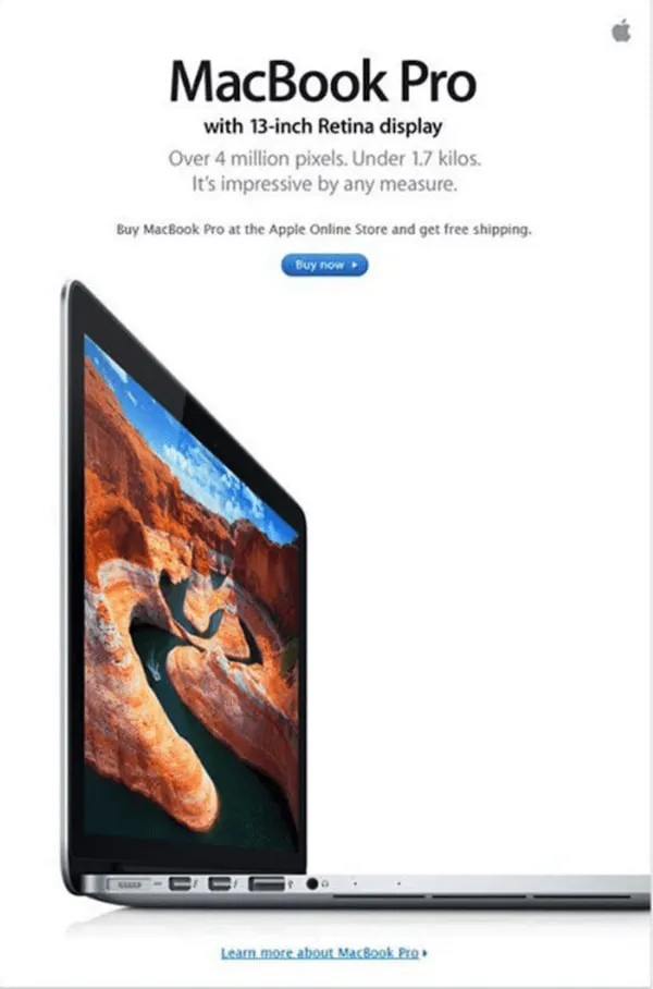
We all know Apple for its fashion-forward design and minimal aesthetic. So, of course, we expect the same from Apple’s newsletters. (Thankfully, they deliver.) As you can see from this example, the brand is great at whitespace and minimal design, with carefully placed pops of color to call attention to certain elements. It’s a newsletter that perfectly complements the brand’s personality on its website and elsewhere.
Award for: Simplicity
19. Smart Insights
@SmartInsights
Screenshot via MageMail
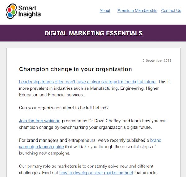
We’d expect nothing less than great from Smart Insights, a digital marketing company. And they deliver, with a newsletter that gets directly to the point: simple, easy to digest, and packed with actionable information – exactly what the Smart Insights audience is after. In fact, their newsletter is so simple it’s almost a throwback (it’s almost completely plain text)… except that it’s 2018, and Smart Insights has the insight to know their audience wants zero distraction.
Award for: Old-school Minimalism
Screenshot via CoSchedule
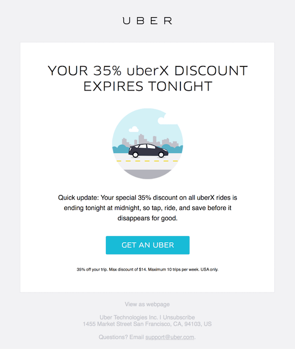
If you’re even so much as a casual Uber user, then you’re familiar with the brand’s black-and-white aesthetic. Enter Uber newsletters, which don’t deviate: Even in a world of cluttered email, dozen-image emails, and lots of newsletter content, Uber keeps its cool. It’s minimalist. It’s consistent. It’s straightforward. And it’s totally, undeniably Uber.
Award for: Adherence to Brand Aesthetic
Winners: excellent content
21. Ben & Jerry’s
@benandjerrys
Screenshot via Lyfe Marketing
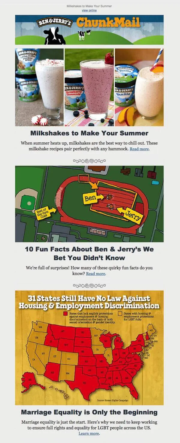
Ben & Jerry’s does a lot of things right but what we’re focusing on here, is their display of company values. Note that this can be tricky for brands – think very, very carefully before you wade into the waters of public debate – but once you’ve stated your values (and your company policy of sharing them publicly), sharing them can bring you closer to your audience. (Provided they share your values. Again, tread carefully!)
Award for: Display of Values
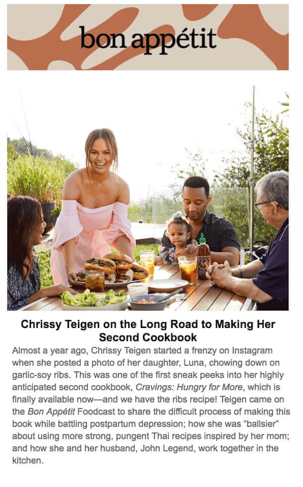
When your brand incorporates text and images into a newsletter, it’s easy to get lost in the clutter. There’s just so much to see and read and digest, especially if you’re seeing and reading and digesting from a smartphone screen. And that’s why we love formats like that of Bon Appetit, which uses clean and non-competing images, paired with super-simple (and very limited) text, to keep their content-packed newsletter easy to navigate.
Award for: Uncluttered Content
Screenshot via CoSchedule
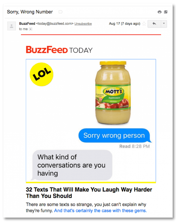
Like ‘em or not, Buzzfeed does a lot right when it comes to today’s digital world. We’re going to skip over a lot of the accolades and head straight for the subject line, because Buzzfeed does that so well: They’re interesting. They’re not at all bland. They make you want to click. And they’re unlikely to get reported as spam. (That’s a big deal, since about 69% of people are ready to hit “this is spam” based on subject line alone.)
Award for: Strong Subject Lines
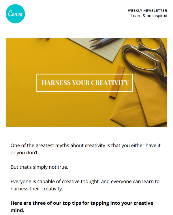
It’s no secret that we love Canva for its easy design, so it shouldn’t be a surprise that we also love Canva’s email marketing. Clean design, pops of color, easy navigation – those are all givens when it comes to Canva. But where the design tool’s newsletter really stands out is in content: They know what their users need and want, and they’re quick to deliver on it. In addition to full-length inspiration, they also offer visual inspiration and links to other articles of interest.
Award for: Inspirational Content
25. Domino’s
@dominosScreenshot via CoSchedule
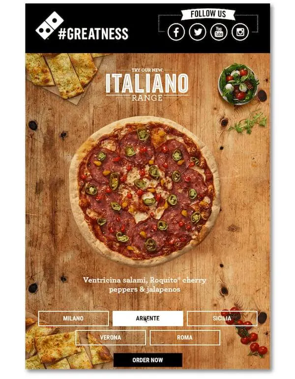
It’s amazing what you can do with email today. Enter interactive content, which Domino’s does well. Instead of sending a laundry list of Italiano pizza offerings, the company invited a bit of interaction: Pick your poison, and your choice auto-triggers a surprise photo-change. (GIFs are an easy way to do simple interactions – not just on Twitter and Facebook, but in your newsletters, too.) It’s not complicated but it is just new enough to be fun.
Award for: Interactive Content
Screenshot via Venngage
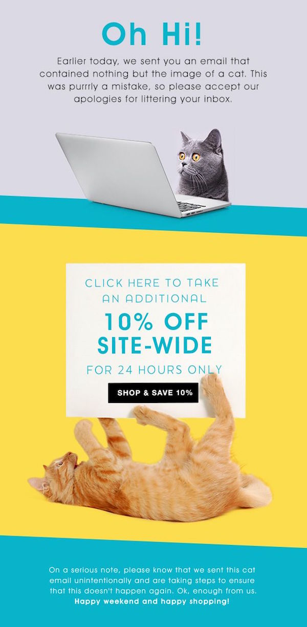
Raise your hand if you’ve ever sent out a newsletter with a mistake in it. Maybe you forgot the subject line, or your link was broken, or your design rendered wonky. Whatever happened, you received a copy to your inbox and your heart dropped. Enter the newsletter apology, which Fab pulls of perfectly: with humility and humor (and who doesn’t love a good cat and pun?!), plus a discount as apology. Well done.
Award for: Oops! Control
Screenshot via omnisend
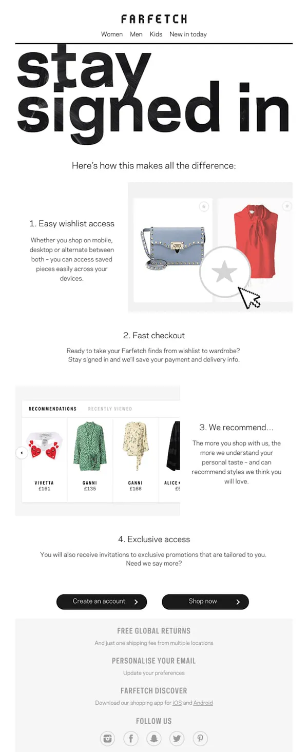
Email is a saturated market so, to get email addresses (and actual opens), you need to prove your worth. Farfetch does just that with their daily newsletter, which starts with a welcome email detailing its value: Stay signed in for a bevy of benefits, including daily recommendations (here comes the email!) of personalized suggestions, based on your own likes and dislikes.
Award for: Proof of Worth
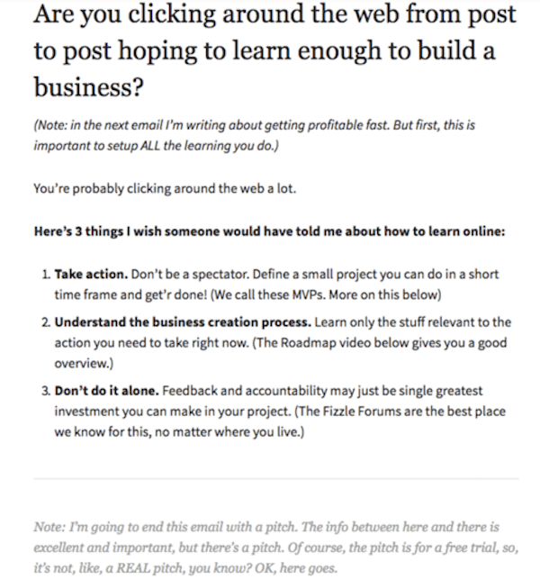
Screenshot via FitSmallBusiness
What’s one of the easiest ways to get people to sign up for your newsletter? Offering exclusive, not-seen-elsewhere content, available only to your subscribers. And that’s something Fizzle does well, delivering not only newsletter-exclusive content but newsletter-exclusive content that’s packed with helpful information and actionable tips, presented in the straightforward format their entrepreneurial audience craves.
Award for: Exclusive Content
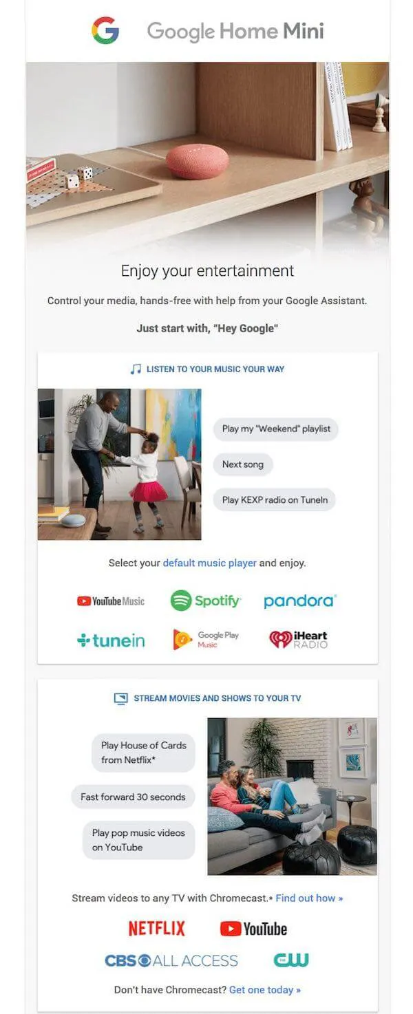
29. Google Home Mini
@madebygoogle
Screenshot via MailJet
Google Home Mini is another of those super-smart, personalized devices that knows a lot about its users. So, again, the company’s newsletter is all about personalization – but this time, with a twist. Because, in addition to serving up the content its users want, Google Home Mini also delivers the pop-culture references of the day: cues to queue popular shows, or play nostalgic games, or whatever else is on the day’s entertainment radar.
Award for: Pop Culture Savvy
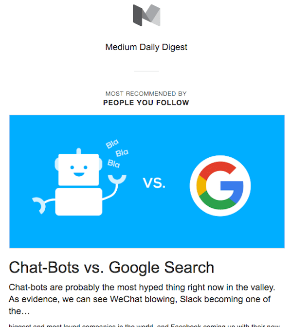
Screenshot via FitSmallBusiness
Know your audience. No, really – know your audience. This is one of the most important reminders in email newsletters because, while a fashion co. subscriber might want photos, Medium knows that its professional audience wants quick, simple, uncluttered access to regular news and updates. That’s why this daily newsletter, which features just one header image and zero distraction, does so well. Medium’s audience doesn’t want copious images or flashy GIFs, and that’s okay.
Award for: Getting to the Point
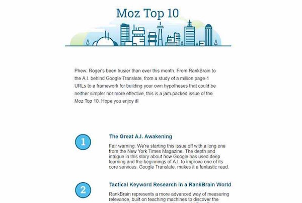
Screenshot via Lyfe Marketing
One of the easiest and best ways to get out a daily/weekly/biweekly newsletter, without devoting half your life to writing it? Content curation! Take this great example in the Moz Top Ten, which pulls (aka curates) excellent, relevant content from around the internet, and pairs it with brief descriptions to deliver content that is varied, helpful, and scannable, not to mention a huge value for Moz’s audience.
Award for: Content Curation
32. Secret Escapes
Screenshot via pure360
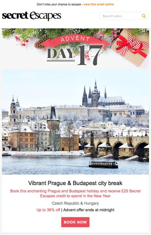
Holidays offer a great opportunity for brands to get in on society’s collective good cheer and nostalgia, and that’s why we love this newsletter campaign from Secret Escapes: a take on the traditional advent calendar. Because, while you may not think a travel brand could swing the winter holidays to their advantage – everyone stays home for the holidays, right? – they use their 25 days of Christmas (and the scarcity of a flash deal) to serve up tempting travel deals, each and every day.
Award for: Holiday Tie-in
Screenshot via Venngage
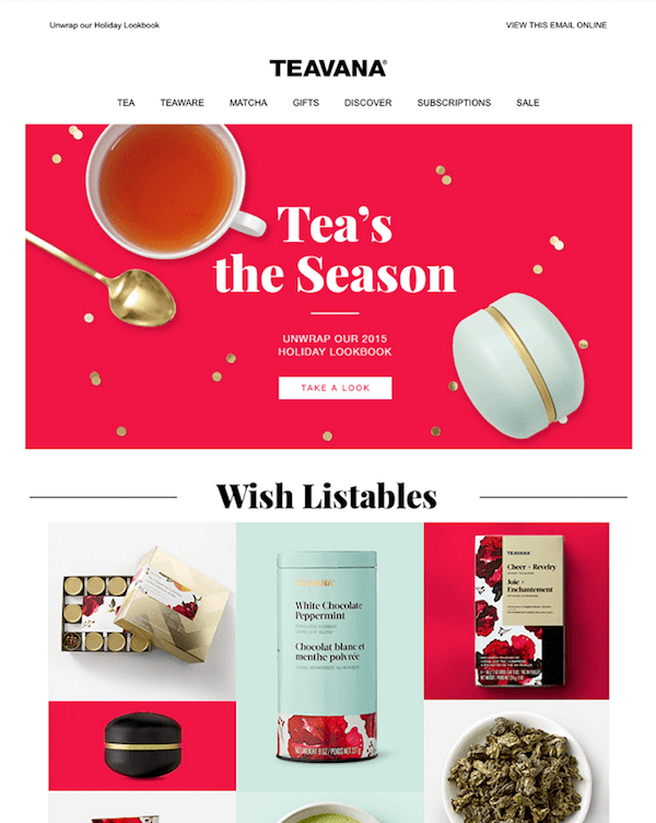
We are huge suckers for a good pun (note: a good pun) and, when it fits the brand, punny wordplay is one of our favorite kinds of copy. Teavana does this wonderfully, filling up on the belly laughs while communicating their message. The end result: Teavana doesn’t seem like some big company, but rather like you best bud, texting you some funny lines when you need a good laugh.
Award for: Lighthearted Wordplay
34. UncommonGoods
@UncommonGoods
Screenshot via The Daily Egg
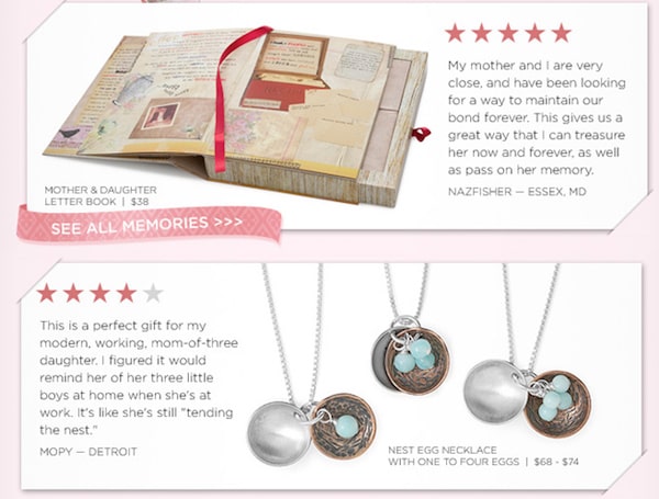
There’s nothing like real-world testimonials to convince interested parties to buy with you. Bottom line: They work, so why not use them to their best advantage? UncommonGoods does it well in their newsletter, which showcases themed, seasonal, and other related goods, each paired with a genuine (and, of course, glowing) testimonial. Bonus points for pairing it with the universally recognized star system.
Award for: Testimonial Placement
Screenshot via The Daily Egg
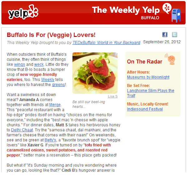
Lists do really well in email newsletters. Custom content does really well in newsletters. Now, enter custom lists, courtesy of Yelp. Not only is this content hyper-relevant to users, but it’s presented in one of subscribers’ favorite formats. Even if you don’t know your subscribers as well as does Yelp, you can segment them – ask them to self-identify at sign-up – so you can customize, at least a bit. And then, list away!
Award for: Custom Lists
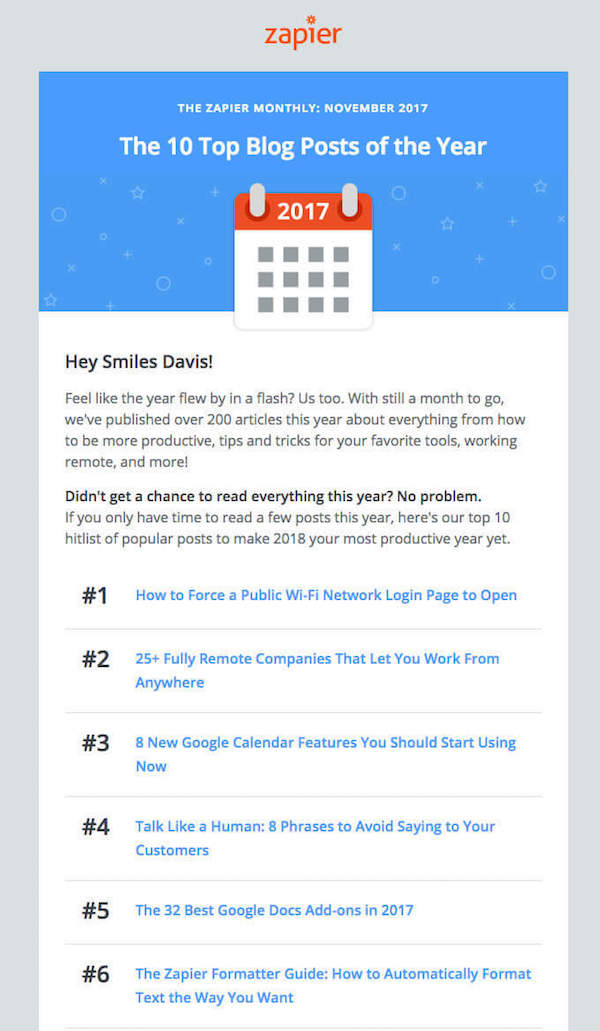
We’ve all experienced it: You read an interesting subject line, think “yeah! I want to know that!”, open the email and then, for the life of you, cannot find the article you were promised. Enter Zapier, whose newsletter does the exact opposite: They deliver what they promised, in a format that’s dead easy to digest. And you know their readers love them for it.
Award for: Keeping Their Promise
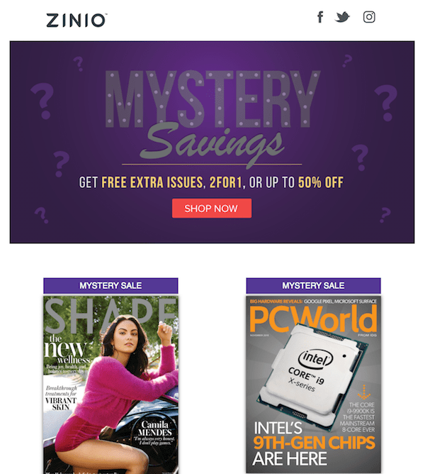
What’s the one thing more alluring than the promise of a sale? The promise of a mystery sale. Zinio is great at sending out irresistible promos like this one, which promises not only a good sale but a bet-you-can’t-NOT-click mystery: Will you get extra issues, 2-for-1 magazines, or even 50% off your chosen title? Bonus points for an unconventional color scheme.
Award for: The Allure of Mystery
Winners: powerful calls-to-action
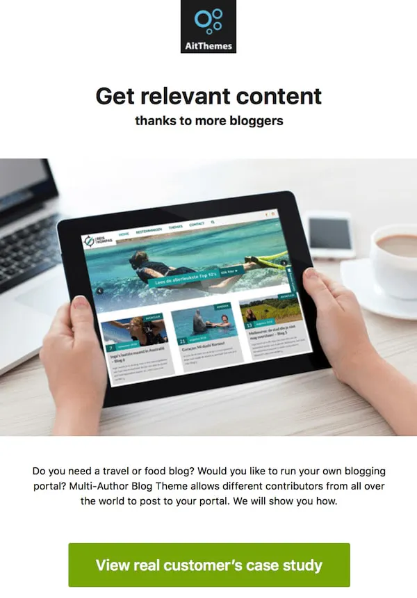
Often, we get carried away with our pithy, one-word calls-to-action. That’s great, if your CTA lends itself well to a one-word button (ex. “Book”), but sometimes, a concise CTA is an ambiguous CTA. That’s why we applaud this email from AitThemes Club, with its unconventionally long call-to-action button: View real customer’s case study. It may not be short but it’s clear in its messaging, in a way a short View never would have been.
Award for: Clarity in CTAs
Screenshot via Venngage
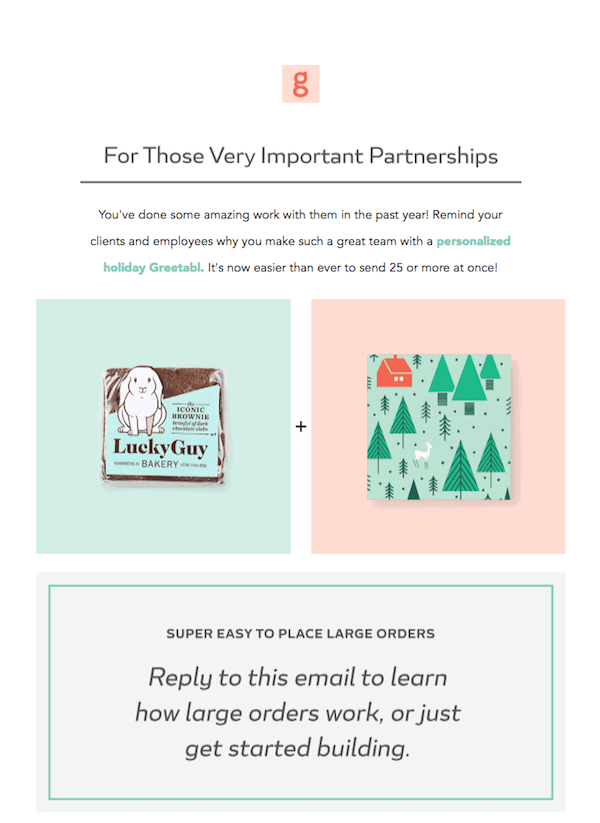
Often, calls-to-action require too many barriers to entry: Do this. Fill this out. Give us this. Blah, blah, blah – you’ve lost ‘em. And that’s why we love this newsletter CTA from Greetabl, which keeps it super simple with an easy “reply to this email.” Not only is it the easiest request in the email world, but that simple “reply to” suggest that there’s a person at the other end of the email. And that implication is priceless.
Award for: The Easiest CTA
40. Inside Design by InVision
@InVisionApp
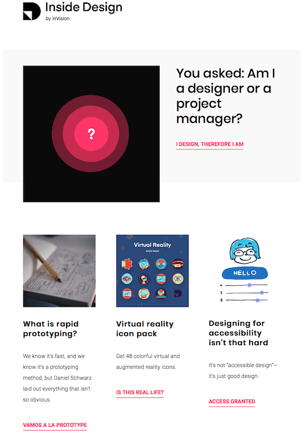
We freely admit, we’re suckers for great copy. And that’s why it’s so fun and refreshing to get this newsletter from the InVision App, a design-focused app that knows how to write good copy. Case in point: Check out these fantastic article calls-to-action which, instead of asking you to “Read More,” tempts you to “Bring Hand Sanitizer” and innovate “Eight Days a Week.”
Award for: Fun Secondary CTAs
41. Litmus
@litmusapp
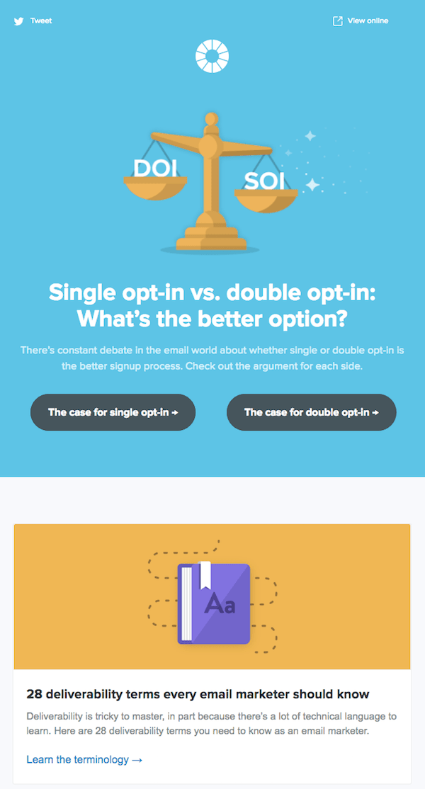
A lot of what you read will tell you to only ever have ONE call-to-action. Sure, that serves you when you have a super-specific goal in mind. But with newsletters, your goal is often to serve up interesting information to your readers. You want clicks but you don’t care what they click. Enter this example from Litmus, which shows you how you use multiple specific CTAs (“Learn the terminology”) to direct readers to what will most benefit them.
Award for: Use of Multiple CTAs
Screenshot via The Daily Egg
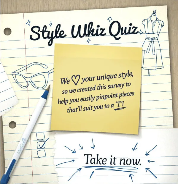
Calls-to-action can’t always be amazing but man, sometimes they can be. Because getting your readers to open your email is only half the battle, companies like ModCloth go a step further to make an offer that is hard to refuse: Who doesn’t want to take a Style Quiz, to discover their personal tastes and most complementary styles? (This is also an excellent example of presenting information – essentially, a marketing survey! – in a way that resonates with your customers.)
Award for: Must-Click CTA
43. The North Face
@thenorthface
Screenshot via AWeber
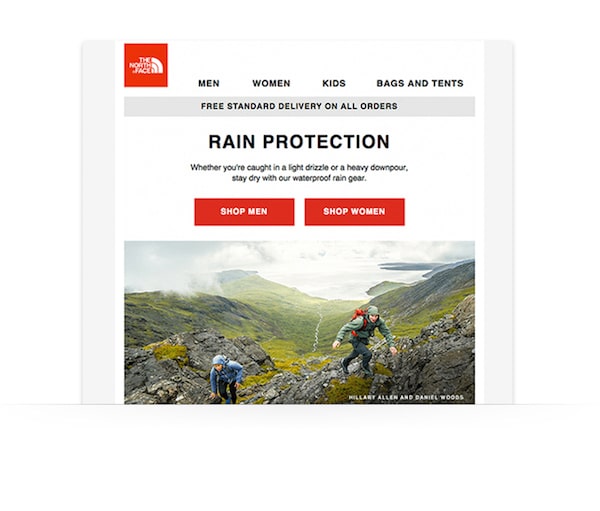
The North Face does a great job with color placement, especially when it comes to their calls-to-action. They employ plenty of whitespace and a neutral image, with the only bold colors being a logo and equally vibrant call-to-action buttons. (Both of which, conveniently, mimic a backpack in the photo.) It’s very eye-catching – as it should be, since their true goal is to get you to click on one of those buttons.
Award for: Clear CTAs
44. Vertical Response
@VR4SmallBiz
Screenshot via The Daily Egg
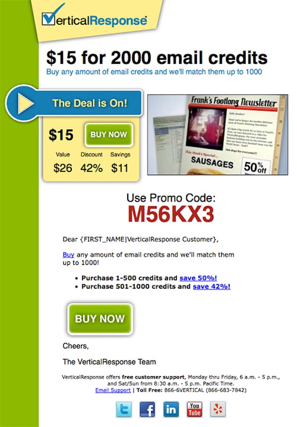
Marketers are constantly on the look-out for the next great idea that will sell big. Vertical Response shows you one way, with a newsletter that offers Groupon-style flash deals on their product (email credits), paired with a countdown timer to show that this deal would soon be going, going, gone! The takeaway here: Remember, you can derive newsletter inspiration from any industry, not just your own.
Award for: Great Flash Deal
Winners: illuminating imagery
Screenshot via sendinblue
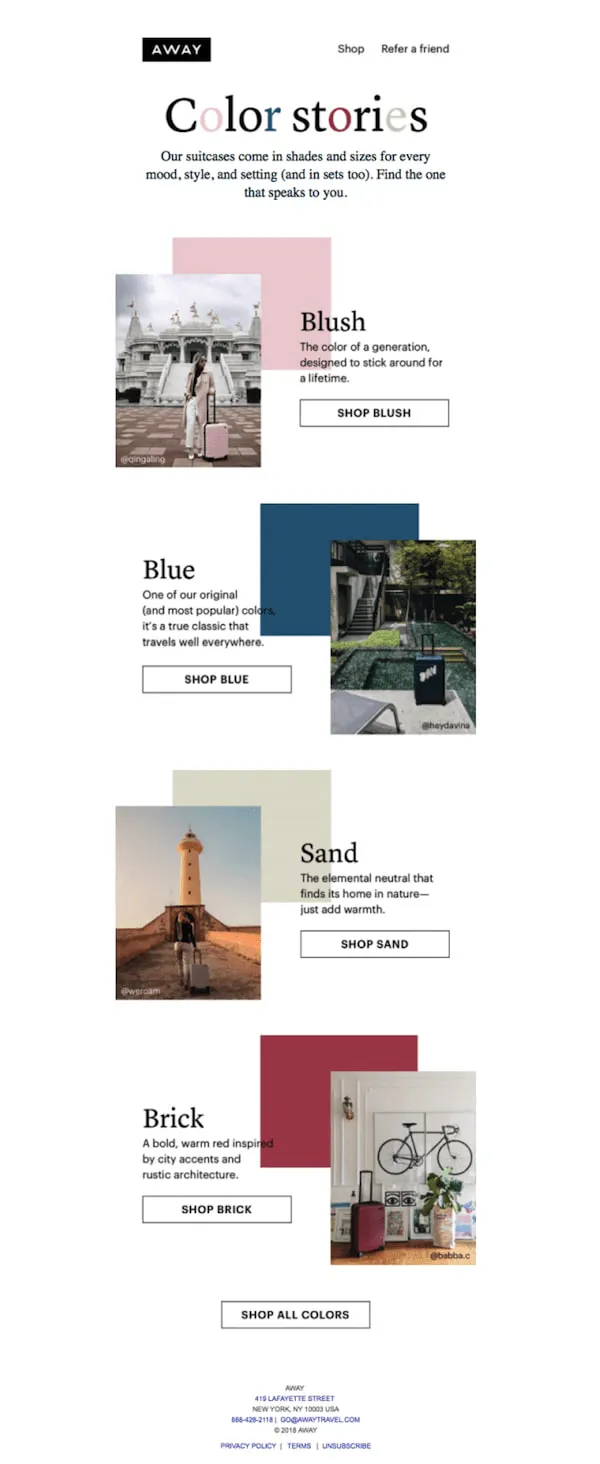
A startup dedicated to delivering “smart luggage,” Away is a company far from the old and dated model of luggage design. And thus, their newsletter mirrors this reality, with modern colors and very modern, user-generated content: Away customers’ images, curated to highlight the brand’s own product colors. It’s a perfect marriage of social awareness and marketing savvy, and it works perfectly with Away’s personality.
Award for: Social Tie-in
Screenshot via pure360
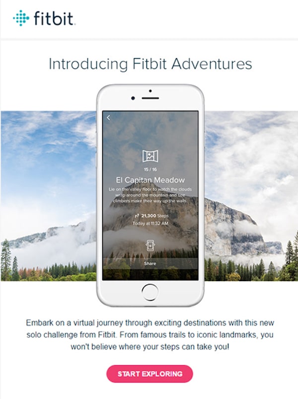
Fitbit is clearly in on the knowledge that a picture speaks a thousand words. The brand also knows its customer. And that’s why we love their newsletters, which often pair an inspiring image with plenty of whitespace. (Doesn’t this example make you crave a long hike outdoors?) With a simple click of the Send button, they’ve planted the seed of activity, without shaming or using scare tactics. Positive reinforcement!
Award for: Inspiring Imagery
Screenshot via pure360
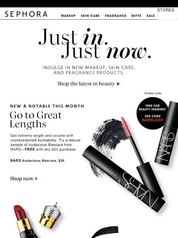
Ah, the perfect marriage of copy and imagery. We wouldn’t expect anything less from image-conscious brand Sephora, which does beauty newsletters right: great color, modern design, and product copy + images perfectly melded. Transparent backgrounds and product placement are well done, as well, mimicking the state they’d be in, if they were already on your makeup counter. Subtle but genius.
Award for: The Power of Suggestion
Screenshot via MageMail
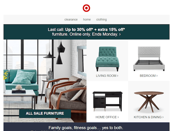
You know how everyone always jokes that you go to Target for toilet paper and come out with a trunk-ful of everything you never knew you needed? Target’s emails are like that, too. Smartly designed to pack as many images as possible above the fold – instant and unavoidable impact (aka temptation!) – this is one brand that understands their highly suggestible, please-do-tempt-me target audience.
Award for: Maximum Temptation
49. Taylor Stitch
@TaylorStitch
Screenshot via MailJet
When it comes to fashion newsletters, women’s brands and makeup usually get the glory. But Taylor Stitch, a menswear company, is pitch-perfect with their newsletter, which breathes modern cool. Through plenty of whitespace, perfectly placed products, and complementary images, the brand demonstrates visually how easily their customers can morph from metropolitan man to mountain man, thus echoing the promise of Taylor Stitch threads.
Award for: Storytelling through Images
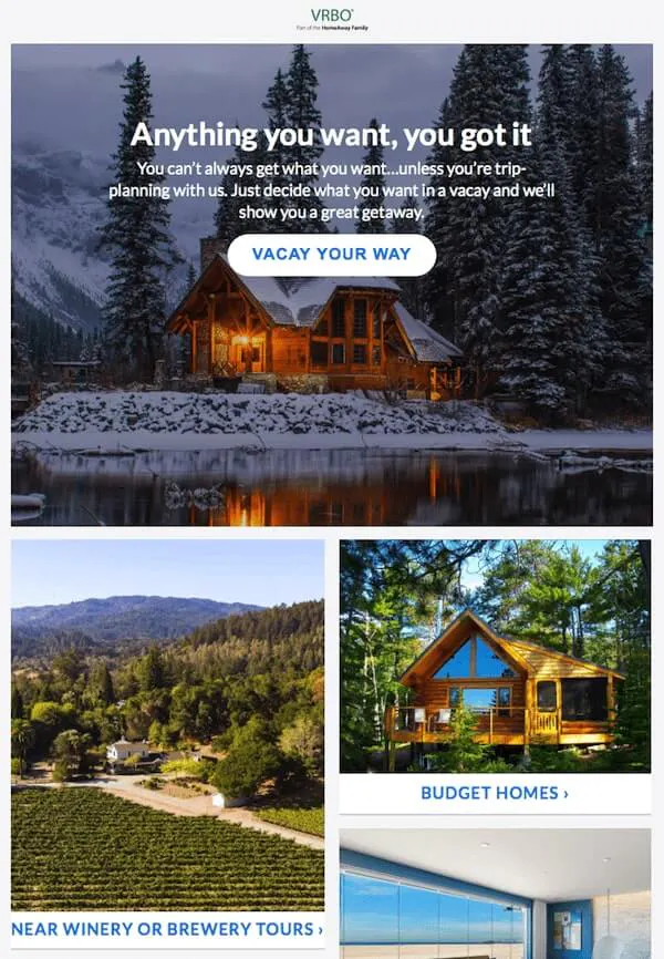
You don’t need written content to make your newsletters pop. Take this example from VRBO (aka HomeAway), which uses some pretty inspiring vacation rental photography to do the talking. Of course, your use of imagery (and almost only imagery) depends on your brand but if you’re a visual kind of company, embrace your photography.
Award for: Wanderlustful Imagery
Now that you’re inspired by these amazing designs, check out our post on how to use powerful words in your email marketing campaign to create your own impossible-to-resist, highly effective newsletter that gets results.
Looking to grow your subscriber list? Turn one-time visitors into lifelong fans with our easy-to-use Email List Builder!


