Effective marketing is all about influencing customer behavior. The most effective brand materials will convey a value proposition while also making a clear offer, along with a call to action. According to Vye Agency, the average click-through rate (CTR) for a call-to-action (CTA) is 4.23% across all platforms and industries. In a world where everyone is competing for attention online, it is important that your messaging be unique, clear, and compelling. The best way to discover what makes for a clear and compelling call to action is to look at the most effective call to action examples used by leading brands.
To help you find the right tone for your marketing campaigns, we’ve compiled 50 excellent CTA examples from several different platforms. You’ll find a lot of great ideas for how to craft a message that speaks to your audience and optimize the layout of your website, landing pages, squeeze pages, ads, and search engine listings.
Our list is simply grouped by category for easy browsing (in other words, they’re not ranked or rated in order of importance or value). Check out some of our favorite call-to-action examples:
- Social Media Call to Action Examples
- Google Ads Call to Action Examples
- CTA Examples from Articles and Landing Pages
- E-commerce CTA Examples
- Popup CTA Examples
Social Media Call to Action Examples
1. ClickUp

ClickUp is a popular team collaboration platform that is designed for dispersed workgroups. This Facebook advertisement features a message from the CEO, Zeb Evans, regarding a personal story he shared recently in the publication Fast Company. The message is clear, and the link at the end of the post makes it easy to view the article directly.
Why It Works: The clear description makes it easy to understand the call to action.
2. Wendy’s

The fast food chain Wendy’s has developed a robust social media presence on several platforms. With over 3.8 million followers on Twitter, Wendy’s has a lot of opportunities to engage with customers and keep them informed of new specials and menu items. This call to action example promotes a collaboration the company has with T-Mobile and directs customers to visit the T-Mobile app for a special offer.
Why It Works: Cross-promoting products with other brands is a powerful way to expand your brand awareness.

Witchy Wash Bath sells vegan and cruelty-free bath products created with a “witchy” twist. They have a beautifully curated Instagram feed that features promotions and several engaging posts. This post asks viewers to choose from 3 secrets cards that will be revealed in a later post.
Why It Works: Presenting fun little games can lead to more comments and shares.
4. HootSuite
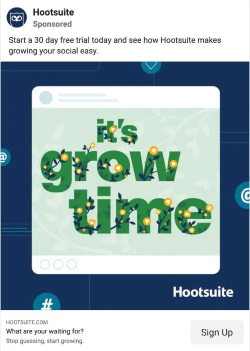
Hootsuite is a social media planning and automation platform for organizing and sharing posts. The marketing team at Hootsuite understands that the primary reason for using their product is to grow a social media audience. This Facebook post is short and clearly presents a call-to-action for signup up to the 30-day free trial.
Why It Works: Sharing a short message within the image helps attract attention to the post.
5. Wix

The website design and hosting brand Wix takes a very personal tone with their advertisements and social media content. This video, from the official Wix YouTube channel, explains the basic value proposition of the platform. This call to action example demonstrates the value of making it easy for visitors to take the desired action. Wix does this by embedding a “subscribe to Wix” button in the lower right corner of the video to give viewers an easy way to respond.
Why It Works: Providing multiple links for your CTA can increase the overall CTR.
6. Old Movie

Sometimes a call to action can be as simple as linking a post. The director M. Night Shyamalan has a new film, titled “Old,” coming out near the end of July, and this tweet shares the trailer along with a message to like the tweet. By liking the tweet, he offers a chance for followers to get more updates on the movie leading up to the theatrical release.
Why It Works: Remind followers why they should like a post to encourage action.
7. Nike
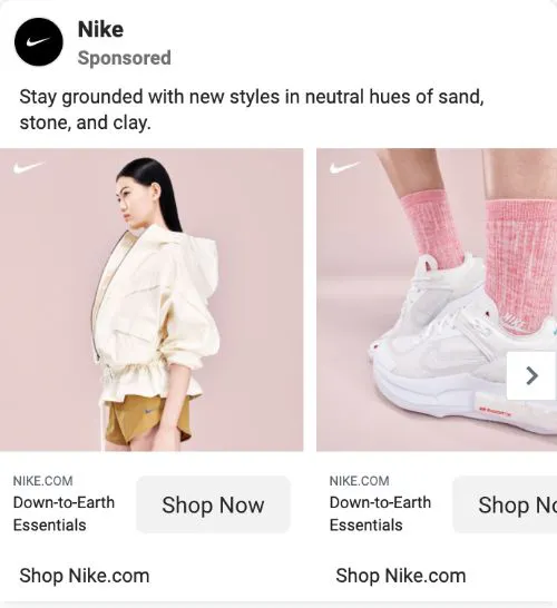
Sports apparel company Nike is one of the most recognizable brands in the world. They make great use of Facebook’s ad formatting features with this campaign, using a Facebook Carousel Ad to showcase multiple products. They invite viewers to shop at their online store with a simple call to action that is displayed underneath each image.
Why It Works: A customer is more likely to visit your website after they see a specific product that interests them.
8. Coca-Cola

Coca-Cola is a massive company that sells iconic beverages and soda around the world. This Instagram post is another great example of using content and an enticing call to action to engage with your audience. They present an interesting riddle and ask followers to comment on the post with their answers. This post has received over 500 comments as a result.
Why It Works: People enjoy answering riddle and trivia questions.
9. Headspace

The meditation app Headspace helps people find some mindfulness in this busy world. They use their social media channels to promote events, such as this meditation session that was recently held in June for Pride Month. This event was streamed directly on Instagram Live, making it very easy for followers to join. This call to action example also showcases how eye-catching images can draw attention, particularly on social media where distractions are plentiful.
Why It Works: Promoting live events on social media platforms is a great way to speak directly to your most engaged followers.
10. Netflix

The streaming entertainment platform Netflix has thousands of different film and TV titles that they promote each month on social media. These monthly roundup videos are very popular on YouTube and highlight new content that will be added. At the end of this video, they provide 4 embedded buttons for viewing additional videos, subscribing to the YouTube channel, or subscribing to the streaming service.
Why It Works: This call to action example shows how providing multiple calls to action at the end of video content gives the viewer options.
11. Elementor

Elementor is a website collaboration and design platform built for WordPress. They have amassed over 124,000 followers on their Instagram page by posting regularly about product updates, events, and customer stories. This Instagram Story post promotes their #webcreators 2021 webinar series and directs viewers to swipe up for more details.
Why It Works: A “swipe up” prompt is a fast and easy way to direct viewers to a call to action.
12. Target

Target sells a wide variety of products, and they are constantly running new promotions and weekly ads. This Facebook advertisement presents a clear CTA for a free gift card with a purchase of $50 or more on home essentials. Social media channels are an excellent place to share promotions in order to reach a large and relevant audience.
Why It Works: Customers often search on social media for the latest product promotions and sales.
13. Coleman

The U.S.-based outdoor gear supplier Coleman shares beautiful outdoor pictures and videos on their social media channels. This advertisement from their Facebook page uses a hashtag to get traction and features a CTA button titled “Learn More.” This call to action example demonstrates how placing a CTA button directly on the ad makes it easy for viewers to click and get additional details.
Why It Works: Labeling your CTA buttons helps viewers understand what you’re offering.
14. Winc
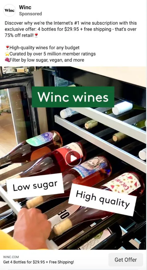
Winc is a wine delivery service that has become a popular way to try new brands and varieties. This Facebook ad uses the “Get Offer” CTA button, and the post itself does a great job of presenting the major benefits of using their subscription service. A clear value proposition and well-designed buttons make this post very appealing to new subscribers.
Why It Works: Providing specific numbers and measurable figures helps add credibility to your CTA.
Google Ads Call to Action Examples
15. Adidas
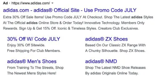
The athletic apparel company Adidas shares a lot of information through this single Google ad. There are 3 different CTAs inviting customers to shop at the online store, use the holiday discount code, and sign up for a membership. Including the relevant coupon code within the text is a useful way to give potential customers this information without requiring them to search further.
Why It Works: Sharing a discount code gives customers an immediate reason to shop.
16. Upwork

The freelance job marketplace Upwork does an excellent job with this Google PPC advertisement. The first words of the ad text is “Post a job,” which is an action that the majority of their target customers are looking to take. Starting with a clear and relevant CTA makes the ad actionable, and they use the rest of the space to list additional benefits of using their service.
Why It Works: Beginning your ad copy with a verb is the perfect way to get your customers thinking about action.
17. Avis
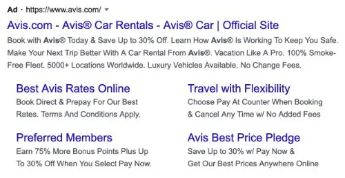
Car rental agency Avis relies on a steady stream of customers to rent their vehicles in locations across the world. This Google ad is a great call to action example, with a CTA that says “book with Avis” and a discount offer to entice customers to make a reservation. By sticking with the basics, Avis increases the chances of their ads getting more clicks from motivated buyers.
Why It Works: Ad keywords should be highly relevant to your target markets.
18. Teachable

Teachable hosts online courses developed by a large number of content creators. They take advantage of social proof in this ad by highlighting the fact that over 100,000 people are already using Teachable to host their course content. With a CTA to join these other members, the ad makes a clear offer to potential customers.
Why It Works: Social proof can be especially useful when demonstrating the strength of a product or service.
19. Progressive

Progressive provides over 30 different insurance products, including home and auto. This Google ad appears after a search for “car insurance” and begins with a CTA to request an insurance quote. The additional section below includes a large header stating that an insurance quote will only takes 6 minutes to complete.
Why It Works: Potential customers are more likely to request a quote if they know the process will be fast and simple.
20. Verizon

Wireless network provider Verizon offers several subscription plans to meet the needs of businesses, individuals, and families. They include several calls to action in this ad by inviting customers to shop phones and plans or look for the latest offers. Customers can also choose between free 2-day shipping and in-store pickup.
Why It Works: Each customer may have a different preference for shopping in a retail store, browsing online, or requesting an in-store pickup, and letting customers know what their options are can appeal to a wider audience.
21. Amazon

Amazon is an active online marketplace that offers thousands of different products in hundreds of categories. This ad simply states that Amazon has the largest selection of products available and displays a summary 5-star customer review score. They also include a couple of additional links that encourage people to explore their smart home selection or shop for Amazon devices.
Why It Works: All of the ad space should be used to maximize the amount of information you share.
22. Asana

The workplace productivity platform Asana has become a popular choice for businesses of all sizes. A major priority for many software companies is to get potential customers to take a product tour. This Google ad includes one of the most effective call to action examples, with a direct link and CTA for taking a product tour, giving prospective buyers a quick way to do so.
Why It Works: Offering a product tour is an effective call to action for software companies to attract prospects who want to learn more about how the platform works.
23. Domino’s Pizza

Domino’s Pizza has continuous ad campaigns running on print and online platforms. This ad from the Google search results shows how to highlight several adjacent products with a single advertisement. With a single listing, Domino’s is able to provide links for guiding customers to a new order, coupons, an order tracker, and the complete menu.
Why It Works: Delivery tracking can be a very valuable benefit for customers placing mobile orders, an example of how you can use CTAs to promote the unique features of a service.
24. JBL

The audio device company JBL sells high-quality products with lifetime product support. They talk about this in their Google advertisement and use the extra sections to highlight 3 discount offers and a new line of Quantum Series speakers and headphones. By focusing the ad on their product quality, they help the reader understand their brand and increase the chances of a click.
Why It Works: This call to action example demonstrates how highlighting the key product benefits can lead to more clicks and purchases.
25. Peacock

NBC’s streaming service, Peacock, takes a unique approach in this Google ad. Instead of describing their call-to-action in a header, they embed it (Watch for free) within the body of the text. This gives them more space to highlight the major features of their streaming service, including new content that has been recently added.
Why It Works: Sometimes it can be beneficial to blend a call to action within the advertisement copy.
CTA Examples from Articles and Landing Pages
26. Tim Ferris

Tim Ferris has become one of the leading influencers in the personal development space. This landing page for his book, The Four Hour Work Week, has a prominent email sign-up box with the words “Start Here.” This CTA example directs all visitors to the sign-up form and the additional free content he provides for joining.
Why It Works: Using a sign-up form that contrasts with the web theme colors will get noticed.
27. Square

Square provides small businesses with payment processing and financial management tools. They have created a minimalist website design that incorporates a noticeable button that simply states “Get started.” The blue color stands out against the background image and encourages interested visitors to click and learn more.
Why It Works: This call to action example shows the value of using CTA buttons that stand out and contain easy to understand text.

The home apparel and appliance store website for Bed Bath and Beyond is constantly updated based on new events and promotions. This call to action example shows the setup for college season with CTAs related to order pickup and the 3D room designer. You’ll also notice the banner placed at the top of the page that reminds visitors that they can order online and pick up their items in any store.
Why It Works: A banner is an easy way to display a call to action without updating the rest of your landing page.
29. Microsoft

The computer software and hardware company Microsoft has a detailed website for promoting their products. This recent offer is part of an image carousel that changes every few seconds and features several advertisements. The CTA example displayed here allows customers to book a simple online appointment to talk with an expert.
Why It Works: Customers may prefer to interact with a company representative before making a purchase.
30. Samsung

Samsung sells a variety of home appliances, TV displays, and other audio and computer devices. Many large hardware retailers offer a popular service: refurbished items that can be purchased at a significant discount compared to new retail models. Samsung includes a “Learn more” CTA button on this page so that visitors can easily review the program details.
Why It Works: A “learn more” button is one of the most useful CTA examples that can be very effective for complex or unique service offerings.
31. Prezi

Prezi creates software that can be used to improve visual presentations during virtual meetings held on platforms such as Zoom and GoToMeeting. The landing page on their website has some enticing CTA buttons, including one that enables a live demo. Being able to view a virtual demo with a single click is an effective and functional feature of the website design.
Why It Works: A live demo can be an incredibly immersive way to demonstrate the value of your product.
32. Old Navy

The fashion retailer Old Navy conveys a lot of information on their website home page. In addition to a large red banner introducing a clearance sale, you’ll also notice banners discussing free shipping on all orders over $50 and the ability to pick up your online order in stores. There is also a small pop-up at the bottom of the screen that highlights coupons that are available for customers.
Why It Works: Having multiple CTAs can work well on a website if you have many different types of customers visiting.
33. McDonald’s

McDonald’s is one of the most recognizable fast-food chains in the world. Their company website offers a nice example of the value of focusing your content around a central theme which, in this case, is placing an order. McDonald’s has invested a lot of effort in perfecting its mobile experience, and they ask customers to use their app when placing an order.
Why It Works: It can be beneficial to direct customers to a new or preferred ordering platform.
34. Lyft

The rideshare platform Lyft must develop an active group of both riders and drivers to keep their service operating. On their main website, you will find information for both of these groups clearly displayed. The two call to action examples shown here – buttons labeled “Apply to drive” and ‘“Sign up to ride” – are especially helpful for anyone new coming to the site for more information.
Why It Works: Using a message that speaks to a specific audience is often the best way to get engagement.
35. Pinterest

The social media platform Pinterest functions by having users “pin” their favorite images onto boards to create curated collections. This requires users to log in to the service in order to save their preferences, and they offer new visitors 3 options: a direct login, Google sign-in, or Facebook sign-in. The act of logging in is the most important CTA for Pinterest, and they make this the entire focus for users first visiting the website.
Why It Works: Confirming a customer login will build a deeper connection to your service or platform.
36. BarkBox

BarkBox is a subscription service that provides a monthly assortment of toys and treats for dogs. They rely on a steady stream of new customers trying their service in order to sustain their business. The call-to-action example shown here, “Give a Gift,” helps the company generate new business that could develop into long-term relationships.
Why It Works: Asking people to share a subscription box as a gift is a great way to promote the product to new customers.
E-commerce CTA Examples
37. Ebay

eBay is a popular auction hosting platform with listings that cover thousands of product categories. One best practice in website and landing page design is to include CTAs “above the fold,” which means the viewable area you see before scrolling. The eBay site has a couple of clear buttons labeled “Get going” and “Read more” that directs customers to the information they are currently promoting.
Why It Works: Customers are much more likely to click on information that is visible on a website above the fold.
38. The North Face

Outdoor apparel brand The North Face makes gear and clothing for women, men, and kids. They have a well-designed website with high-quality product images and interactive elements that make it easy to browse sizes and colors. A best practice they employ is sharing relevant information about colors, size, and reviews very close to the primary call to action button, “Add To Cart.”
Why It Works: A customer’s eye will be naturally drawn to your CTA buttons, so it’s useful to place them close to other important information.
39. Vans

Fashion apparel brand Vans is best known for its iconic collection of casual shoes and activewear. One challenge that consumers face when shopping at these retail outlets is finding the right size. By including information about the stock levels for each size, you can help generate a sense of urgency that leads to more purchases.
Why It Works: Sharing stock information can help create a sense of urgency.
40. Priceline

Travel website Priceline has a selection of special offers on hotels, cars, flights, and cruises. Another great way to encourage customers to take action is by showing them purchases that other customers have made. This call to action example uses a small information box to show the viewer that another customer has recently booked the same room at a higher price.
Why It Works: Customers are often motivated by the actions of others.
41. Walmart

Walmart is a retail giant with a website that matches their large brick-and-mortar presence. One nice way to build anticipation for a product release is to take preorders prior to the official launch date. This example, for a Guardians of the Galaxy Xbox game, includes a dedicated button for pre-ordering with information about the expected delivery date.
Why It Works: Preorders are a great way to build early sales and motivate customers to purchase.
42. Sonos

Sonos sells high quality audio equipment that has a sleek and modern design. They have a minimalist website with a lot of open space that really makes their product information noticeable. This listing example is an important reminder to never clutter your pages with too much information and focus your chosen elements on your desired actions.
Why It Works: A clean website free of clutter is easier for visitors to navigate and helps your CTAs stand out.
43. Lifestraw

Lifestraw sells unique water bottles and survival gear that allow users to drink water from nearly any source. As their products are environmentally-friendly, the company highlights their B Corp certification and climate neutral status. You’ll also notice a graphic near the product description that explains that each bottle/filter purchase can provide a year’s worth of water for a child.
Why It Works: Highlighting social and environmental affiliations can help motivate customers to make a purchase
44. MunkPack

Munk Pack sells protein cookies and keto bars that are flavorful and plant based. On their e-commerce website, they offer the ability to make a one-time purchase or save 10% by signing up for a subscription. These subscription services have become popular with retailers as a way to generate predictable revenue while adding convenience for the buyers.
Why It Works: Subscription services that offer a discount can be a compelling reason for customers to buy.
Popup CTA Examples
45. HubSpot

HubSpot offers inbound marketing and sales software for companies. This popup that appears on their home page asks visitors to accept or decline cookies for their website. This has become a common practice on many sites due to consumer privacy laws.
Why It Works: Clearly displaying your cookie policy and allowing customers to opt in is a prudent CTA for most business websites.
46. Barnes & Noble

Barnes and Noble is a large book and media retailer with physical stores in several states and an active e-commerce website. The banner popup at the top of their page is used to highlight current offers. The banner scrolls between a few different options, and users can click on “see all offers” to learn more.
Why It Works: A simple banner popup is an efficient way to share information without a negative effect on browsing.
47. OptinMonster

OptinMonster has become a reliable resource for website popups that drive sales. They use their own popup on their site that displays specific data about recent product sales. This is a great way to use social proof to entice visitors to make a purchase.
Why It Works: Social proof is an excellent resource for increasing buyer motivation.
48. Lego

The toy brand Lego has a long history of creating immersive experiences for children and adults. This popup asks visitors to choose between their standard company website and The Play Zone, where they offer on-demand games and video content. Using a popup like this makes every visitor aware of the game and video offerings.
Why It Works: A popup is an excellent way to direct visitors to specific website sections.
49. Best Buy

Best Buy has become a leading retail outlet for electronics, appliances, and other gadgets for the home and office. They use an entry popup that asks visitors to sign up with an email or text to receive product promotions and updates. Using a formal popup such as this requires a customer to interact with the box by closing it or making an entry.
Why It Works: Popups are a great way to request an email sign-up from new customers.
50. Zappos

Zappos sells shoes and apparel from leading brands and is known for high-quality customer service. They use an interesting popup that looks like a chatbot but asks the visitor to sign in to the website. The popup box is shown in the lower right corner and does not distract from the main website as much as a full-page popup would.
Why It Works: People are familiar with seeing chatbot popups in the lower right corner of a webpage, so placing CTAs in this prime location can ensure visibility without detracting from the browsing experience.
Now that you’re inspired to create more effective, results-driven calls to action, make your CTAs stand out on your website and your landing pages with ShareThis’ Popup Builder. With easy-to-use templates, you can create and customize powerful popups that generate leads and boost sales in just minutes.


