Having an effective popup ads strategy is one of the best ways to both engage and get key information from the visitors of your website. Playing a key role in your overall digital strategy, there are many types of popup ads you can leverage to engage your audience.
Using effective popups allows all types of businesses to share messages and meet business goals by enticing your visitors to take a desired action. You can use popup ads to make visitors aware of promotions or offer them a special discount to encourage them to complete a purchase before leaving your site, known as exit intent popups. Businesses also use popups to up-sell or cross-sell when a customer is about to complete a purchase. Others use popups to get visitors to opt-in to their email marketing list or get visitors to register for an upcoming event.
You may be thinking: “Where do I get started?” Fortunately, there are plenty of established websites using popups in unique and innovative ways that are an excellent source of inspiration when developing a popup ads strategy. Actually, most popups are quite simple, but when the content or features involved are deemed valuable by your customers, they’re more likely to take action.
To help you understand the many ways you can leverage popup ads, we’ve compiled 50 of the most innovative and effective popup ad strategies for you to test out and adopt. Note: the 50 pop up ad strategy examples below are listed in simple alphabetical order by company name; otherwise, they’re not ranked or rated in any way.
1. Use a Header Pop-Up (Growth Marketing Conference)
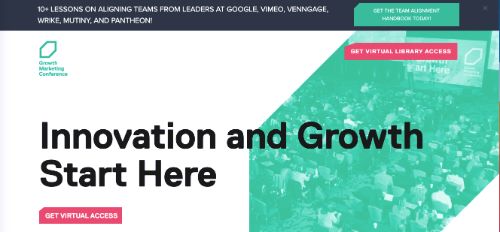
When visiting the homepage for the Growth Marketing Conference, you’ll see a horizontal popup appear at the top of the page. The message promotes their Team Alignment Handbook and includes a link that directs you to an email sign-up form. This is a nice way to introduce timely information to your audience without using a full screen popup.
Why This Strategy Works: A visitor does not need to close the popup to continue browsing and can easily return to it after scrolling.
2. Program a Popup Delay (Moo)
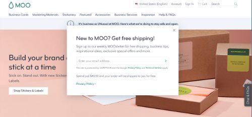
The graphic design and print services company Moo uses a very minimalistic theme for their website. In order to keep things simple, they have programmed a 15-second delay on their popup so it only appears after you have a chance to view all the information above the fold. The popup itself offers free shipping and extras for signing up for the email newsletter.
Why This Strategy Works: Displaying a popup immediately after someone visits a website can be a major distraction that takes away from the site content itself.
3. Hide The Popup Within the Page (Smart Passive Income)
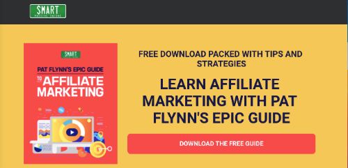
On Pat Flynn’s Smart Passive Income site, there are many useful articles and guides available for visitors. This page is for a downloadable affiliate marketing handbook, and the popup appears after you click on the button labeled “Download The Free Guide.” Designing a popup to appear after a click helps focus the message on the target audience and increase engagement with the form.
Why This Strategy Works: Placing a popup behind a click helps filter out potentially uninterested visitors.
4. Provide An Easy Method For Site Sign-In (Priceline)
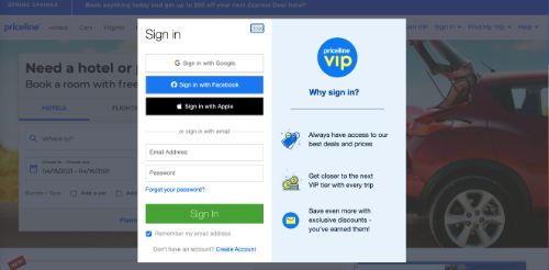
Priceline is a popular resource for finding travel deals on flights, hotels, cars, and cruises. When first visiting their homepage, users will be greeted with a popup notification that gives them the option to sign in to the website using Google Sign-In. The notification is presented on the right side of the page in a small box so it doesn’t distract from the rest of the website content.
Why This Strategy Works: Presenting a quick sign-in option increases the changes that a visitor will do so.
5. Use Geolocation to Personalize the Popup (Decathlon)
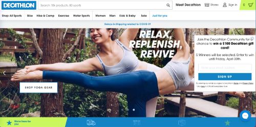
The athletic wear company Decathlon primarily shops their products within the United States. When browsing to their main homepage, visitors will see a popup that directs them to either the U.S. or Canada websites. Anyone who accesses the site from Canada will see a greeting that acknowledges their location and also notes that they can only ship products to the U.S.
Why This Strategy Works: Customizing greetings and information based on a customer’s location is an excellent way to personalize content.
6. Allow Customers to Clarify The Use of Cookies (Visa)
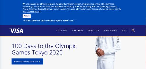
As a financial services company, Visa understands the importance of user privacy and how to handle customer data. The popup that appears after visiting their website allows you to select from specific areas and customize which types of cookies you will allow. This gives you complete control to dictate which information is captured when you browse the Visa website.
Why This Strategy Works: Customers appreciate transparency and the ability to customize their browsing experience.
7. Use a Popup For Age Restricted Products (Budweiser)
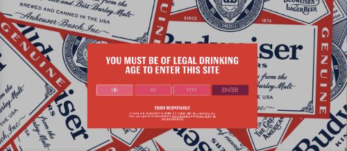
With the legal drinking age being 21 years old in the U.S., companies that sell alcoholic beverages must ask for a person’s birth date before entering the website. This example from Budweiser is seamlessly branded with the company tagline, “Enjoy responsibly,” and has a minimalist design that fits well with the overall website theme.
Why This Strategy Works: A popup is the easiest way to restrict access to website content.
8. Present Your Most Impactful Call-To-Action (MarketMuse)
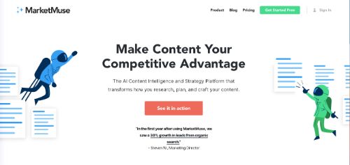
A good website design should make it clear what the business offers and how to find these products and services. One key element that every businesses should integrate is a specific call-to-action (CTA). On the MarketMuse homepage, visitors will see a quick popup with a button that makes it very easy to start an introductory trial with their content planning platform.
Why This Strategy Works: Presenting your most relevant CTA in a popup gives customers an instant opportunity to interact with your offering.
9. Remind Customers To Sign-In (Amazon)
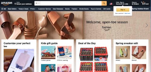
It’s easy for new customers to forget to sign in to a website when returning. This means that their preferences are not displayed, and they will have to sign in later before purchasing any items from their cart. Amazon does an excellent job of reminding customers to sign in by displaying a small popup right below the sign-in button on the main navigation bar.
Why This Strategy Works: To properly collect preferences and customer data, it’s always best to have them sign-in prior to browsing.
10. Allow Visitors to Select a Specific Location (H&M)
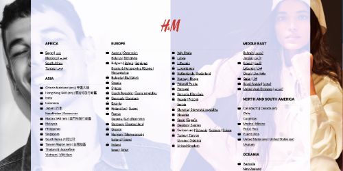
Instead of using geolocation data or assuming where a person is visiting from, H&M presents all locations which they serve. The popup does have relatively small text but shows all locations (over 50) in a single view that is easy to browse. This makes the process of selection easy for visitors from any country and ensures that their content is aligned with the correct region.
Why This Strategy Works: There are many ways to capture customer preferences, and sometimes it’s best to simply ask.
11. Offer a Discount to First-Time Buyers (Revolve)
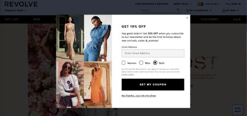
One of the best ways to entice a consumer to make a first purchase with a brand is to offer a special discount. Many companies do this by offering a coupon in exchange for an email sign-up with additional future offers and discounts. Revolve makes this timely offer as a popup as soon as a visitor arrives on the site.
Why This Strategy Works: When a consumer visits a particular brand’s website, they are often looking for something specific and may be interested a discount off a potential first purchase.
12. Use a Banner-Style Popup With Free Shipping And Returns (Under Armour)
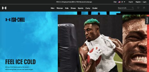
Free shipping has become a powerful offering for many businesses as customers have started to expect it. Under Armour notifies visitors that they will get free shipping and free returns for making their first purchase. This is a simple and effective way to entice someone who many have been undecided to sign up and make a purchase.
Why This Strategy Works: Free shipping is a highly valued perk for consumer product offerings.
13. Present A Delayed Popup To Request a Customer Signup (Platinum Trading Academy)
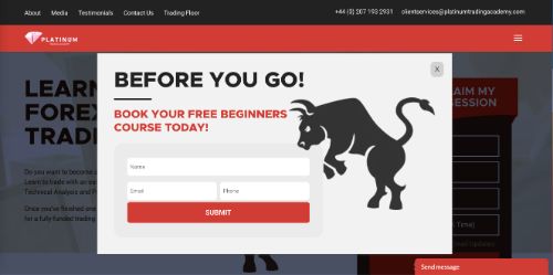
Platinum Trading Academy teaches Forex investment strategies and has a sleek and modern website and landing page. A popup is displayed after 5 or 10 seconds that offers a free beginner’s course and chance to sign up to their email list. It’s a simple message that is easy for visitors to engage with or ignore without distracting much from the browsing experience.
Why This Strategy Works: A visitor may not scroll down to the bottom of your landing page to find an email signup form.
14. Provide an Option to Accept Cookies and Modify Settings (Christy Dawn)
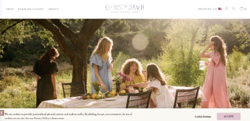
Websites that place a high regard on user privacy and/or those that need to comply with privacy regulations will present an option for visitors to opt-in or out of cookie collection. The Christy Dawn website not only presents this option but also provides an option for viewing more detailed cookie settings. This allows visitors to make a quick selection or adjust more settings if they choose.
Why This Strategy Works: Customers appreciate personalization and transparency when it comes to user privacy.
15. Present a Message That Is Directly Relevant To Your Audience (Smart Blogger)
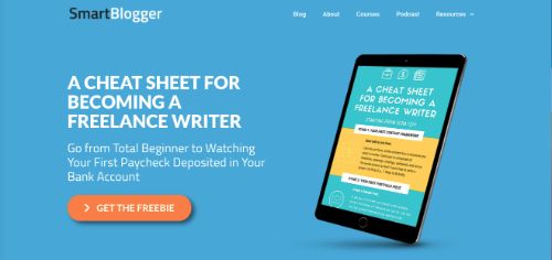
Smart Blogger does a great job of personalizing content to match the interests of their target audience. The popup that appears after entering their website is well designed, with big, bold text that makes it clear what they are offering. A free, downloadable giveaway is an excellent offer to make in exchange for an email address.
Why This Strategy Works: People enjoy free giveaways that they can have access to immediately.
16. Use the Popup As a Navigation Tool (Stuck In Customs)
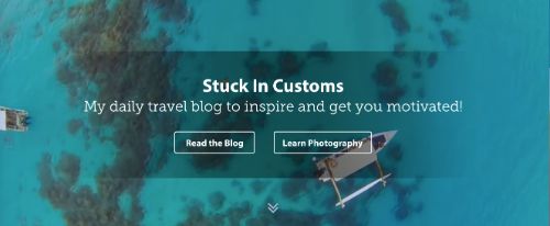
Stuck In Customs is a travel photography site that shares vivid pictures and a ton of great how-to articles and resources. Instead of a traditional popup, the website uses a full-page box that appears above the main navigation bar. This directs customers to enter either the blog or the photography resources by presenting two distinct buttons.
Why This Strategy Works: Directing your audience to targeted content helps increase audience engagement.
17. Offer Free Content In Exchange for Email Signup (National Sewing Circle)
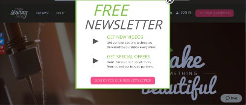
National Sewing Circle brings together a ton of interesting content for those interesting in learning and sharing sewing techniques and designs. Since the site relies on a membership structure, they instantly offer visitors access to their free newsletter through a popup. They mention clearly in the text that this email newsletter includes the latest new content and exclusive discounts.
Why This Strategy Works: Focusing your site content and popups toward a single CTA is an excellent way to succeed.
18. Use a Distinct Popup Background Color (Sleeknote)
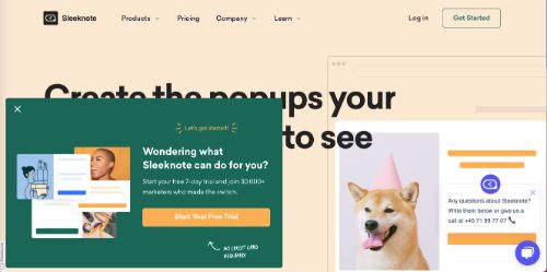
The popup that Sleeknote presents uses a secondary color from the website theme (green) as the background color of the box. This makes it stand out very clearly from the white background. Sleeknote presents its 7-day free trial along with a statement that demonstrates social proof with over 30,000 others who have signed up.
Why This Strategy Works: If a popup blends in too well with your existing theme, visitors may be more likely to close without reading the content.
19. A Disappearing Popup Can Help Direct Navigation (Domino’s)
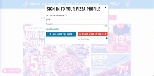
The popup that Domino’s uses on the landing page is simple and effective. After browsing the website, a small box appears below the sign-in button that reminds customers that they can earn rewards points on any order after they sign up and log in. They also mention that the rewards go towards free pizza, which is a tangible and desirable reward for any pizza lover.
Why This Strategy Works: Finding a discrete way to present your urgent information is respectful to customers.
20. Present a Discount Using a Discreet Popup (Chubbies)
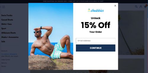
Chubbies sells casual clothing and swimwear to an active audience. This popup use case is similar to the Domino’s example but is directed towards retail purchases involving a discount. With a disappearing popup that appears over the shopping cart icon, the box reminds customers that they can secure a 15% discount and future specials after signing up.
Why This Strategy Works: Discounts are one of the best tools to use for capturing new retail customers.
21. Collect Customer Information (Purina)
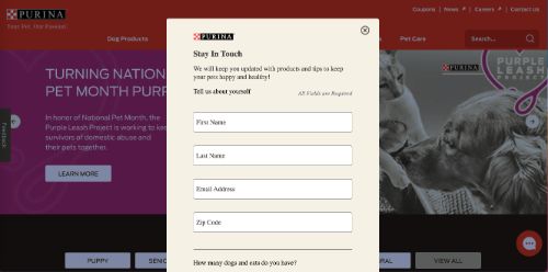
Purina is one of the most popular pet food brands in the world. The popup they use on their website appears immediately upon a first visit and presents a copy of their sign-up form that is located at the bottom of the landing page. This popup is an excellent example because they ask visitors to enter how many cats or dogs they have, which gives the company excellent insights for future messages.
Why This Strategy Works: Learning more about your audience preferences helps you select the most relevant content and offers for each customer.
22. Match A Footer Popup With Your Background Color (Skullcandy)
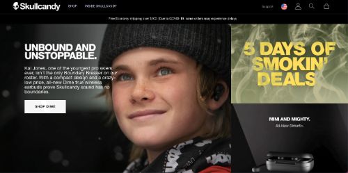
Skullcandy is a popular brand offering headphones and accessories. Their website uses a dark and high-contrast theme with a black background which helps make the text and images more distinct. They utilize header and footer banners to communicate important information without being too intrusive or distracting.
Why This Strategy Works: Integrating popups and banners into your website theme presents a unified brand style.
23. Use A Popup to Segment Customers (HiMama)
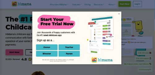
HiMama is a childcare app that caters to parents, teachers, and business owners. Their entry popup presents four buttons and lets customers choose which type of customer they represent. With a clear offer for a free trial, this is a nice way to easily collect customer information with a single click and instantly segment your audience.
Why This Strategy Works: Audience segmentation is one of the best ways to improve targeting and engagement.
24. A Bright Colored Button Can Help Direct Visitors (Pampers)
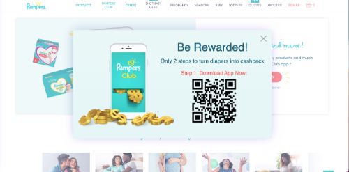
Pampers has become a household name by providing quality diapers and childcare products to families everywhere. They use a simple popup with a white background and a bright red signup button. This makes it very clear where to click if someone is interested in the 10% discount offer.
Why This Strategy Works: A popup form that is not clearly presented is much more likely to be ignored.
25. Direct Visitors to a Specific Offering (Loaded Landscapes)
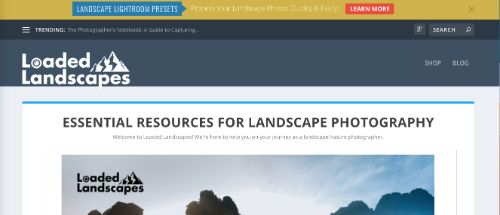
Loaded Landscapes offers photography guides and resources for amateurs and professionals. A major part of their collection is devoted to Adobe Lightroom presets, and visitors to the site are likely to be interested in this content. They use a banner-style header popup to direct any visitors interested in presets to a distinct landing page with a detailed offer.
Why This Strategy Works: Popups that are highly relevant can be used to direct visitors to targeted content.
26. Use a Header Popup That Blends In With Your Landing Page (Sephora)
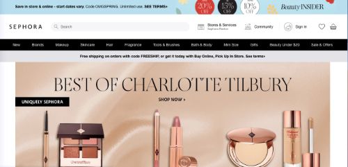
Sephora is a leading provider of cosmetics and beauty products with thousands of products available on their website. Instead of using a standard popup, they present a banner-style header with information regarding a site-wide discount. Continually updating this banner with the latest offering gives new and repeat customers a convenient way to stay informed.
Why This Strategy Works: It’s important to set a clear and expected method of sharing new information with customers.
27. Display An Enticing Photo With Your CTA (Sulky)

Sulky is an embroidery supply company that offers advice and relevant products to customers. The popup that appears on their site includes a noticeable photo of an embroidered item that represents the brand well. These types of reminders help reinforce the value proposition and may increase the level of interest with the presented offer.
Why This Strategy Works: Photos are an excellent way to convey a lot of information in a small space.
28. Request Access To Location Data Using a Popup (McDonald’s)
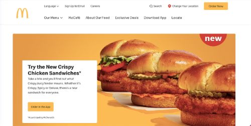
Many websites use location information as a way to target content for each visitor. Especially for large, international businesses like McDonald’s, it’s important to take user privacy seriously. The McDonald’s website uses a small popup that points to the browser as a way to formally ask each person whether the site can use their current location information.
Why This Strategy Works: Transparent user privacy practices should be an important priority for all businesses.
29. Present Offers That Appear When Scrolling (Old Navy)
The clothing chain Old Navy presents a traditional entry popup that offers a discount in exchange for signing up to their email list. In addition to this, they also have a series of “offers” that pop up as a hovering footer when a person scrolls down the page. This allows visitors to notice all the available offers and select one that interests them the most.
Why This Strategy Works: Providing an audience with options is an excellent way to offer product promotions.
30. Ask Your Visitors A Question (Groove HQ)
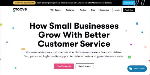
Groove is a customer service platform, and this business operates in a highly competitive industry. The popup banner on their landing page is narrowly targeted at users of the competitive product Zendesk. By asking if these visitors are frustrated with Zendesk, they offer a specific call to action that can be used to capture customers from an existing competitor.
Why This Strategy Works: Asking a question within your popup helps humanize the message and make it more relatable.
31. Include a CAPTCHA Tool in the Popup (Colgate)
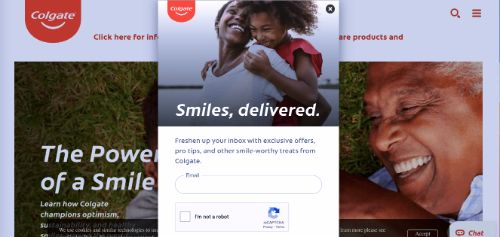
Especially for large companies, such as the dental product company Colgate, it’s important to protect your website with advanced security practices. They have integrated a CAPTCHA tool in their popup to prevent automated bots from filling out the form. This can be a useful tool to use on a popup or any form embedded in a website.
Why This Strategy Works: A CAPTCHA tool helps maintain site security and data quality.
32. Present a Question With Multiple Choices (Neil Patel)
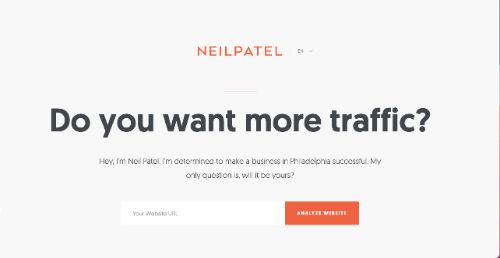
Neil Patel is an SEO and digital marketing expert who has an engaging website. His theme uses a distinct orange color and white background to really stand out from other websites. When entering the site, you’ll notice a small popup in the lower right corner that asks if you are interested in generating more traffic from Google, a simple and relevant question for his audience.
Why This Strategy Works: Giving customers a choice to declare their interest is an effective way to encourage sign-ups.
33. Require a Sign-in To View Locked Content (Pinterest)
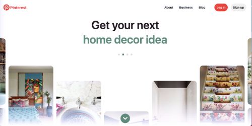
Pinterest has become a massive social media platform where users collect images and “pin” them to custom boards. If visiting the site for the first time, a popup appears that asks you to sign in before accessing any content. By requiring a user account to access the site, they can increase their subscriber base and capitalize on the interest of new visitors.
Why This Strategy Works: Making content exclusive helps engage highly interested and relevant customers.
34. Use a Specific Phrase For a Negative Response (Gear Moose)
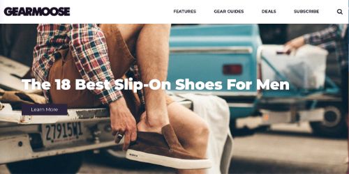
The Gear Moose website curates products and posts that are targeted at men of all ages. There is a simple popup that appears and asks visitors to subscribe to the email newsletter. They use the phrase “No thanks, I don’t like awesome gear” as the negative response as a way to remind potential customers that they will be missing some great product ideas if they don’t sign up.
Why This Strategy Works: A carefully worded negative phrase can remind a customer why they should sign up.
35. Present a Limited Time Offer (Anthropologie)
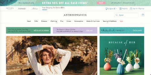
The women’s clothing store Anthropologie uses limited-time offers to keep new and existing customers engaged. This is especially important for clothing brands that offer a constantly changing product line that evolves with the seasons. Their popup banner clearly mentions that the current discount offer is good for a limited time only.
Why This Strategy Works: Limited time offers help increase the sense of urgency.
36. Use a Countdown to Generate a Sense of Urgency (Convince & Convert)
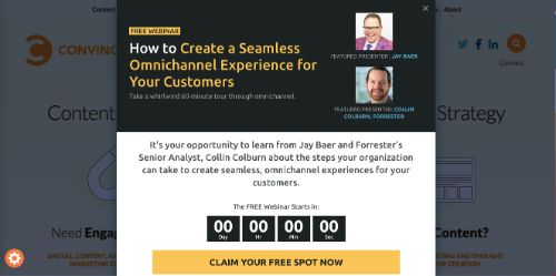
The team at Convince and Convert are experts in content marketing and use their website to highlight some of their proven techniques. This popup, which markets an upcoming free webinar, includes a countdown. Embedding a timer like this can help customers clearly understand that the event or offer is for a very limited time only.
Why This Strategy Works: A countdown is a highly visual and engaging way to promote events and limited offers.
37. Use A Full-Page Popup That Requires Attention (Shinesty)
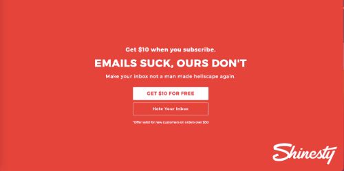
Shinesty is an edgy brand that sells underwear for men and women. This full-page popup that appears on their website takes up the entire screen and demands some action in order to clear it. Using such a bold format fits well with this particular brand and can be a helpful way to present truly unique offers or special events.
Why This Strategy Works: A full-page popup is one of the most noticeable formats you can use.
38. Allow Visitors To Choose Which Products Interest Them (Frank & Oak)
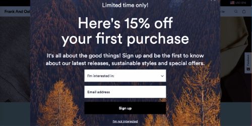
The clothing brand Frank & Oak sells both men’s and women’s fashion styles through their website and stores. When their popup appears, it asks visitors to choose between men’s or women’s styles. This helps direct each person to the landing page that is most relevant to the clothing that they are most likely to buy.
Why This Strategy Works: A popup offers a quick way to direct customers to content that most interests them.
39. Use Icons To Make Selections Easier (Wag)
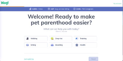
The dog walking service platform Wag has a friendly and inviting website. A popup appears soon after arriving on the main page and guides visitors through a series of questions to help direct them to the right services. They use icons for many of the selections such as “walking” and “training” to help people quickly find the ones that match with their needs.
Why This Strategy Works: Icons can be recognized very quickly without the need to scroll through text.
40. Make It Clear What Customers Will Receive (Danielle LaPorte)
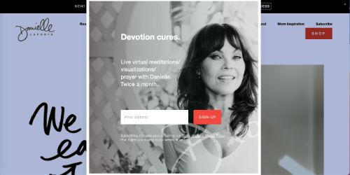
Danielle LaPorte is a meditation expert and wellness influencer with an active group of followers. The popup that appears to collect an email signup for her newsletter does an excellent job of making it clear what people will get. She offers live virtual meditations twice per month for those who join her mailing list.
Why This Strategy Works: Most customers expect something of value in exchange for sharing their email address.
41. Direct Visitors With Clear Instructions (Southwest)
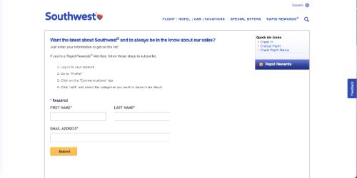
Southwest Airlines has a basic website that aims to make travel as easy as possible. Their email signup form appears as a popup and informs existing “Rapid Rewards” customers that they can sign up for offers through their account preferences. By providing clear instructions directly in the form, they help direct their most valuable customers to these offers.
Why This Strategy Works: It’s important to consider how new and existing customers will interact with your popups.
42. Keep The Popup Design As Simple As Possible (Dodo Case)
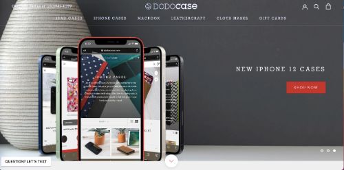
Dodo Case provides premium iPhone, iPad, and Macbook cases through their website. They refer to their email newsletter as “The Nest” and offer a 15% discount off of an order for joining. They use only 11 words for the entire form, including the navigation buttons, which reduces any clutter and presents a simple and effective CTA.
Why This Strategy Works: Customers don’t want to read through a lot of text or content in a popup.
43. Ask For Relevant Customer Data (Zoosk)
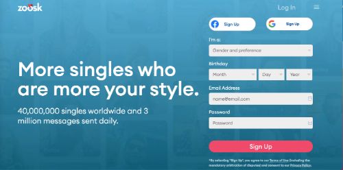
Zoosk is an online dating site that is available in 80 different countries. Customer data is a critical part of their business model as they seek to provide a useful platform to connect people. Their popup form asks for some basic information right from the start which streamlines their new customer onboarding process significantly.
Why This Strategy Works: Collecting customer information early on gives a business more time to personalize content.
44. Offer Free Delivery For New Customers (Grubhub)
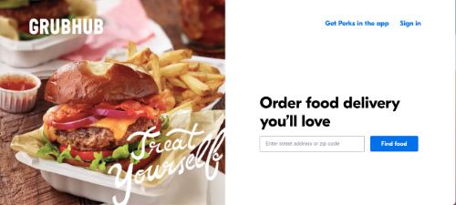
The food delivery service Grubhub must find innovate ways to attract new users to their platform. This popup offer uses a direct cash amount instead of a percent discount. The offer of $10 off an order of $15 or more is a tremendous value that is hard for any interested party to pass up when considering a first-time purchase.
Why This Strategy Works: Seek to offer your best values for first-time customers to attract new business.
45. Direct Customers To The Shopping Screen (Southtree)
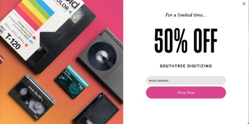
Southtree provides digitization and media conversion services. They are well aware that the majority of customer activity will take place from their homepage, and they’ve embedded their header popup above the main navigation bar. This makes it very noticeable but does not block any of the other website content.
Why This Strategy Works: It’s best to tailor your popup style to the preferences and habits of your audience.
46. Make It Easy For Existing Customers To Navigate The Popup (Tobi)
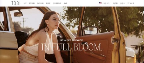
The women’s clothing brand Tobi uses a popup effectively by having it appear only after scrolling through the landing page content. This gives customers a chance to view some of the clothing and get a little familiar with the site before interacting with the popup. In some cases, this is a great way to give customers time to see the quality and value of your products.
Why This Strategy Works: Customers are more likely to engage with an offer if they understand the value they are getting.
47. Choose a Design that Embodies Your Brand (Bruno Magli)
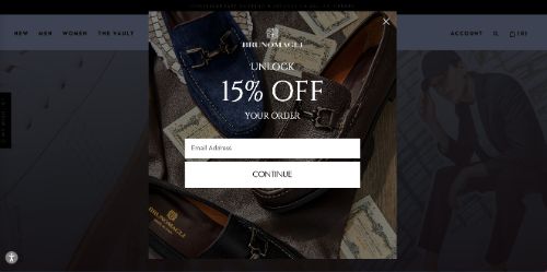
Bruno Magli is a popular luxury clothing brand with an elegant website. Their popup is simple and includes a nice photo of one of their flagship products. They feature some excellent high-quality photography throughout their website, and it’s important for them to leverage this in their individual popup message.
Why This Strategy Works: It’s always best to present your most impressive media and branding elements to grab visitors’ attention.
48. Use a PopUp That Embeds In Your Existing Banner (The New Yorker)
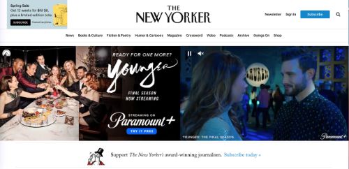
World-famous publications like the New Yorker may get plenty of website traffic, but that doesn’t mean that they don’t need popups to support and direct their readers. This clever pop up actually embeds itself in the main banner so that visitors can see the current deals or news from the publication as they navigate the website.
Why This Strategy Works: Ultimately, it’s a non-intrusive, yet efficient way to send messages to website visitors, without overwhelming them with screen-sized pop ups.
49. Offer a Free Giveaway For Signups (Practical E-Commerce)
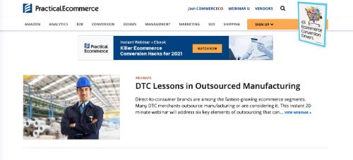
Free giveaways are one of the oldest and most established marketing strategies for collecting potential customer information. This information provides a method for contact, as well as smoother intake processes down the road. Practical E-Commerce uses a small, colorful pop up to communicate the free giveaway in exchange for visitors’ email addresses.
Why This Strategy Works: Information collection is usually met a lot more enthusiastically when paired with a generous giveaway.
50. Make Your Offer Sound Exclusive (Timberland)
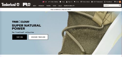
Timberland, maker of iconic boots, uses top-notch copywriting to make the website visitor feel “in the know.” This popup urges users to “Get on our list,” a tactic that conjures up visions of exclusivity. It may just be an email list, but it’s a hip-sounding one, just the same.
Why This Strategy Works: This strategy gives visitors an “in the know” experience that also facilitates e-mail address collection.
Ready to get started implementing your popup ads strategy? The POWR website popup builder is now available to publishers directly through the ShareThis platform, allowing you to create engaging popup ads in minutes. Whether your aim is to boost sales, grow your email list, or something else, the POWR website popup builder offers easy-to-use templates so you can create visually stunning and engaging popups with ease.