You’ve probably learned by now that share buttons can do wonders for your site traffic and SEO, and maybe you’ve even started to incorporate them into your site’s layout – but how do you know where exactly to put them? Should they be rounded or square? Big or small?
The answers to these questions are, of course, unique to your site, but we wanted to lend a few tips and showcase some of our favorite examples. We love these sites because they’re taking advantage of everything ShareThis share buttons have to offer, and making them work for their site’s needs in powerful, creative, and sometimes surprising ways.
So, what exactly should you do with those share buttons?
1. Put share buttons next to what you’re selling.
If you’re building an online store, you want visitors to not only make purchases, but also share your products with their networks to help spread the word and build a robust customer base.
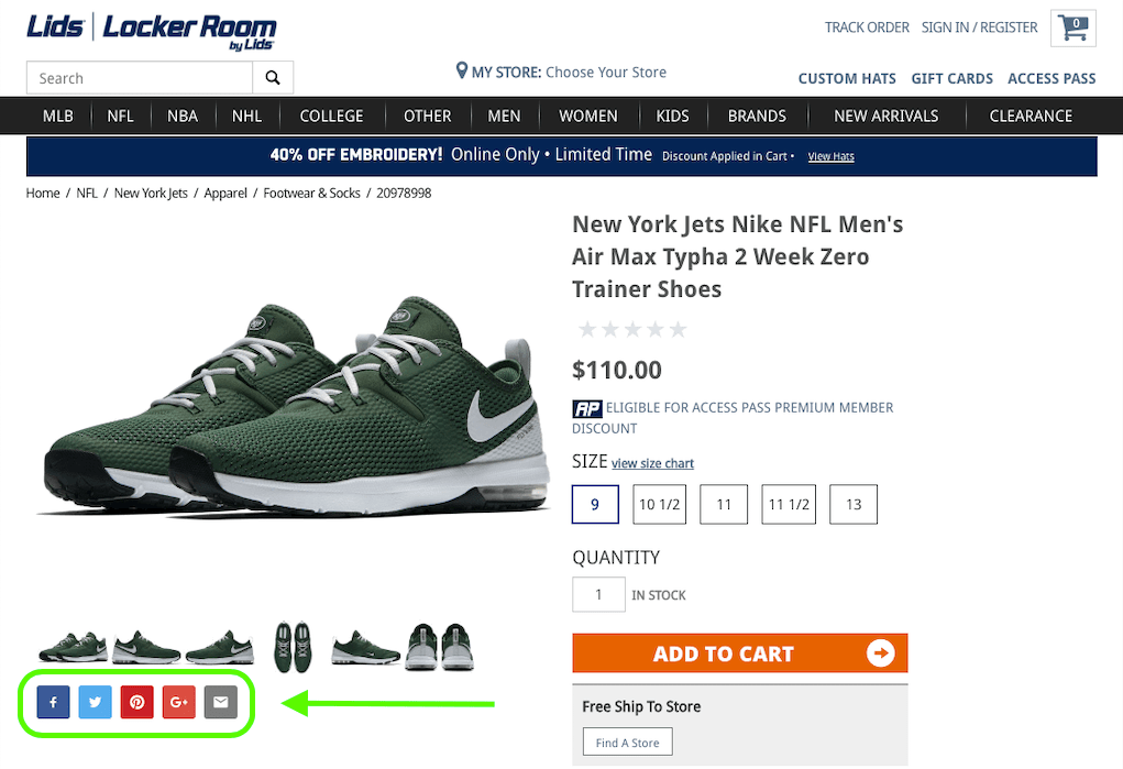
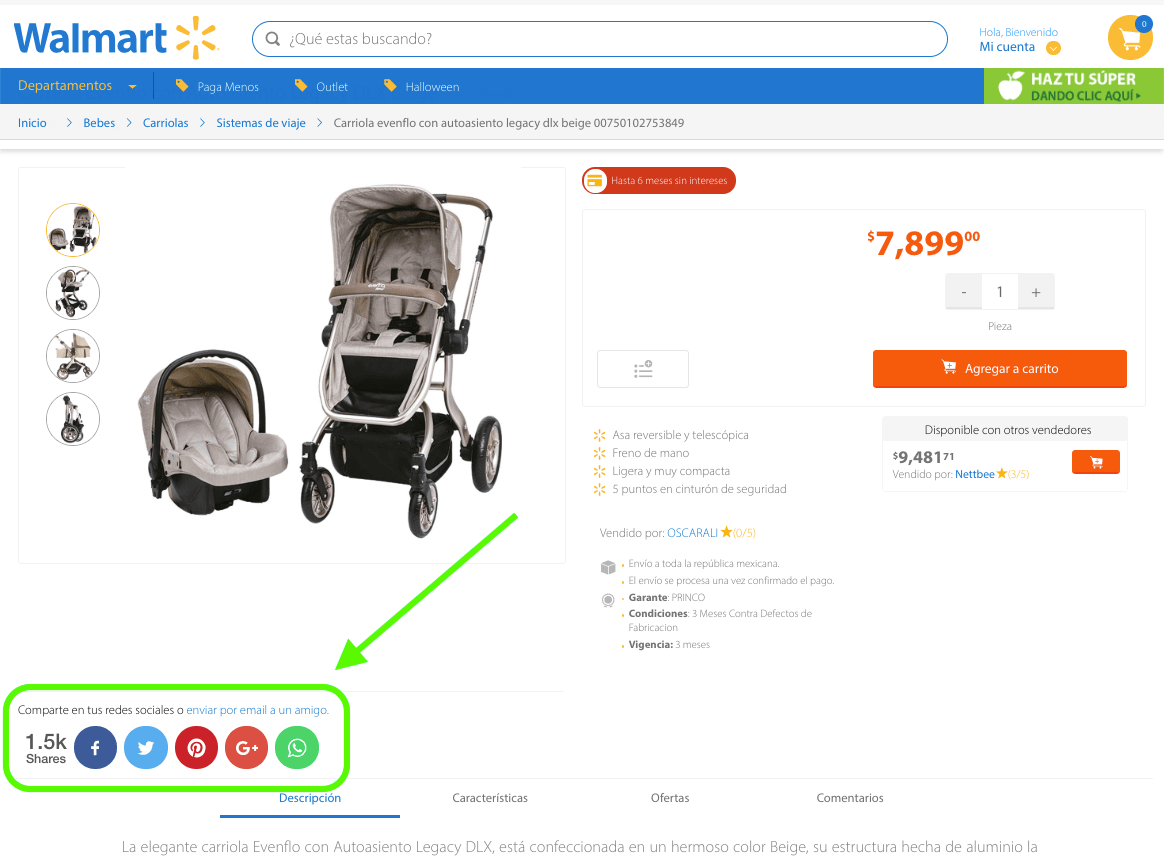
For both Lids and Walmart Mexico, the inline share buttons sit directly beneath the product image, tapping into a customer’s immediate visual instincts. Notice that Walmart has chosen to include the ‘share’ count, which helps gives the impression that this is a hot item that is already making waves across sharing channels.
2. Put share buttons right at the top of your article.
Sometimes a headline is enough to get a reader to share a piece of content. Publisher sites tend to place share buttons below the header, but before the content of the article (aka ‘above the fold’).
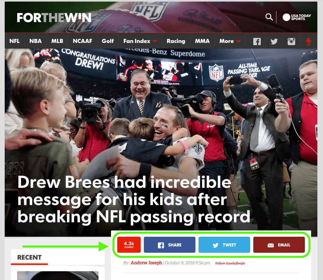
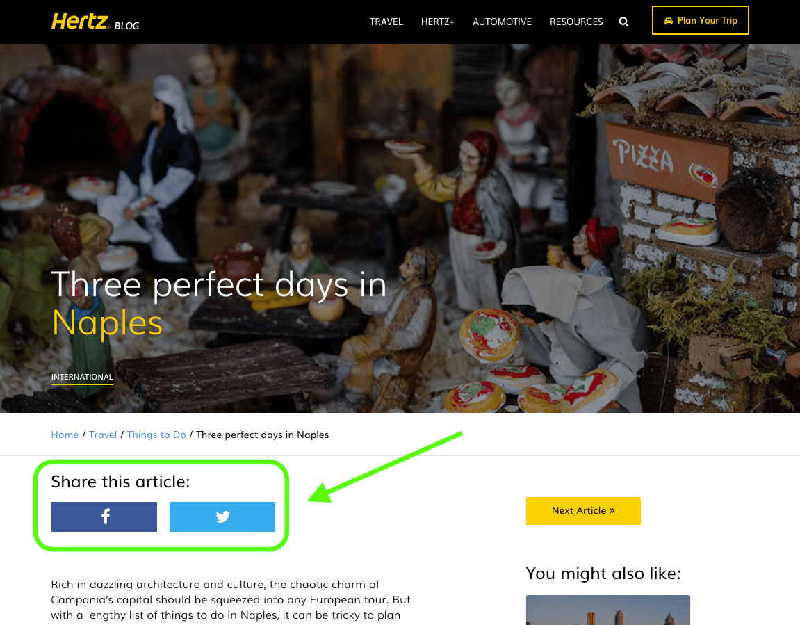
To ensure maximum shareability, USA Today Sports and Hertz have embedded inline share buttons at the beginning of each article. They have also added explicit calls to action so that readers know that the tools to “share this article” (or “tweet” or “email”) are right at their fingertips.
3. Add share buttons to the bottom of your article, too.
These are, perhaps, the most intuitive share buttons: if a reader is interested enough to make it all the way to the end of your article, they’re even more likely to want to share it. Even if you’ve already put share buttons above the fold, you might want to consider adding share buttons to the end of your article.
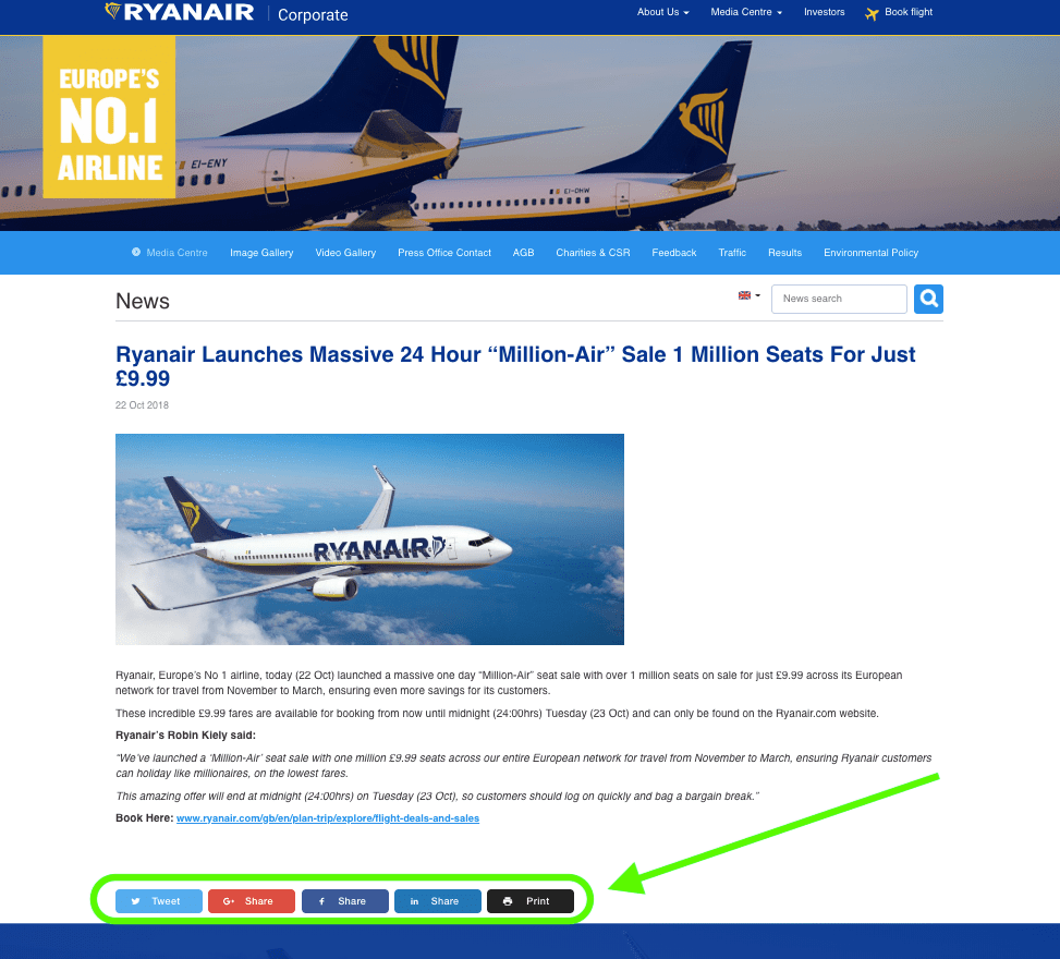
Putting buttons at the bottom of an article works especially well with short notices (brief press releases, quick news bytes, etc.) where the user can see the headline, image, content, and share buttons all at once, as in RyanAir’s Million-Air sale announcement.
4. Keep share buttons tethered to the side of the page.
If you’re a savvy site owner, you know that your visitors like to click and scroll from one corner of your site to another.
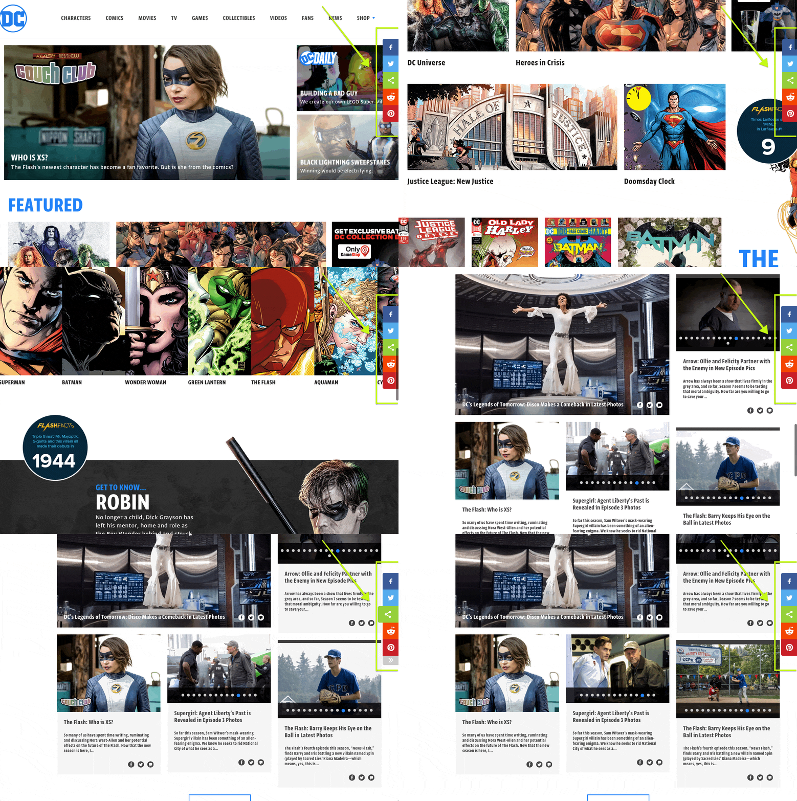
Sure, strategically placed inline share buttons work great for articles and products, but the consistent visibility of sticky share buttons can work great on a homepage, like DC Comics does, or any kind of page with a wide array of content in one place, like ET’s articles, which fluctuate between text, images, social media posts, and links.

5. Customize share buttons to blend in with your site.
Streamlined user experience and a uniform aesthetic have become the expectation for online users, so it’s no surprise that site owners have found ways to incorporate share buttons into seamless web design.
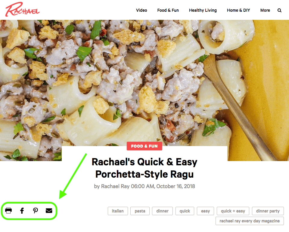
For sites that are highly visual, like Rachael Ray recipes that put high res food images front and center, the visual content should be the focus. Here you can see the customized black & white share buttons, which ensure the colors and images really pop.
Bonus tip here: choose share buttons that make sense for your content – for example, recipe readers might want to print and try it out before sharing on social media.
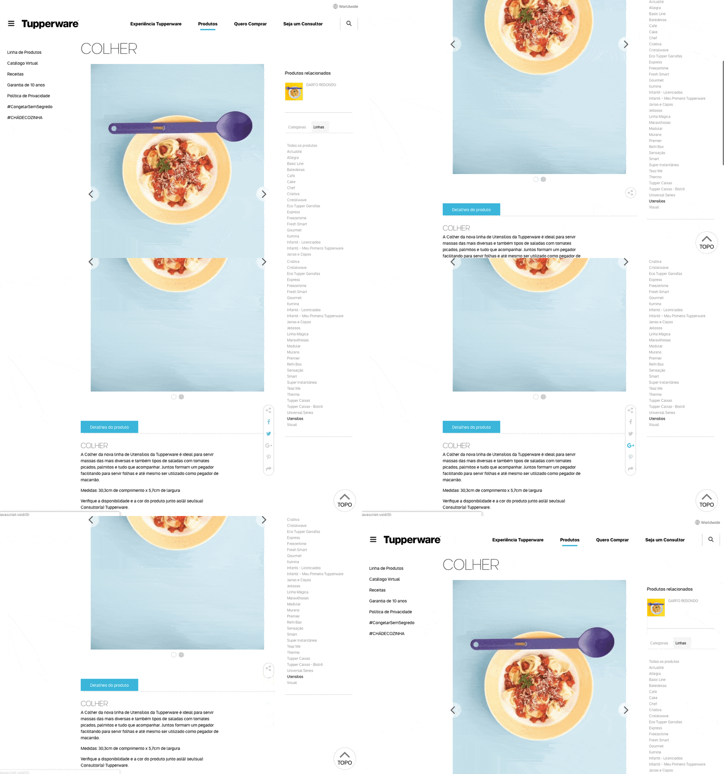
Going one step further, Tupperware share buttons are fully designed to match the clean minimalism of the site. When scrolling, the user only sees the standard share icon, but if they are inclined to share, they can hover over the icon to discover even more sharing options at their disposal.
Whether you want to encourage your users to share product listings, news articles, or blog posts, share buttons are the simplest way to let your site grow organically. And when it comes to the where and how, the possibilities are endless, so click below to get started with share buttons and let your imagination roam!


