Today’s websites display different forms of advertising, like pop-up ads, in-feed ads, and video ads. And then there are the traditional banner ads that display along the top, side, or bottom of a website. These ads are probably the most common to see around the web, yet there’s still a lot of mystery surrounding them. Are they still effective, or have we come to almost ignore them as we scroll through a site?
What are Banner Ads?
A banner ad is a visual graphic ad that’s rectangular, although it can come in a wide range of sizes to fit each website. Most commonly, banner ads display on top of a site’s header, along the footer, or in the sidebar of a website. However, some sites have banner ads in other places, like the top of blog posts, depending on the site’s layout.
The banner ad’s primary goal is to quickly grab a viewer’s attention through a strategic mix of imagery and text. Typically, banner ads have minimal text and an eye-catching photo that immediately tells viewers the purpose of the ad.
Banner Ads: Best Practices
If you’re interested in using banner ads for your brand’s advertising, follow along with these tips and best practices to make yours stand out.
Banner Ad Sizes
When displayed vertically, the banner ad is called a skyscraper ad, while horizontal banner ads are called leaderboard ads. There are also rectangular ads that are only slightly longer than they are wide, or vice versa. Billboard ads are banners that stretch across the full width of a site and are generally longer than traditional leaderboard ads.
There’s no right or wrong size for a banner ad, but there are many sizes you’ll need to decide on. It’s best to create banner ads in several skyscraper and leaderboard sizes to appeal to a wider variety of advertising platforms and website owners.
Google Ads, for example, allows website owners to choose optimized ads, which automatically finds ads that will fit the best within their ad spaces. Formatting your ad to different sizes makes for more potential options when placing those ads using advertising networks.
Some of the most popular banner ad sizes for websites are 300×250, 336×280, 728×90, 160×600, 120×600, and 300×600. You should also consider making some mobile-friendly ads to display on mobile devices. Common sizes for mobile banners include 320×50, 320×320, 250×250, and 320×100.
Banner Ad Branding
Banner ads need to show off your brand in a small amount of space, so it’s necessary to spend time planning and designing them to be an excellent visual representation of your brand. Does your banner ad include your logo and display your values?
This ad from Bayer is a worthy example. Even if you don’t know what Bayer does, you can figure it out from the ad. Using clues from the ad, you can conclude that the company relates to science and health, and its text entices viewers to learn how it’s advancing them.
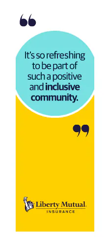
And then there’s this one from Liberty Mutual. Notice that it’s incredibly simple, yet it still manages to give you a sense of its company culture with the inclusion of one impactful quote.
Banner Ad Placement
Banner ads can fit into numerous spots on a website, and it’s ultimately the website owner that decides where they go. For example, Only In Your State has an advertising area in its sidebar, like many sites do. These are usually stationary, so that when a user scrolls down, the banner doesn’t remain in view. However, this one scrolls down as the user scrolls, making it stay in view and likelier to get noticed.
If you work directly with a website to place ads, you have more control over where they go than if you use an ad network. What’s more important to focus on is what audiences you target for placement, especially if you use an ad network. Make sure the people who will see your ads are ones that will be interested in your ads.
Banner Ad Visuals
Banner ads are perfect blends of imagery and text. They grab attention with their visuals and use text appropriately to get the message across. This banner ad for The Home Depot is just about as creative as they come, using imagery within its text to let you know what the store is all about.
Your ad should look clean and professional, so be sure to use only high-quality images that are clear, crisp, and sized properly for your ad. Also, use an image that doesn’t drown out your text. You might even make one half of your ad a solid color under your text, and the other half an image, like Purdue University Global does.
Banner Ad Text
You have limited space to say what you want to say on a banner ad, so concision is key, but so is clarity. Your ad should state its purpose in just a few words, like this ad for Pipedrive.
It clearly tells viewers what they can expect from the service without even mentioning its name. Doing so leaves a little bit of mystery in wanting to find out what company is behind it. That coupled with the simple, clear call-to-action (CTA), ‘Try it free’, lets the audience know exactly what they should do with the ad — click it and get a free trial.
The best way to know what kind of banner ads will work best for your business is to design several and test them. Play around with different designs, CTAs, placements, and targeting, to narrow your options to a few solid ads that get attention.
If you’re running a banner advertising campaign that relies on consumer data, such as retargeting campaigns to show ads to website visitors who didn’t complete a checkout, you’ll want to be sure that you’re complying with all relevant data privacy regulations. The ShareThis Consent Management Platform makes it easy to collect and manage your website visitors’ consent, which not only aids you in maintaining compliance but also helps to build trust with your visitors.


