Last month, we released a new, visual share button design tool. It allows publishers like you to design a perfect set of share button in just a few clicks. Since launching the new tool, thousands of publishers deployed fresh new share buttons to their sites. While every publisher has distinct needs and styles, we do see certain patterns emerging. Sticky buttons or inline buttons? Call to action labels or counts? Rounded or square? Let’s break down the numbers.
Inline Buttons
70%
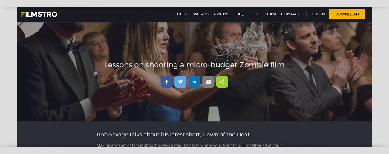
70% of publishers prefer their buttons inline.
Labels: Call to action
60%
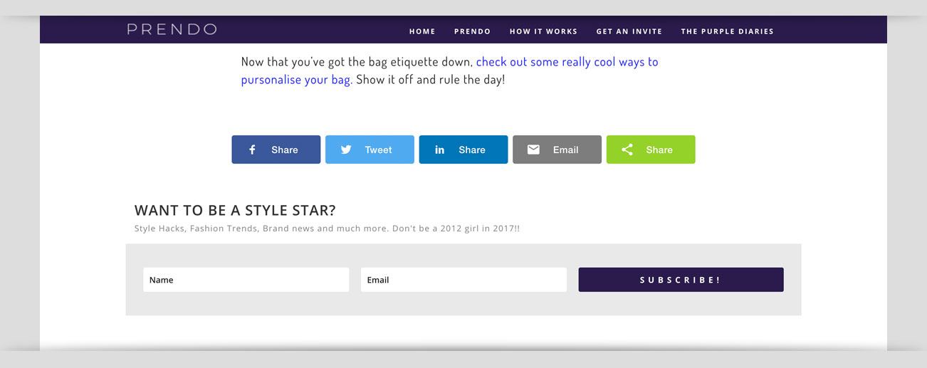
60% of publishers prefer a call to action label on their button (Share, Tweet, Email), rather than individual share counts, or no label at all. If you don’t use the call to action label option, we highly recommend you add a small call to action next to your buttons on the page – it will increase engagement with your buttons!
Labels: Show total count
70%
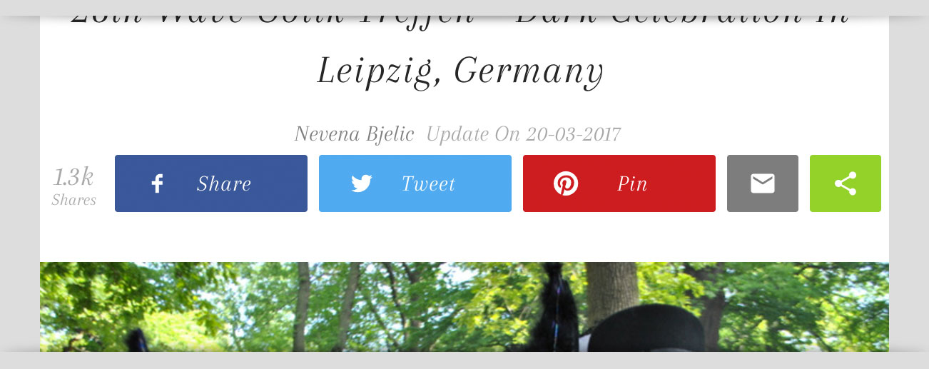
70% of publishers like to show their total share counts. We get it, when you’ve got it, flaunt it! You can also easily configure share counts to only display once a certain number of shares has been reached.
Sticky Buttons: Left alignment
85%

85% of publishers use sticky share buttons on the left side of the screen. Left has never felt so right.
Size: Small & medium
94%
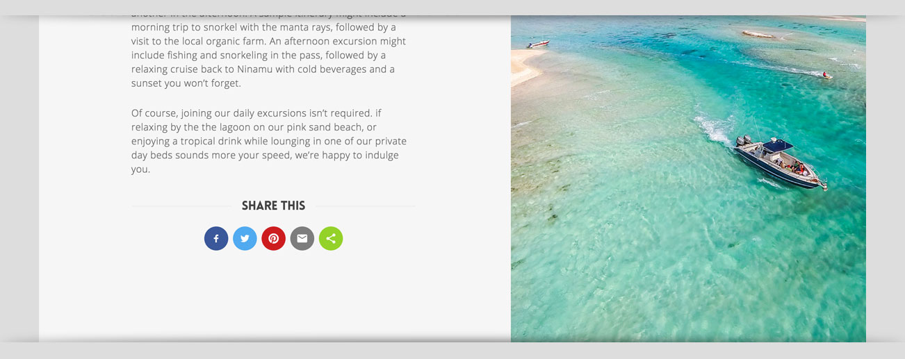
94% of publishers opted to use small or medium inline share buttons. Sorry, large buttons. Maybe the trends will swing your way in the future.
Corner radius: Rounded corners
95%
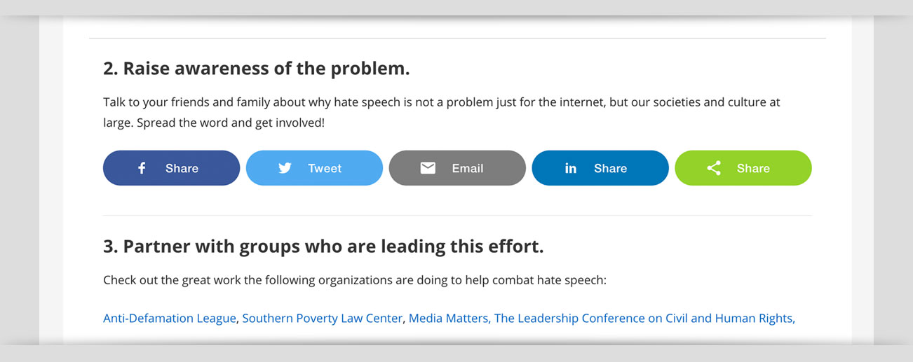
Very few publishers have opted for squared-off buttons: 95% of all publishers use some sort of rounding, with 35% of pubs fully rounding off their sticky buttons. Only 6% fully round off their inline buttons.


