
Landing pages have become a standard format for capturing web traffic and converting visitors into buyers. Created for marketing or advertising campaigns, they serve as standalone web pages that visitors land on after clicking on a link in an ad, email, or from another location on the web. They’re different from your website home page in that while your home page is a broad, general entry point for visitors, landing pages are designed to entice visitors to take advantage of a specific offer, such as signing up for a newsletter, purchasing a product, or downloading an ebook.
Because you might be using several offers for your marketing and advertising campaigns, you should have several landing pages as well: a distinct page targeted specifically to each unique offer. By creating landing pages for each offer, you can cater the content to the target audience and craft the page design and content around the offer, so when visitors land on the page from elsewhere on the web, it’s immediately clear that they’re in the right place. It takes time and effort to develop an effective page design, and the approach must often be tailored to the needs of your target audience. When landing pages are properly tested and targeted effectively, they can increase conversion rates by more than 300%.
In this post we’ve collected 50 excellent landing page examples to help you find ideas for your own marketing needs and learn best practices for effective landing page design. We’ve also included some unique examples for very specific purposes, such as promoting a webinar. One of the best ways to improve your landing page effectiveness is to test new ideas and choose the options that perform the best. Note that the landing page examples below are listed in alphabetical order but otherwise aren’t ranked or rated in any way.
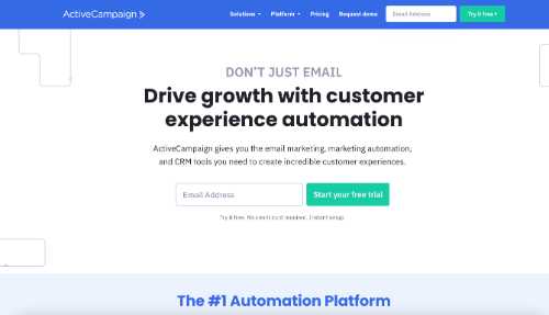
ActiveCampaign is an email marketing platform that includes additional features such as a fully-functional CRM. The main landing page of the website has a clear CTA that promotes a free trial with no requirement for sharing credit card information. Browsing through the page explains how the software works, and the same CTA button appears several more times throughout the page for easy access when visitors are convinced to click.
Why It Works: Each landing page should present a clear and easy-to-access call to action.
2. Airbnb
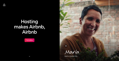
Airbnb has revolutionized the accommodation industry by connecting homeowners who want to rent their properties with guests looking for accommodations. This landing page targets hosts and presents photos and testimonials from several real hosts from various locations around the world. By giving the page a personal feel, Airbnb helps potential hosts to realize the benefits of joining the service and presents a CTA button for interacting directly with other superhosts to learn more.
Why It Works: A landing page that is specifically tailored to the preferences of your target audience is likely to get more engagement.
3. Asana
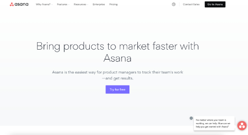
The team collaboration platform Asana is designed to help employees perform their tasks faster and manage complex projects involving multiple participants and tasks. This landing page was designed for product managers and presents several benefits for product management that is likely to resonate with this group. They also present several different CTA buttons that give viewers options for learning the kind of information they are interested in.
Why it Works: Multiple CTA buttons can be used to direct visitors to different resources depending upon their interests and needs.
4. AWeber
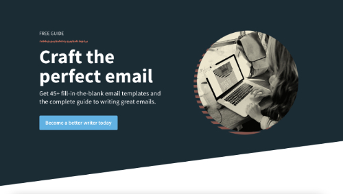
AWeber is an email marketing platform that’s optimized for small businesses. Writing quality content is a must for email marketing success, and this landing page presents a free guide with more than 45 customizable email templates. This is an excellent strategy for the target audience that is likely to receive more clicks and email signups.
Why It Works: Your target audience is more likely to take advantage of a giveaway if it is directly relevant to their life or work.
5. Basecamp
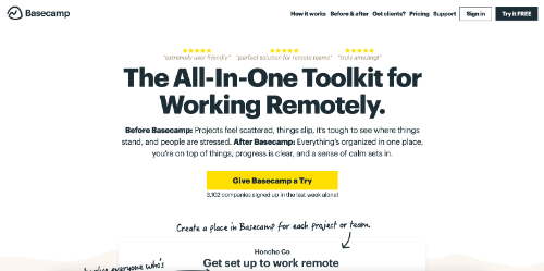
Basecamp is a project management and collaboration platform for today’s remote teams. This landing page uses casual language such as “Give Basecamp a Try,” which makes the site more accessible to visitors from all backgrounds and levels of experience. The page also uses a white background that makes the bold yellow CTA buttons really stand out.
Why It Works: CTA buttons should stand out from the background color and other landing page elements.
6. Blue Apron

The meal delivery service Blue Apron provides healthy ingredients and recipes that meet specific dietary needs. This landing page encourages visitors to view the available meal plans or enter an email address to join the mailing list. It’s a simple and relatively short landing page that effectively targets new customers who are interesting in learning more.
Why It Works: A message that is clearly presented is more likely to be understood as intended.
7. ClickUp
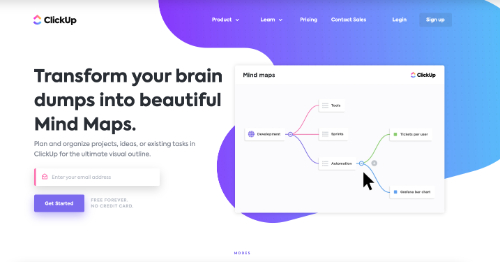
ClickUp is a team productivity software platform that comes with a free version for personal use and many subscription plans for teams of all sizes. One unique feature of ClickUp is a mind map creator that is featured on this landing page. The layout follows a standard content flow with clear visuals that describe how the mind map tool works.
Why It Works: Using a traditional and proven landing page layout is a great place to start.
8. Codecademy
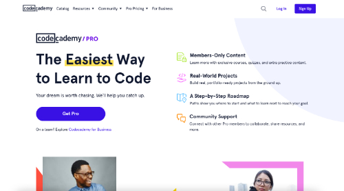
This landing page from Codecademy is part of the company’s marketing effort to capture signups for their membership. The page has a simple white background and uses a dark-colored element at the very end where the main CTA button is displayed. This helps draw attention to this area, which is displayed right after the plan pricing is presented.
Why It Works: Carefully using color can make a landing page more engaging and help improve click-through rates.
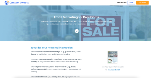
Constant Contact is a popular email marketing platform used in a variety of different industries. This landing page targets the real estate market and describes specific points of value for professionals in this space. With a simple design and nice use of bold text headers, this landing page quickly presents a value proposition and offers a free trial.
Why It Works: A highly targeted landing page is an excellent way to present a relevant message to a specific group.
10. Deliveroo
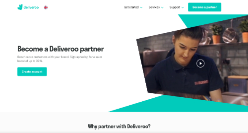
Deliveroo is a UK-based food delivery service that’s now available in several locations around the world. The company relies on restaurants to join the platform, and this landing page explains the easy signup process and benefits of joining. An FAQ is included at the bottom of the page to help address common concerns that may be preventing someone from becoming a partner.
Why It Works: Placing a CTA button in the header allows a reader to click at any time while browsing.
11. Digital Marketer
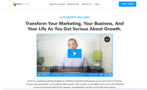
Digital Marketer is a digital marketing community that provides a variety of products and services. One of their core offerings is coaching, and this lengthy landing page talks about how the program works, who is involved, and how a company can get started. It provides enough information on a single page to allow for a detailed review to convince visitors to apply.
Why It Works: The length of a landing page is less important than the relevance and value of information provided.
12. DoorDash
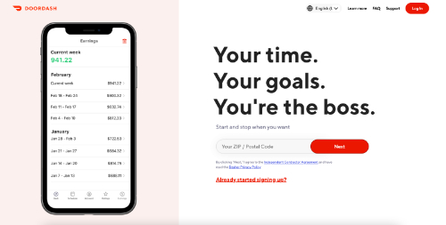
The delivery service DoorDash calls its delivery employees Dashers and is always marketing for new signups. This landing page shares the benefits of joining, how the service works for Dashers, and answers to many common questions. The webform only asks for a zip code to start the signup process and uses a CTA that simply says “Next.”
Why It Works: Requesting minimal information through a landing page form can boost engagement and conversions.
13. Dropbox
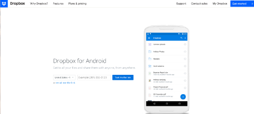
Dropbox is a file storage and document collaboration platform that includes a web-based interface and dedicated apps for major desktop and mobile device operating systems. Android users who are searching for the Dropbox app are likely to be routed to this landing page, where they’re presented with a simple signup form that requires only a phone number. Users will then receive a text and can immediately download the app to their device.
Why It Works: A straightforward landing page is often the best option for highly targeted leads.
14. Edupath

This landing page from Edupath is a very effective format for the audience of students and parents that the company is marketing to. Targeted specifically for parents, this specific page uses bold colors, a nice summary of features, and an easy-to-read signup form. The content also clearly states that Edupath is the only full-service, remote SAT and ACT test prep resource, highlighting one of the company’s key selling points.
Why It Works: Highlight key competitive differentiators and advantages to boost conversions.
15. Epicurrence

Epicurrence is a community-designed personal growth conference that takes place over 4 days. The organizers present this event on this landing page as a unique opportunity to engage in outdoor activities, networking events, and creative discussions. They do a great job with the branding and make a point to clarify COVID-19 policies for upcoming events.
Why It Works: Landing pages designed for creatives should take special care with logos, page layout, and colors.
16. GetResponse
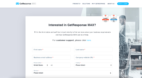
GetResponse Max is an enterprise marketing suite with advanced tools for managing customer support. As a company that really understands the needs of customer support, GetReponse has customized its contact page to include a standard intake form and an additional link for customer support. This helps direct customers who need assistance to the right support resources without additional browsing.
Why It Works: A minimalist design works great for landing pages that focus on sharing and capturing contact information.
17. Hootsuite
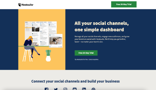
The social media management platform Hootsuite offers a free 30-day trial, which is the offer promoted on this landing page. You’ll notice that this landing page has a simple design with muted colors and a minimal amount of text. There are 4 different CTA buttons that present the 30-day free trial offer, and a popup is also included that sweetens the deal with a 60-day free trial offer to capture visitors who may be hesitating.
Why It Works: A popup can be an effective landing page tool to capture additional customers who may be undecided.
18. HubSpot
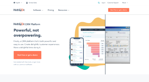
HubSpot is a popular CRM that offers a powerful free version to get started. As you can see on this landing page, the primary CTA button offers visitors the free version or a demo of the premium software program. When visitors scroll below the fold they’ll see details about the free and premium offerings, including some of the most popular features.
Why It Works: Customers may visit your site for either free or premium features, so it may be helpful to feature both.
19. IBM
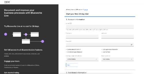
IBM Blueworks Live is a business process modeler that is part of the SmartCloud suite. This landing page directs traffic directly to a signup form that includes a bulleted list of benefits and a few fields for visitors to fill in. The form makes it clear that you can receive a 30-day free trial, and the web form is the main focus of the entire page.
Why It Works: Presenting only a web form and minimal text can help entice visitors to complete the form.
20. Intercom
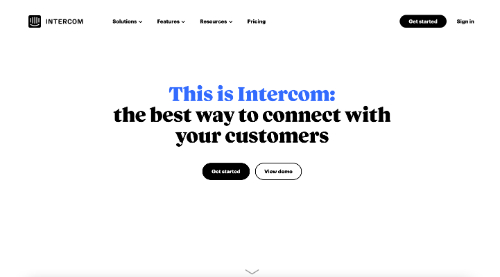
The main landing page of Intercom’s website has a clear goal of acquiring email newsletter signups. With dynamic animations and rotating graphics, the page presents a lot of information about Intercom’s value proposition as you scroll toward the bottom. The end of the page features tons of testimonials and a simple signup form that creates a compelling call to action for visitors.
Why It Works: Most people who scroll down a landing page are looking for additional details about the product or service being offered.
21. Keap
@Keap
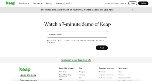
Keap, formerly Infusionsoft, is a CRM and marketing automation software suite for capturing and following up with sales leads. This landing page is probably the simplest one we feature on this list and includes a single entry field for an email address in order to receive a 7-minute demo video. This is an excellent landing page to use for any situations where a demo is of interest to the audience.
Why It Works: A specific product demo landing page can be used in many marketing situations.
22. Khan Academy
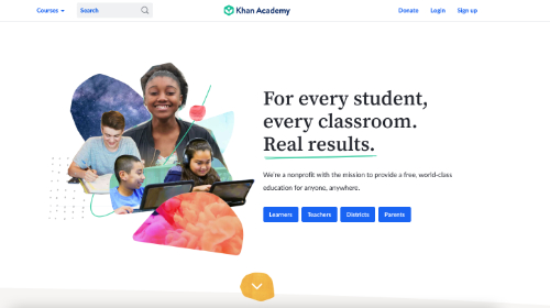
The Khan Academy is a non-profit that provides distance learning resources to students and educators around the world. This landing page caters to four groups (learners, teachers, districts, and parents) and uses CTA buttons to help viewers find the appropriate pages. The page does an excellent job of following a single cohesive value proposition while also describing the needs of each group separately.
Why It Works: Most visitors are looking for personalized information based on their unique needs.
23. Lending Club

Lending Club is a banking institution that focuses on personal loans and checking or savings accounts. Its main landing page presents many different CTA buttons including offers to check loan rates, learn more about accounts, and read customer reviews. This can be an effective approach for a home page that must address the needs of any visitor to the site.
Why It Works: Using multiple CTA buttons can be effective for general-use landing pages.
24. Lyft
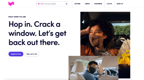
The rideshare service Lyft begins this landing page with two CTA buttons that give options for riders and drivers. Since Lyft drivers have very different needs than those who choose to join the service as riders, this allows the company to immediately filter visitors to the appropriate content. This ultimately allows them to address the needs of adjacent markets through the same entry point.
Why It Works: Clear CTA buttons can be used as a guide to lead visitors to appropriate content based on their needs.
25. Mailchimp
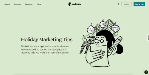
Mailchimp is a leading email marketing platform, and this holiday landing page is an excellent example of a seasonal offering that works. The page describes holiday marketing tips and uses a well-presented roundup of other blog posts and resources from the website. While scrolling down the page, the header remains visible with a clear “Sign Up Free” CTA button.
Why It Works: Seasonal landing pages are an engaging way to offer unique and dynamic offers to your customers.
26. Medium
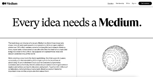
The content hosting platform Medium has become a valuable resource for both writers and readers worldwide. The about page on the website is a great example of presenting a company vision in a clear and compelling manner. This landing page not only describes the mission of Medium but also introduces the company blog, job opportunities, and many other features of the website.
Why It Works: An about page is an excellent place to highlight the most valuable content on a website.
27. Microsoft
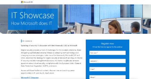
Microsoft has hundreds of products and services for sale through its website, and the company does a nice job of creating unique landing pages for specific content. This IT Showcase landing page presents a registration form for an on-demand webinar on the topic of digital security. The page not only presents the signup form but also includes links to Microsoft careers, the company’s LinkedIn page, and the IT Showcase app.
Why It Works: Including additional links on a landing page can help capture additional engagement.
28. Milanote
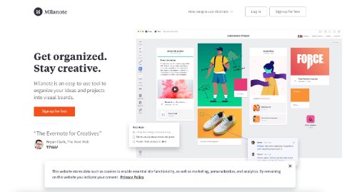
Milanote is a visual organization program that has an appealing landing page on the main website. The white background presents a clean look, and the graphics are modern and high-quality. Also included on the page is a floating footer that describes the privacy policy along with a link for more details.
Why It Works: You should always include a clearly visible link to your privacy policy on all landing pages.
29. Mixpanel
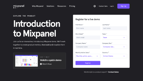
Mixpanel is a product analytics software platform for optimizing user experience and operational efficiency. Website visitors interested in a product tour are directed to this landing page where they can register for a live demo. The page also describes some common product performance questions that Mixpanel data visualizations can help answer.
Why It Works: Presenting compelling screenshots is an excellent way to communicate features of software products.
30. Netflix

Netflix thrives through the signup of new customers to their platform. Their landing page has a minimalist design with a clean black background that makes the images appear vivid on a device screen. The frequently asked questions at the bottom of the landing page make it easy to quickly understand what Netflix offers, and you can sign up by entering your email and completing a few simple tasks.
Why It Works: The signup form uses only a single field, making it very easy for someone to begin the process.
31. NordVPN
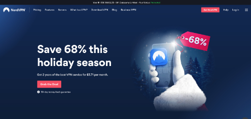
NordVPN is one of the top VPN providers in the world, and it features a dymanic landing page on the main website. At the beginning of the page there’s a clearly visible header that shows your current IP address and whether you are currently protected by a VPN. You can also read testimonials from major social media influencers and other active users of the software.
Why It Works: Many times data and statistics are much more effective than using words to describe the value of a product or service.
32. Optimizely
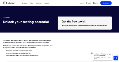
Optimizely helps companies create a more compelling digital experience by providing many tools for content management and optimization. This landing page features a free resource toolkit that can be used to grow and scale a business. With a simple report description and signup form, the page doesn’t waste time or distract from the desired call to action.
Why It Works: Don’t over-complicate the design of landing pages that have a clear and relevant call to action.
33. OptinMonster
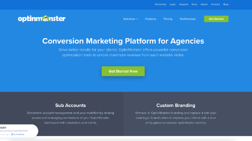
OptinMonster is a conversion marketing platform designed for professionals who seek to maximize their revenue from promotions and digital marketing. The colors and graphics on this landing page match perfectly with the OptinMonster brand, and there are clear sections to divide the content. A testimonial slider demonstrates social proof, and several CTA buttons are included throughout the page, giving visitors many opportunities to interact.
Why It Works: Always make sure that a landing page fits well with your overall brand and style guide.
34. Oracle

The landing page of Oracle’s primary website is another solid example of displaying a lot of information in a very simple format. The page includes only three large content elements showing Oracle Cloud Infrastructure, Oracle Cloud Applications, and a slider that rotates through 5 other current news releases or offerings. Each box has its own CTA button, and visitors can simply view the page and make a selection in seconds.
Why It Works: Sometimes you can include all necessary landing page information above the fold with no need for scrolling.
35. Salesforce
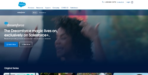
Salesforce has grown into a large company that offers many products and services for businesses of all sizes. One interesting platform for Salesforce is the Salesforce+ streaming service described on this landing page. Visitors can browse the page and access on-demand videos and original series episodes featuring business leaders and stories.
Why It Works: Video content has been trending as one of the most desirable formats for viewing on the web, so make use of it on your landing pages.
36. SEMRush
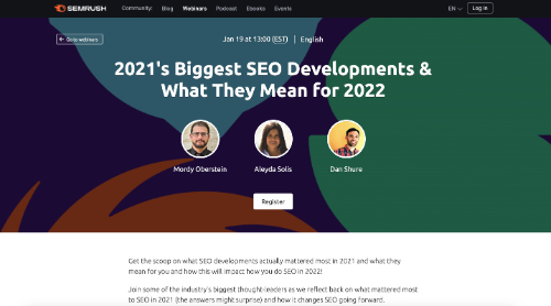
SEMRush is a popular SEO platform that has an active community of users around the world. The company often features webinars for its users, and this landing page is for an upcoming session that features three experts discussing the biggest SEO trends from 2021 and what they mean for the coming year. The page simply presents a summary of the webinar and a registration form without cluttering the page with other content.
Why It Works: Short landing pages are a great format to use when promoting webinars and other highly targeted events.
37. Shopify
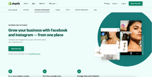
This post-click landing page from e-commerce platform Shopify targets Facebook and Instagram users. Using minimal text and excellent high-quality photos, the page explains how Shopify can be integrated with these social media platforms to sell directly to followers. This is a great example of a highly relevant landing page with a clear audience in mind.
Why It Works: Each landing page should be designed with a clear audience in mind.
38. Skillshare

The online learning platform Skillshare offers classes on just about any topic you could imagine. The company offers a 7-day free trial for new customers, and this is the primary landing page they use for all new signups. The page has a nice dark background that makes the text easy to read, and visitors can sign in quickly using existing Facebook, Google, and Apple accounts.
Why It Works: Sign-in services from companies like Facebook and Google make it easier for new customers to register, reducing friction in the conversion process.
39. Slack
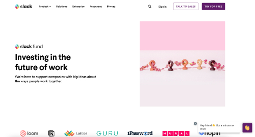
Slack is a leading collaboration platform that also has several other initiatives such as the Slack venture capital fund. This landing page from the Slack website presents the key partners in the fund with links to additional articles about how Slack supports innovative startups. Instead of using dedicated CTA buttons, Slack relies on standard options of “Try Slack” and “Talk to Sales” to capture all visitors, including those interested in the fund.
Why It Works: Landing pages can be adapted to a company’s current needs and priorities.
40. Spotify
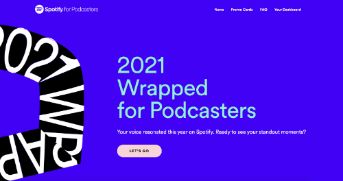
The music and audio streaming service Spotify has made a big push into the podcasting space, and this landing page targets podcast content creators. Large graphics on the page share important metrics to convince podcasters to join Spotify, including the nearly 300 million listeners that are reachable on the platform. This landing page also uses unique colors when compared to Spotify’s standard brand kit, which adds some uniqueness to the visuals.
Why It Works: Unique colors can make important visuals stand out.
41. Squarespace

The website hosting platform Squarespace is known for its modern template designs and user-friendly web builder. The dynamic graphics and scrolling animations used on this landing page can be risky in many situations, but for Squarespace they seek to display the potential that their websites offer. Squarespace manages to present over 10 different pages from the site on a single landing page without it feeling overly complex.
Why It Works: The content flow of a landing page is extremely important and should take into account the digital experience.
42. Taboola
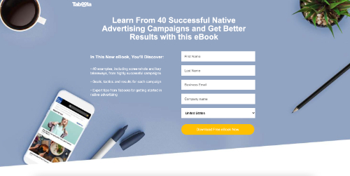
Taboola is a content discovery and native advertising service for businesses. This landing page offer a free ebook in exchange for an email newsletter signup. Ebooks are a great marketing tool as they can be used repeatedly and scaled to reach thousands of customers through your landing pages.
Why It Works: An ebook is an excellent giveaway to use on a landing page to encourage more signups.
43. Taster’s Club
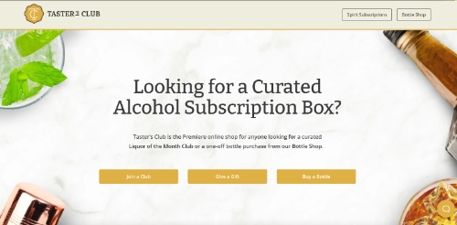
Taster’s Club is a subscription box service featuring wine and other spirits such as whiskey and rum. The presentation of the main content above the fold includes 3 CTA buttons that capture visitors looking to join the service, buy a gift subscription, or purchase a bottle. This is a really nice way to engage busy website visitors who want to move quickly without having to scroll through a lengthy landing page.
Why It Works: Adding CTA buttons above the fold can help capture busy visitors who may otherwise leave the site quickly.
44. Webflow
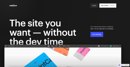
Webflow is a website design and marketing platform with e-commerce integration and many pre-made templates. This landing page makes excellent use of animations to show how the website builder features work. The page is also highly interactive, with several buttons and clickable elements displayed as you scroll.
Why It Works: An interactive landing page is an excellent option for a website home page.
45. Wix

As a leading provider of website hosting and management services, Wix has a lot of in-house expertise in landing page design. This example has an ultra-modern look that uses illustrations and a minimal amount of text. A simple call-to-action button titled “Start Now” is included above the fold, and visitors can then scroll through several sections that clearly describe the value of joining the platform.
Why It Works: A minimalist landing page design reduce clutter and needless scrolling.
46. Uber
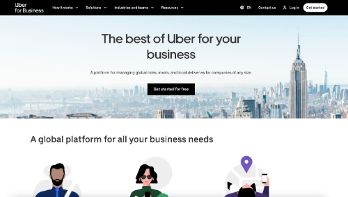
Uber is a leading rideshare company that has solutions for transportation, food delivery, and business. Business clients are directed to this landing page that explains how Uber integrates rideshare, meal service, and delivery into a single solution for corporate use. The landing page also features some excellent case studies from leading businesses like Samsung and Coca-Cola that demonstrate social proof.
Why It Works: Product reviews, case studies, and testimonials can be used on a landing page as examples of social proof.
47. Udemy Business
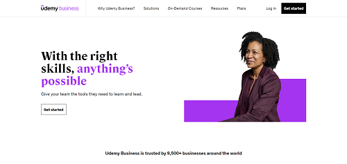
The online education platform Udemy has become a popular resource for students and other learners worldwide. The Udemy Business landing page explains how the company’s solutions can be used to improve company onboarding and leadership development. Several different CTA buttons are used throughout the page to share important links to more information about the course content and options for getting started.
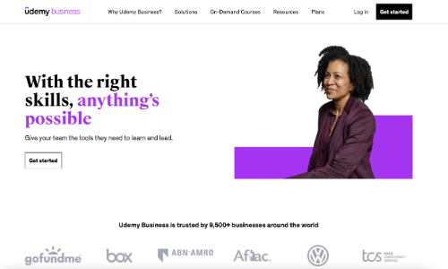
Why It Works: It can be helpful to create a dedicated landing page for each major market segment you are targeting.
48. Vimeo
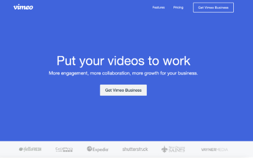
Vimeo is a versatile video production and distribution platform with three distinct versions servicing the needs of professionals, business teams, and advanced users. This landing page promotes the Vimeo Business offering and uses graphics and video to explain the core features. For easy reference, the page also includes a useful table at the bottom of the page comparing Vimeo Business to the other two plans offered.
Why It Works: Tables are a great way to compare features when you offer multiple product or service plans.
49. Zoho
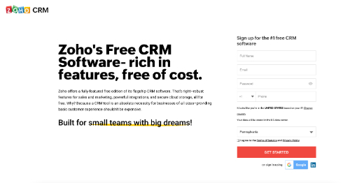
This excellent landing page example from Zoho promotes the free version of its CRM software. The company is known for generously including many features with their free software, and the page includes several clear reasons why this platform is a great option. All the important information needed to sign up is also included above the fold, creating a clean and efficient look.
Why It Works: Including a CTA above the fold allows people to take action without scrolling.
50. Zoom
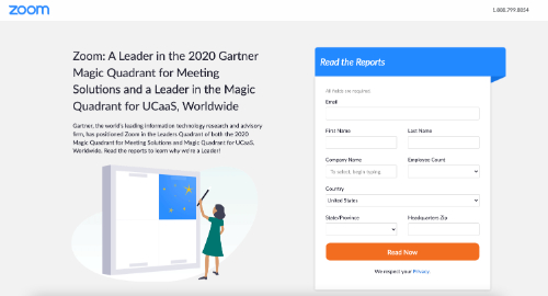
Zoom has teamed up with Gartner to provide a free report on meeting solutions for businesses. Giving away a free gift is an excellent way to collect new signups, and the team has also created a dedicated landing page for this offering. Several fields must be completed to access the report, giving Zoom valuable information about those who are interested in the report.
Why It Works: Offering a free gift for signups is one of the most effective CTAs you can use on a landing page.
You’ve put a lot of work into creating a visually appealing, engaging landing page that converts. So, why not get even more exposure for your landing page by making it easy for visitors to share your offers with their family and friends on social media? Installing social media share buttons takes just minutes, and they’re totally free to use! Plus, with customized share buttons featured on your landing pages, all it takes is a single click for visitors to share with their networks.