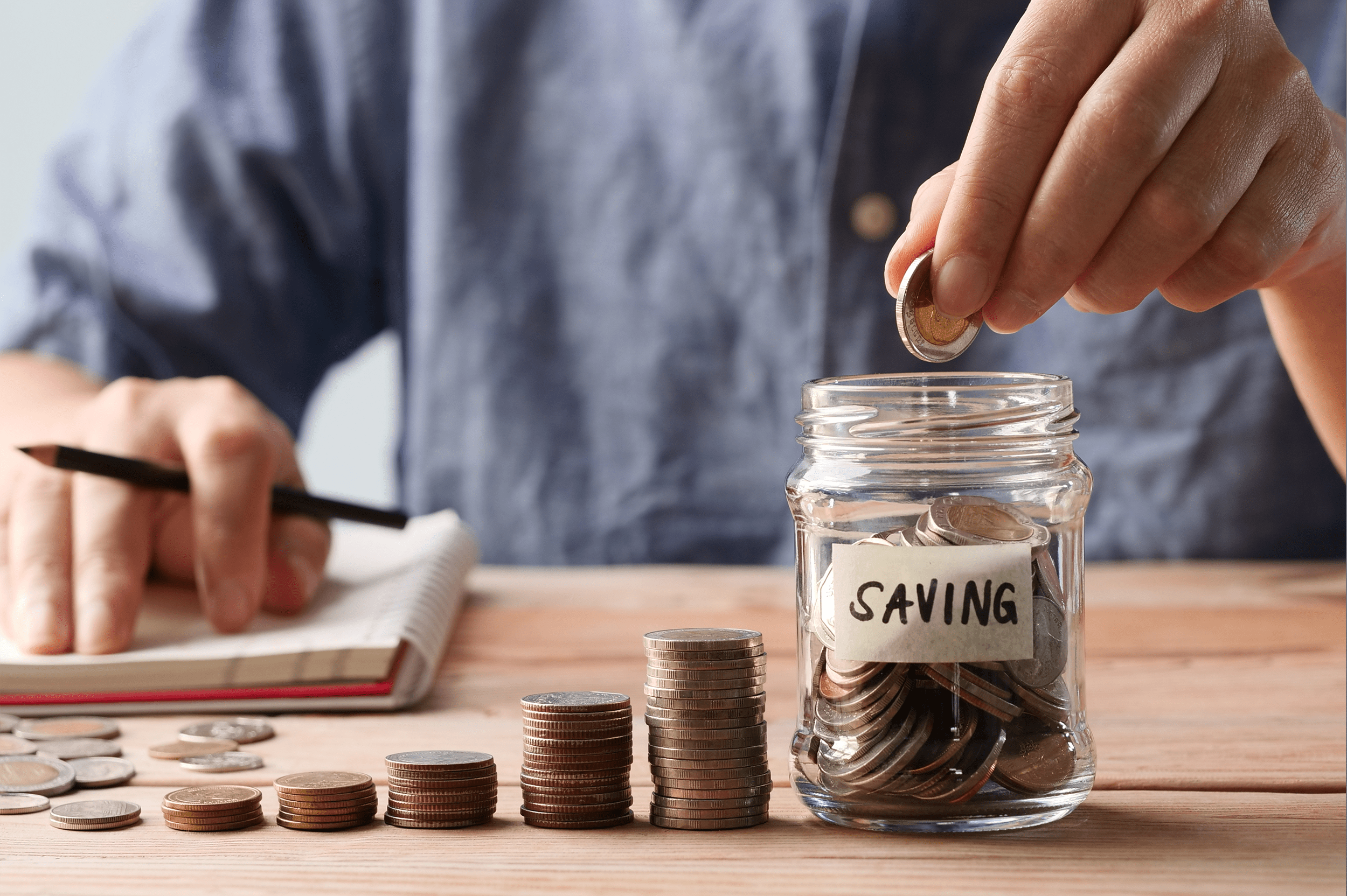
25 Digital Marketing Experts Share Their Top Tips for Optimizing Popups

We’ve all encountered popups at one time or another. Popups run the gamut from large, annoying popup windows that take over the entire screen and are difficult (if not impossible) to close and more subtle, yet still attention-grabbing popups with irresistible offers that entice you to take action. For example, eCommerce websites often use exit intent popups to remind visitors that there are items in their shopping cart and offer an exclusive discount to encourage them to complete the checkout process.

Popups can be used to grow your email marketing list, upsell or cross-sell your products or services, or to send visitors to other areas of your site or specific landing pages based on their previous behavior on your site. You can also use popups to promote digital downloads, get visitors to sign up for an upcoming webinar or event, or create a sense of urgency by making visitors aware that they only have a limited time to take advantage of an incredible offer. There are many different ways to utilize popups to help you achieve your goals in any niche.

Obviously, some popups are more effective than others, but what’s the secret to optimizing popups for the best results? To learn more about the best ways to optimize popups to improve your marketing results, we reached out to a panel of digital marketing professionals and asked them to answer this question:

“What’s your #1 tip for optimizing popups?”

Meet Our Panel of Digital Marketing Pros:

Keep reading to learn what our experts had to say about the best ways to create fully optimized popups that won’t frustrate your visitors and instead entice them to take action.


Jeff Cooper

Jeff Cooper

@MessagelyHQ

Jeff Cooper is the Manager of Messagely.

Pay attention to the timing. If you’re implementing a popup on mobile, you still need to be mindful of the timing. As on desktop, you need to assure your popup isn’t intrusive for the visitor. By applying smart triggers proposed by Exit Bee, you can target your mobile audience based on their responses on your site. For example, you can target them based on their scrolling pace, scroll location, and more.”

Tim Koster

Tim Koster

@Clvr_Creations

Tim is the founder of CleverCreations. He is passionate about building, repairing, and anything home DIY related. When he is not busy writing about these topics, you can find him in his workshop.

A good method to optimize popups on a website is by implementing slide-in instead of large/full-screen popups. Popups that obscure a large portion of the webpage are more likely to be instantly clicked away, whereas small (but still clearly visible) slide-in popups draw attention without being intrusive. We have seen a decent increase in CTR by making this switch.”

Ron Evan

Ron Evan

@ThriveAgency

Ron is a Digital Marketing Specialist at Thrive Agency.

When optimizing popups for your website, be sure that the popup is not the first thing on your website when a visitor lands. Give them time to browse multiple pages, or they’ll just opt-out from your website in seconds! The popup should have a close button or option. Everyone hates the kind of popups that don’t close.

Also, use engaging copy in your popups to make them more useful and effective. Lastly, the popups shouldn’t be so big that they cover the entire screen. They should also not be full of text. After all, it’s a popup…. not a landing page!”

Allison Chaney

Allison Chaney

Allison Chaney is the Chief Digital Training Officer at Boot Camp Digital and one of the most experienced Digital Marketers in the industry. Allison has over 20 years of digital marketing experience, working with B2B and B2C companies of all sizes including Cisco, NASA, Idaho Potato, Porsche, FTD, Blue Cross Blue Shield, Dominos Pizza, Mane ‘n Tail, UPS, Fresh Express, Timbertech, and Synchrony Financial (formerly GE Capital). Allison is passionate about helping businesses and individuals turn their digital marketing into money by getting better results faster.

“My #1 tip for optimizing popups on a website is actually a tip about what not to do. The problem that I’ve seen a lot of marketers fall into when creating popups is that they get caught up in testing small changes that don’t really impact the results. So when optimizing popups, test big, significant changes like a change in the offer. Making small changes like shifting the graphics or changing the timing of the popup don’t really make a significant enough impact on the results to make it worth your time.”

Mark Coster

Mark Coster

@stemtoyexpert

Mark Coster is an online entrepreneur and the driving force behind STEM Toy Expert. With 20 years of experience in chemistry education and research, and 3 willing children as guinea pigs, Mark has a passion for inspiring kids and adults to combine fun and learning with STEM Toys.

“As a person who uses the internet for work, education and entertainment, I absolutely get it: Popups are often annoying and obtrusive. In some cases, they affect user experience so much that they force you to leave an otherwise decent website. So does running them on my website make me a hypocrite?

I don’t think it does. There are many different types of popups, but one thing can make or break any of those types: copy. When the copy is interesting, relevant, tailored to the audience, and gives them what they need rather than pushing them into actions they wouldn’t normally do, there’s nothing inherently wrong with the popup.

There are many other things you can do to optimize your popups: setting them up so they only get triggered by certain user behavior, adjusting their position, size, mobile-friendliness, etc. But all of these tips won’t be worth much if you don’t have good copy in place. You need to be fair to your audience and make it easy to turn off a popup. Still, you need to always keep in mind the user’s natural urge to click X. You need to understand this urge, experience it, and craft your copy accordingly.”

Ron Stefanski

Ron Stefanski

@Rstefanski

Ron Stefanski is an entrepreneur and college marketing professor who has a passion for helping people create and grow their online business. He teaches internet marketing and business courses at five different colleges and owns a media company that consists of a portfolio of websites ranging from 250,000 visitors to a couple of thousand visitors monthly.

“My tip to optimizing popups on a website is simple: All decisions with popups should first consider the user experience. Two very important things to consider with this are:

  • The popup should never cover the entire screen. It creates an inconvenient user experience for the customer, especially if they can’t find where to exit. And it will create a terrible user experience on mobile, which is important because of Google’s mobile-first indexing policy. It will not serve your website well to create a bad mobile experience with an aggressive popup that covers the entire screen. Google will recognize that and stop considering your site valuable when giving search results to the end user.
  • Another important thing to remember with the user experience is what value that inconvenient popup ad is going to provide them. It should be worth it to the end user and it should be fulfilling one of your website’s goals. If it doesn’t do both, don’t do it. If you’re going to ask something of your users, make it very worth their while. For example, if you want their email, provide something free, or a discount on their order.”

Brian Robben

Brian Robben

@BrianJRobben

Brian Robben is the CEO of the fast-growing digital marketing agency Robben Media. He focuses on helping companies grow through high-quality traffic, leads, and sales.

“Want the secret to popups? Put an irresistible offer in your website popup and it will do wonders. Now it has to be extremely good, almost too good for this to work. If you ask for their email and give the visitor nothing, like most popups, that’s going to fail. With an irresistible offer, you’ll build goodwill and drive sales. Also, it will not irritate your list because the offer is so good.”

Oli Graham

Oli Graham

@RightlyWritten

Oli Graham is the Marketing Manager of digital content agency RightlyWritten. He has 6 years experience in PR and content marketing.

My tip for optimizing popups is to match the popup to the page that you are placing it on. You are only going to get someone to opt in if they have a decent level of engagement on your site. As engagement is measured in different ways for different pages, you should choose popup types that reflect this.

A few examples of this include:

  • Blog posts should have popups that trigger once a certain scroll depth has occurred.
  • Pages with video embeds should have popups after a certain amount of video has been watched (interaction based popup).
  • Sales pages indicate engagement by virtue of someone landing on them, so they should have exit intent popups.

Of course, this is just a rule of thumb, and you can test similar intent-based popups to find out what works best for you.”

Kristaps Brencans

Kristaps Brencans

@OnTheMap

Kristaps Brencans is the Chief Marketing Officer at On The Map.

My number one tip for optimizing website popups is constant A/B testing. Test image versus copy, how much copy, different calls to action, different colors, different locations where it pops up, different times it pops up, different triggers. Focus on constantly evolving your popup until you are getting a 3.5% and higher conversion rate.”

Rex Freiberger

Rex Freiberger

@gadgetreview

Rex is the CEO of Gadget Review, a top technology and lifestyle publication with over 50,000 product reviews and ratings of the top electronics, software, and services.

If I could only give one tip for optimizing popups, it would be to create mobile-specific popups. A large number of your customers will visit your site through a mobile platform. Desktop popups don’t work well on mobile – if they work at all – and are shown to have very poor conversion rates. This can tank the overall conversion rate of your popups and skew the data from your marketing efforts.

When designing popups for mobile, the biggest thing you want to do is avoid using multiple form fields. Limit it to two at the most, ideally just one. Also, don’t bother using images. You never know what kind of connection someone is working with, and even just one image can drastically slow down loading time.

Another mobile popup best practice is to have popup ads trigger after a set amount of time on the page, rather than when you first enter it. This will cut down on the number of users who just immediately disengage with the page.”

Justin Smith

Justin Smith

@OuterBox

As the Founder & CEO of OuterBox, Justin Smith has grown OuterBox into the nations #1 ranked eCommerce SEO agency and a leader in the eCommerce website design, development, and marketing space. He personally is an SEO and eCommerce expert.

My #1 tip for optimizing popups on a website is to make them as unobtrusive and value-driven as possible. I know that may sound counterintuitive, but I often think of popups as the online version of in-store sales reps – you know, those people that follow you around, asking if you need any help when all you really want to do is shop in peace. While I can appreciate that they are just doing their jobs, unless they are adding something of value, I’d rather be left alone. You should think of your website popups in the same way.

When using popups, use them strategically. Use different messages and call-to-actions depending on the page the user is viewing so that the experience is more tailored. If you just use the same generic popup message on every page of your website, visitors will get annoyed – quickly. By the same token, if you offer something of value (e.g., 10% off coupon, free shipping, access to an exclusive report), users will be more inclined to engage with your popup.

Ultimately, it all comes down to the user experience. The more tailored and unobtrusive you can make your popups, the more engagement you will see.”

Dimitris Tsapis

Dimitris Tsapis

Dimitris Tsapis is the Head of Marketing at Retail CRM Cloud, a CRM software specifically made for retailers.

Popups have to be created with a goal in mind, and therefore the #1 popup optimization tip is to re-define your marketing strategy and buyer personas.

A few relevant questions to ask are:

  • How are my popups converting?
  • What am I trying to achieve: generating leads, driving more sales, harvesting e-mails or improving customer experience?

More specifically, we have found that for retail companies the best way is NOT to go with entry popups, as they are too intrusive, but rather with interaction-based popups. Retail experience online nowadays is about customer experience as much as it would be in a brick-and-mortar store. Interaction based popups guarantee that you reach your customer after they have already engaged with a specific point on your website and can help convert that customer. It will allow you to create a personalized experience for the customer, based on their behavior. Make sure you work on offering value to the customer with the popup – it can be a discount, voucher, similar product, special offer, etc.”

Michael Steele

Michael Steele

@FlywheelDigital

Michael Steele is the CEO of Flywheel Digital, a Vancouver-based technical marketing agency. He started Flywheel on the side while teaching digital marketing at a local tech school, after hearing from students and partners that there was a need for a more technical, transparent approach to digital marketing.

“Here is my #1 tip for optimizing popups: Traffic is only as valuable as your ability to convert. Despite the negativity surrounding popup ads, it is actually one of the best ways to turn a page visit into a conversion.

When using popups, always consider the user. Make sure the popup is easy to follow, relevant to the user’s search intent, and well structured on both desktop and mobile devices.

Making the conversion process easy while simultaneously providing users with content they want to see is the best way to optimize popups. This is a best practice that is particularly relevant when we leverage A/B testing to improve on-page conversions, which allows us to create self-reinforcing business outcomes.”

John Ross

John Ross

@insight_prep

John Ross is the CEO of Test Prep Insight, an online education company.

My absolute best tip for optimizing popups is to use actionable copy. Specifically, keep the copy for your main call to action in the popup to 6 words or less. We have done A/B testing with different popups where some versions have 6 words or less, and others have 8 to 20 words. The popup with shorter copy ALWAYS outperforms the popup with lengthier copy. In fact, our click-through rate was 34% higher with popups that have 6 words or less.

The takeaway is that users’ attention span for reading popups is next to nothing. You have less than a second to draw them in, so your message has to be as short and actionable as possible. Keep your call to action concise, and focus on the element of your pitch that will most likely get the click – whether that’s a sale, success rates, whatever.”

Rob Powell

Rob Powell

@robpowellbiz

Rob Powell is an online entrepreneur who shows bloggers and content marketers how to use SEO to get traffic to their website and build their online presence.

What increases conversions more than anything else (in my experience) is having an image of your lead magnet. I use the free version of Canva to do this. Just grab one of their ready-made templates and customize it with your own brand colors. Don’t worry about having a 3D book cover – a flat 2D cover is fine. Here’s an example of a lead magnet image I created on Canva in about 5 minutes.”

Stephen Light

Stephen Light

@NolahSleep

Stephen Light is the Co-Owner and Chief Marketing Officer at Nolah Mattress.

My #1 tip for optimizing a website popup is to make it as uncluttered, concise, and straightforward as possible. Many popups are ineffective because they contain too much content, making them look unorganized and unappealing to read. Have your website designer create a popup layout that makes all content readable and clear.

A cluttered popup scares and overwhelms internet users. When they see one, chances are high that they’ll close the popup to avoid the unnecessary stress of reading the content. Limit the scope of your popups and structure them intelligently, making the content easy-to-digest and clear.”

David De Haan

David De Haan

@KayaksFantastic

After spending most of his life on or near the water rafting, fishing, and sailing, David started the website Fantastic Kayaks, where he helps beginning kayakers with tips and advice.

My top tip for using popups is this: be creative. Almost every website you visit has popups, and you will notice that they are mainly used to collect emails. But they can do more than that. What if some of the people visiting your website have already subscribed to your email list? Why would you be showing them a popup asking them to subscribe? The popup is not helping them (or you).

Create different popups for different visitors. For people who have already subscribed, design a popup with a suitable CTA. This could be making a purchase or entering a free trial. It depends on what you are selling. And for visitors who have already made a purchase, design another popup, just for them. This ensures that you are effectively targeting everyone that visits your site, regardless of where they are in the buyer’s journey.”

Mitch Harad

Mitch Harad

@harad

Mitch Harad is the leader of a financial services marketing team, as well as a husband, father, and dog dad. He’s a die-hard Philadelphia Eagles fan, HIIT fanatic, and Australophile (forlorn former Sydneysider).

“In an era when roughly 25% of internet users are blocking ads on their devices, it’s clear there is little warmth towards interruptive marketing. For that reason, no amount of tinkering with message or value proposition will overcome a natural aversion to ads. Asking for less data and tinkering with the timing are all well and good, but unless you can convince a site user to care then these optimization strategies will fall flat.

As a marketer (and someone who’s been met with the dreaded popup when all you want is some online peace and quiet) my #1 tip is to incorporate your popup into the design of your site.

That’s not to say your popup should be camouflaged, but aim to design the popup to fit seamlessly with the design of your site and the unique character of your business. This can be as simple as inverting the primary colors of your site, or grabbing attention with character-filled copy.

The goal isn’t to slide past your audience’s built-in bullsh*t meter – it’s to use your personality to show people your popup isn’t something to be avoided, but a value-driven opportunity to be grabbed with both hands.

At the end of the day, it’s all about thinking outside the lightbox!”

Stefanie Siclot

Stefanie Siclot is part of the SEO team at Growth Rocket. She is responsible for increasing the quality and quantity of website traffic, which means fun for her.

Popups should have more urgency and create a feeling of regret if a customer chooses to close the popup. A popup should only be redeemable in a short given period of time to have a higher chance of conversion. For example, if you’re offering a code, that code should only be available by clicking the button on the popup, and if the customer closes it, then the code won’t be valid.

Choosing the right words is also helpful to make customers feel that urgency, so be more creative in choosing words that create a feeling of urgency but are not usual words or phrases we see on popups of other websites.”

Boris Abazher

Boris Abazher

@Triare_official

Boris started in IT as a QA engineer, then grew to a sales and a product manager. He has been running a TRIARE software development company as a Founder and a CEO since 2015. After mastering a high-level PM, he learned to create appropriate conditions for everyone to reveal their best for the whole team to succeed.

“It’s hard to make an entry popup visitors will like. Our approach was to make it look like an inherent part of the page, an interesting interactive element, not something to get rid of quickly. It appears smoothly and uses design and colors that resonate with the site’s look. It also takes up a small space and doesn’t cover other content so that it does not feel intrusive and almost does not feel like a popup at all. But of course, there is an option to close it, just in case.

What makes it offbeat and eye-catching is the video. The video features me talking (muted of course – we don’t want intrusiveness) with a clear call-to-action: ‘Talk to me.’ We wanted to create this atmosphere of authenticity and show the clients how approachable we are.

If you click on the button, you will listen to this short video and be invited for further interactions. People can respond via video, audio, and text. We can hit reply anytime to keep the conversation going. The Videoask widget by Typeform can record, transcribe, and organize the interactions. Their motto, ‘The best interface is your face,’ says it all. It helps build more trust, urges clients to make personal contact, and allows us to better cater to their needs.”

Bryan Philips

Bryan Philips

@InMotionMKTG

Bryan is the Head of Marketing for In Motion Marketing.

One of my best tips for optimizing popups is don’t neglect the microcopy. Microcopy, the bit of instructional and motivational text on the popup, is some of the most important text on your website, but so many times, it’s just casually thrown up there instead of really painstakingly put forth.

The point of microcopy is to get users to take action. Relaying clarity and trust are vital in writing good microcopy. Explain to users why you need the information you do and also what they get when they give you this information.”

Matt Bertram

Matt Bertram

@EWRDigital

Matt Bertram is the CEO & SEO Strategist at EWR Digital.

Use multistep popups. You often want to know as much as possible about your subscribers. The more details you have, the easier it is to send personalized emails that provide value and drive conversions. The problem is that users tend to ignore popups with three or more input fields. We have found that the conversion rate drops by 66% when you add a third input field.

Multistep popups allow you to gather the information you need without affecting your conversion rate. Use the first popup to capture the user’s email, then follow up with a second popup with a question about the user’s interests. Our tests show that 75% of the people who complete the first popup will go on to complete the second.”

Alex Membrillo

Alex Membrillo

@Alex_Membrillo

Alex Membrillo is the CEO of Cardinal Digital Marketing, based in Atlanta, GA. He has been named Atlanta Business Chronicle’s Small Business Person of the Year and Digital Marketer of the Year by Technology Association of Georgia (TAG). Cardinal uses digital marketing, including SEO, to ignite client growth.

My number # 1 tip for optimizing popups on a website is to give an option for the user to decline and close the popup. When you think of optimization, an option to close the popup may seem counter-intuitive. However, this feature can save you from generating high bounce rates and completely losing the site visitor. This can also be key if there is an issue with the popup loading. Make sure there is a small ‘close’ button on the popup that works.”

Nick Drewe

Nick Drewe

@teamwethrift

Nick Drewe is a resale expert and founder of Wethrift, one of the world’s largest eCommerce platforms dedicated to consumer savings when online shopping.

“Popups are all too familiar for us in the eCommerce industry – you’ll see them used quite strategically and creatively on some sites, but on others, well, not so much.

Here’s one of the most effective ways I’ve seen sites upgrade their popups: Feature a gamification or interactive element that ups visitor anticipation and, therefore, popup conversions.

For instance, you see more and more eCommerce brands adding digital spin-the-wheel or scratch-and-save buttons on their popups versus that cliche ‘Get 15% off your first order when you input your email.’ Visitors then spin the digital wheel or scratch off a concealed text box to reveal the discount they’ve earned.

These are creative ways to gamify your popups. It makes the whole message feel more like an interactive game than a marketing move, plus adds some fun and a rush of anticipation given the element of chance. It’s a powerful motivator that can increase popup conversions, particularly for eCommerce brands and retailers.”

Aaron Haynes

Aaron Haynes

@loganix

Aaron Haynes is the CEO of Loganix, a remote-based digital marketing company providing mostly SEO/SEM deliverables.

Your website popups should always be optimized for SEO friendliness. The two main factors that you want to focus on here are mobile responsiveness and time to load. In today’s age, more than 50% of your website visitors come from mobile, so you need popups that respond well to different devices. This little tweak is crucial for popup conversion and SEO, so always make sure to test your popups from different devices.

While you’re at it, ensure your popups aren’t taking ages to appear on the screen. Popup load time is largely dependent on its design, so you want to use minimalistic designs with fast load times. These two changes will make your popups much more SEO- and user-friendly.”


Popups are a powerful tool for building your email list, boosting sales, and more, but finding the sweet spot that produces results without frustrating your audience can be challenging. Now available to publishers directly from the ShareThis platform, the POWR Form Builder makes creating effective popups easy – with no coding required! Get started with the Form Builder today to start creating effective popups in minutes.

About ShareThis

ShareThis has unlocked the power of global digital behavior by synthesizing social share, interest, and intent data since 2007. Powered by consumer behavior on over three million global domains, ShareThis observes real-time actions from real people on real digital destinations.

Subscribe to our Newsletter

Get the latest news, tips, and updates

Subscribe

Related Content